Scoring binary classification models
Binary classification models distribute outcomes into two categories, such as Yes or No. How accurately a model distributes outcomes can be assessed across a variety of scoring metrics.
The metrics expose different strengths and weaknesses of the model. None of them can be a true measure of a good fit on their own. Specifically, it is important to note that a great overall accuracy score doesn’t mean that the model is great. For example, what if a business only had a 10 percent conversion rate? The model could get a 90 percent accuracy score by simply saying that no leads would ever convert. This is where F1, recall, and precision come into play to help determine the balance of strengths and weaknesses of a model. If the model would assume that 100 percent of the leads would not convert, F1 would be 0.
During the training of a binary classification experiment, the following charts are auto-generated to provide quick analysis of the model scores:
-
Confusion matrix: A chart summarizing the accuracy of prediction results in a classification model. See Confusion matrix.
-
ROC curve: A chart showing how good a machine learning model is at predicting the positive class when the actual outcome is positive. See AUC and ROC curve.
Confusion matrix
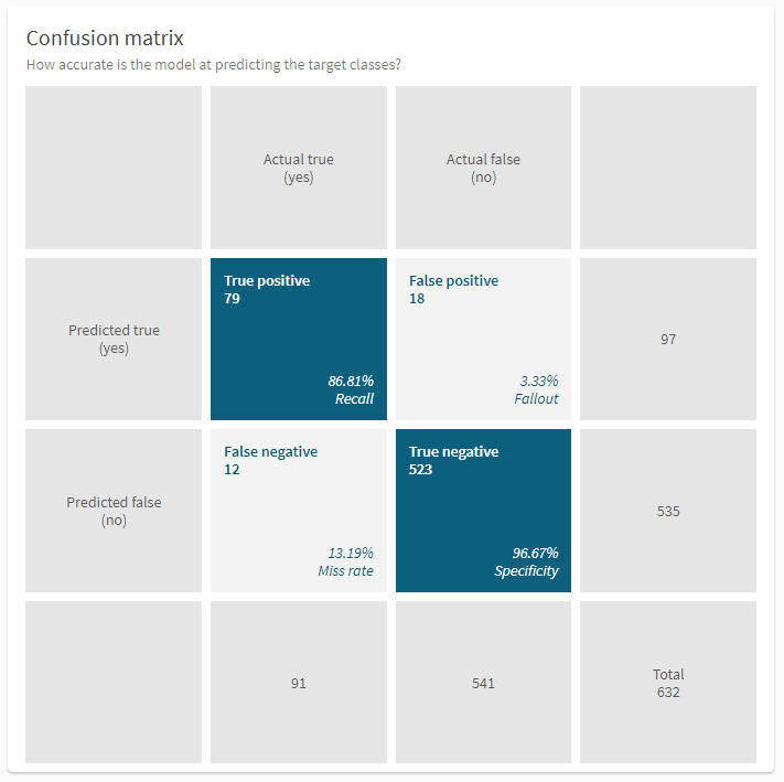
Most of the metrics for binary classification problems are generated by different calculations of the values in the confusion matrix. The confusion matrix is one of the visualizations shown in the Models tab. It shows how many of the actual true and actual false values were correctly predicted, with a total for each class. The values displayed in the chart are based on the automatic holdout data that is used to validate model performance after training. Each record in the dataset is sorted into one of the quadrants:
-
True positive (TP) are actual true values that were correctly predicted as true.
-
False positive (FP) are actual false values that were incorrectly predicted as true.
-
False negatives (FN) are actual true values that were incorrectly predicted as false.
-
True negative (TN) are actual false values that were correctly predicted as false.
Below the numbers in each quadrant, you can also see percentage values for the metrics recall (TP), fallout (FP), miss rate (FN), and specificity (TN). Hover over a value to see a tooltip with the metric.
Confusion matrix for a binary classification model

Any realistic case will show false positives and false negatives in the confusion matrix. Perfect predictions on the training data would indicate that the model has memorized the answers and will perform poorly in the real world. You will want to ensure that you have captured enough true positives and negatives.
F1
F1 score is a metric that tries to consider the accuracy when classes are imbalanced by focusing on the accuracy of positive predictions and actual positive records. It can be seen as how accurately the model captures outcomes that matters. The metric is trying to balance recall and precision to ideally find something that's in the middle between those two. Note that the more imbalanced a dataset is, the lower the F1 score is likely to be even with the same overall accuracy.
If the F1 value is high, all the other scoring metrics will be high. If the value is low, it is a sign that you need to do further analysis. However, if the score is very high, or if the holdout score much lower than the cross-validation score, it could be a sign of data leakage.
F1 is calculated as: 2 x ((Precision x Recall) / (Precision + Recall))
Recall
Recall is the true positive rate. It measures how often the model accurately predicted true when something actually was true. That is, how accurately did the model find all the actual true cases within a dataset? Recall is the measure of good remembrance of the positive class. It is calculated as: TP / (TP + FN)
Precision
Precision is also known as the positive predictive value. It measures what the probability is that the model was correct when it made a prediction that something is true. It is calculated as: TP / (TP + FP)
Trade-off between recall and precision
Recall can be described as how wide of a net the model casts: Did it capture all the trues, even if it made some false positive predictions? Did it capture as many trues as possible? Precision is a bit of the inverse to recall. Here we want to be sure that when the model predicts true, it's very precise about predicting true. However, with high precision we're going to end up with more false negatives where the model predicts false even when something is true.
There is a trade-off between not missing any true outcomes and being sure that none of the outcomes predicted as true was actually false. Whether a bias toward higher precision or higher recall is advisable depends on your business use case. For example, in prediction of disease diagnosis, you want to make sure you don’t miss patients who actually had the disease, that is, false negatives.
-
If the "cost" of a false negative is high, a model biased toward high recall might be justified.
-
If the "cost" of a false positive is high, a model biased toward high precision might be justified.
Accuracy
Accuracy measures how often the model made a correct prediction on average. It is calculated as: (TP + TN) / (All predictions)
Specificity
Specificity is the true negative rate. It measures how often the model accurately predicted false when something actually was false. It is calculated as: TN / (FP + TN)
MCC
Matthews Correlation Coefficient (MCC) ranges from -1 to 1, where 1 means that the model predicted every sample correctly. MCC is calculated as: ((TP x TN) - (FP x FN)) / [(TP + FP) x (FN + TN) x (FP + TN) x (TP + FN)]^(1/2)
Miss rate
Miss rate is the false negative rate. It is the ratio between the number of false negatives and the total number of actual positive events. It is calculated as: FN / (TP + FN)
Fallout
Fallout is the false positive rate. It is the ratio between the number of false positives and the total number of actual negative events. It is calculated as: FP / (FP + TN)
NPV
Negative predictive value (NPV) measures the probability that the model was correct when it made a prediction that something is false. It is calculated as: TN / (FN + TN)
Log Loss
Log Loss is a common measure for accuracy in logistic regression. A lower log loss value means better predictions—a perfect model would have a log loss of 0.
AUC and ROC curve
Area under the curve (AUC) is a more complicated accuracy metric that can help you understand how deterministic a model is. It describes how good the model is at predicting the positive class when the actual outcome is positive.
AUC is defined as the area under an ROC curve. The ROC curve plots the false positive rate (x-axis) versus the true positive rate (y-axis) for a number of different threshold values between 0.0 and 1.0. Put another way, it plots the false alarm rate versus the hit rate. This curve is useful for understanding if separation between classes is possible, indicating if the data is good enough to accurately distinguish between predicted outcomes.
The true positive rate is calculated as: TP / (TP + FN)
-
The closer the true positive rate is to 1.0—the maximum possible area under the curve—the more deterministic the model is.
-
The closer the true positive rate is to 0.5 the less deterministic the model is.
The image below shows a good ROC curve. It is good because the curve should be as close to 1 as possible, which gives a high AUC. The dotted line is random chance, 50:50. If the AUC is low, the curve is considered a poor curve.
A good ROC curve with a high AUC

Threshold
The threshold is the probability that a prediction is true. It represents the trade-off between false positives and false negatives. The threshold value is determined per algorithm and there will likely be a different threshold value for each algorithm in your model.
Threshold tuning
Threshold tuning is an effective way to ensure that the correct threshold value is selected to optimize the F1 scores of binary classification models. Qlik Predict computes the precision and recall for hundreds of different possible thresholds from 0 to 1. The threshold that achieves the highest F1 score is chosen.
Selecting the threshold—rather than relying on the default 0.5 threshold—produces predictions that are more robust for datasets that have an imbalance in the number of positive and negative cases.
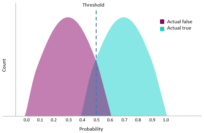
In the chart, the threshold is set to 0.5. In this case, records that were actually true and predicted less than 0.5, got the predicted label of false (false negative).
Threshold value at 0.5

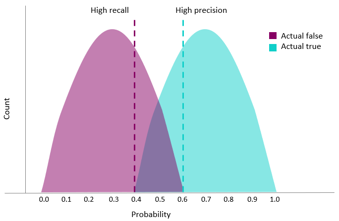
By changing the threshold that decides whether a record is predicted true or false, we can get a bias towards either higher recall or higher precision.
Alternative threshold values result in either higher recall or higher precision

Prediction speed
Prediction speed is a model metric that applies to all model types: binary classification, multiclass classification, regression, and time series. Prediction speed measures how fast a machine learning model is able to generate predictions.
In Qlik Predict, prediction speed is calculated using the combined feature computing time and test dataset prediction time. It is displayed in rows per second.
Prediction speed can be analyzed in the Model metrics table after running your experiment version. You can also view prediction speed data when analyzing models with embedded analytics. For more information, see:
Considerations
The measured prediction speed is based on the size of the training dataset rather than the data on which predictions are made. After deploying a model, you might notice differences between how fast predictions are created if training and prediction data differ greatly in size, or when creating real-time predictions on one or a handful of data rows.
