Visualizing SHAP values in Qlik Sense apps
SHAP values help us understand what is driving a model as well as driving individual outcomes. Build visualizations of SHAP values in Qlik Sense apps to further explore your data. The following examples will give you an idea of the insights you can gain.
Preparations
Before you get started, do the following preparations:
-
Generate a Coordinate SHAP dataset. This dataset has the SHAP value columns pivoted into a "feature" and "value", which lets you use multiple features in a single chart.
-
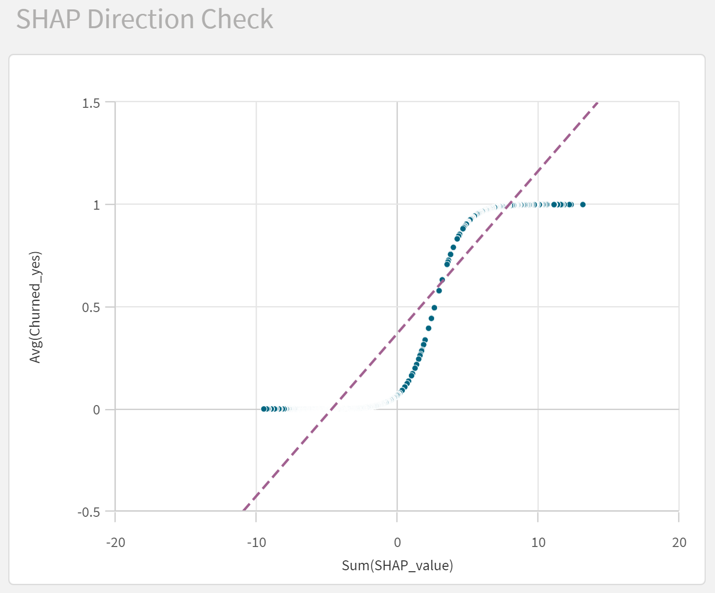
For binary classification predictions, plot the predicted probability against the sum of SHAP values per row and look at the direction of the SHAP values. If the slope is negative, reverse direction of the SHAP values to make it easier to interpret the visualizations.
Direction check for SHAP values showing a positive slope
Feature importance ranking
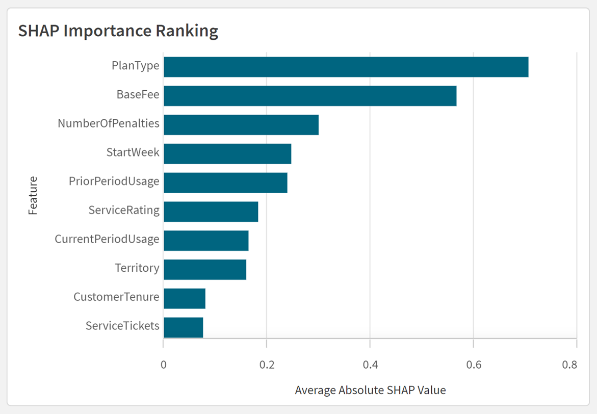
You can create a feature importance rank using the average absolute values of the SHAP values for each feature. The figure shows the importance of different features on the probability that a customer will churn.
SHAP importance ranking in Qlik Sense
Direction and distribution
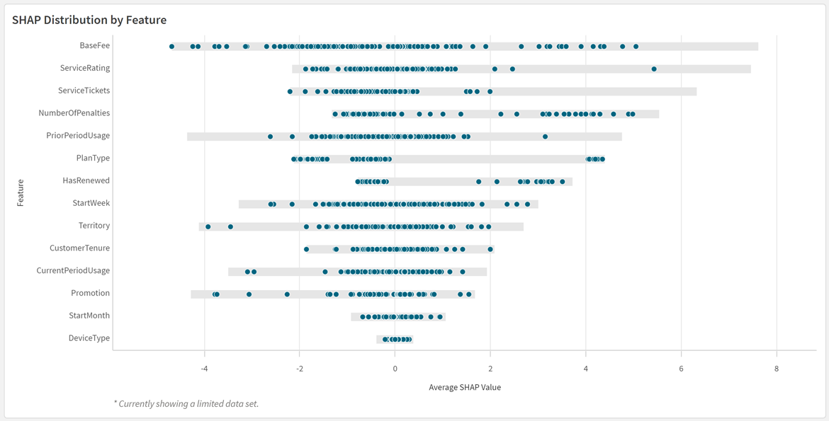
The SHAP values can also be used to understand the direction and distribution of each feature’s influence. In the figure, you can see if the different features make the customers more or less likely to churn.
SHAP distribution plot in Qlik Sense
Feature importance for cohorts
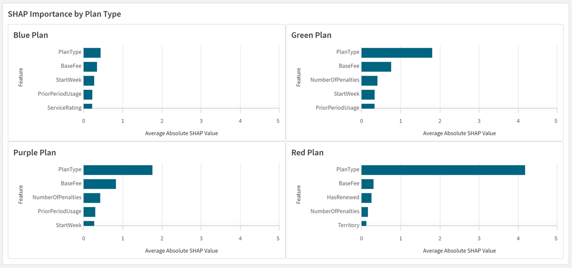
The feature importance can be created for distinct cohorts. For example, you can compare the most important features for customers with different plan types. The figure shows the feature influencers by plan type.
This chart uses a Trellis container to represent the data for specific field values in the data. You can also create similar charts individually using set expressions.
Chart in Qlik Sense displaying most significant churn influencers by plan type
Feature importance at the row level
SHAP importance can be used to understand feature importance at the row level. You can investigate and compare which features influence the probability of churn for different customers, as seen in the figure.
SHAP importance charts for specific customer IDs

Feature variation
You can plot the influence of each variation of a feature. For example, you can create visualizations to show the average influence of customer plan type for each of the plan types you offer.
Bar chart in Qlik Sense displaying SHAP importance of specific field values for a single feature

Distribution plot in Qlik Sense displaying SHAP importance of specific field values for a single feature

Continuous variables
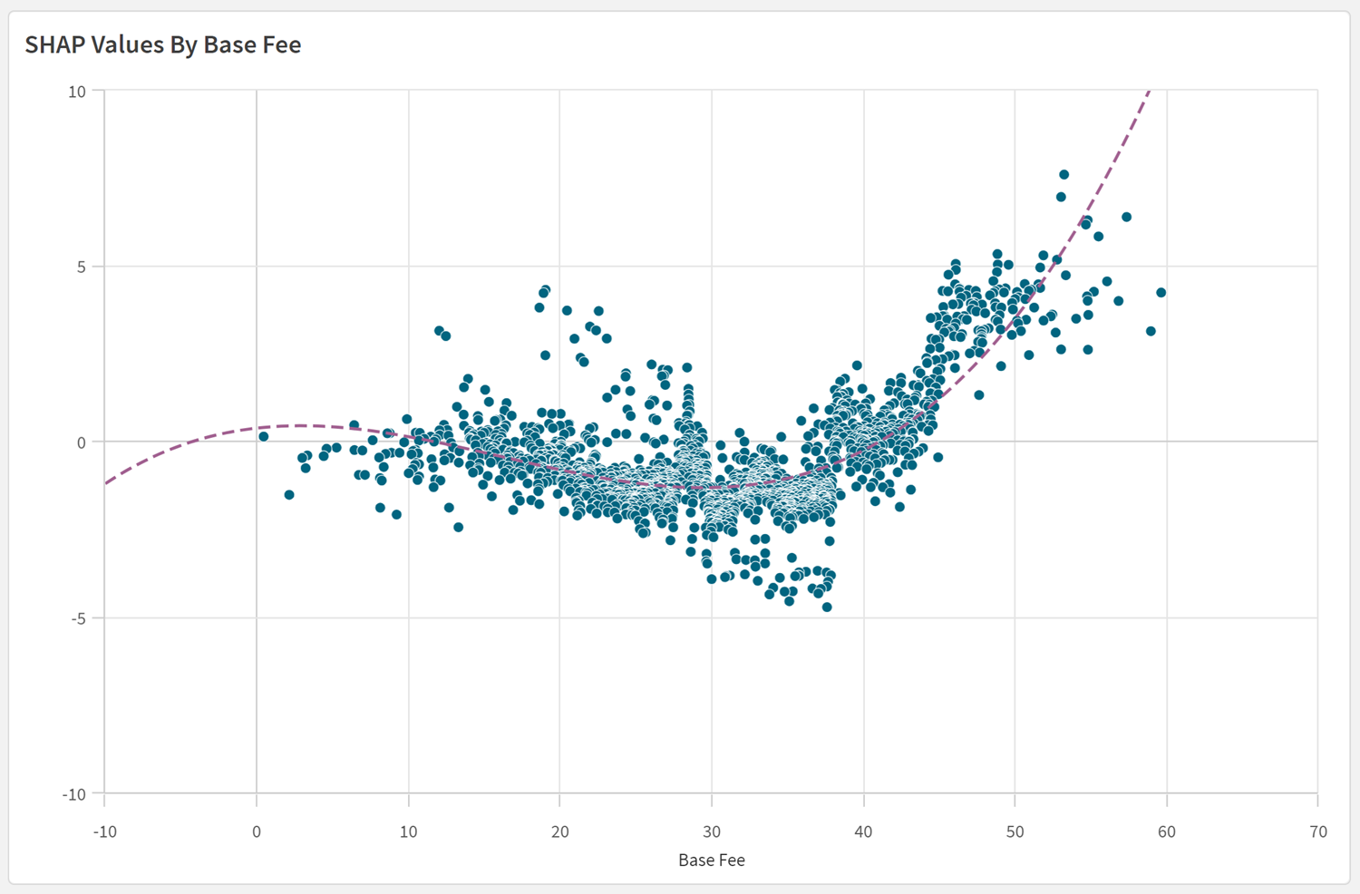
SHAP values can be used in scatter plots to analyze trends as continuous variables fluctuate in value. In this plot of SHAP values, we can see that a customer's probability of churn generally increases alongside increases in their base fee.
Optionally, we can also use regression lines and other tools to uncover new insights in the data.
SHAP scatter plot showing trends in churn outcome as base fee increases
