Correlation
Correlation measures how the features in your data relate to one another. Do the features move together, opposite one another, or are they unrelated?
Correlation ranges from -1.0 to 1.0. Two variables are considered to have a perfect positive correlation at 1.0, moving together in the same direction all the time. Variables with 0.0 correlation are considered uncorrelated, co-moving in a random pattern. Variables with -1.0 correlation move together, but in opposite directions.
An example of positively correlated features is temperature and air conditioner usage. The higher the temperature, the more air conditioners you would expect to be used. Conversely, temperature and heat usage are negatively correlated. The higher the temperature the less heat you’d expect to be used.
Features that are highly correlated are likely redundant. It is best practice not to include two highly correlated features in a model.
Correlation is not causation
When observing strong correlations—either positive or negative—it can be tempting to associate them with causation. Causation is when movement in one variable causes movement in the other. However, correlation does not mean causation and it is important to consider the underlying logical relationship between the two variables.
Correlations that are not grounded in logic are considered spurious. Spurious correlations are easy to discover because there is no logic to tie the two variables together. It is more common to perceive causation when a variable is hiding the underlying cause.
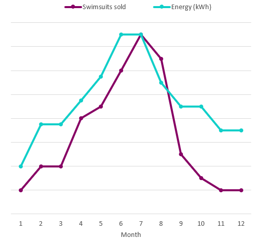
Let’s say that we are trying to understand what drives sales of swimsuits across a chain of retail stores. We find an unexpected relationship between energy and swimsuit sales, as shown in the chart. Based on this, we might unintentionally assume that swimsuit sales are driven by per capita energy consumption.
Energy consumption versus swimsuit sales

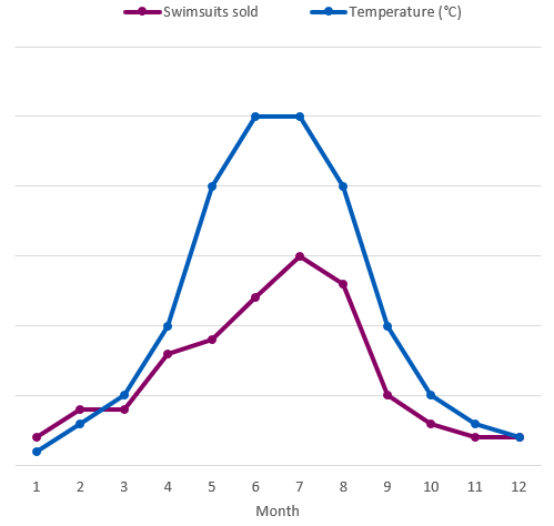
In fact, energy consumption is masking another feature: temperature. As temperature rises, demand for air conditioning spikes, which increases energy consumption. Energy is not causing swimsuit demand, but temperature is.
Temperature versus swimsuit sales

