Extrapolation and interpolation
The range of your data matters when you make predictions. If data points are missing in a data range, interpolation and extrapolation is used to predict the values that are in the missing range.
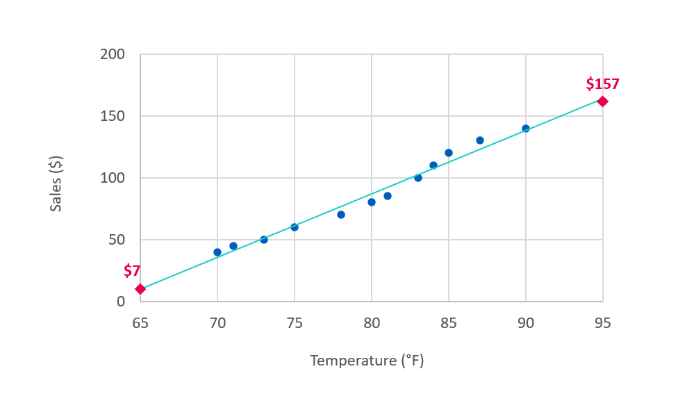
We will use an example of predicting lemonade sales to illustrate the concepts of interpolation and extrapolation. It also shows the risks with extrapolation that you need to be aware of. In our chart, the sales of lemonade in dollars are plotted against the daily maximum temperature. We can see that the sales increase with warmer temperatures.
Sales data plotted against temperature
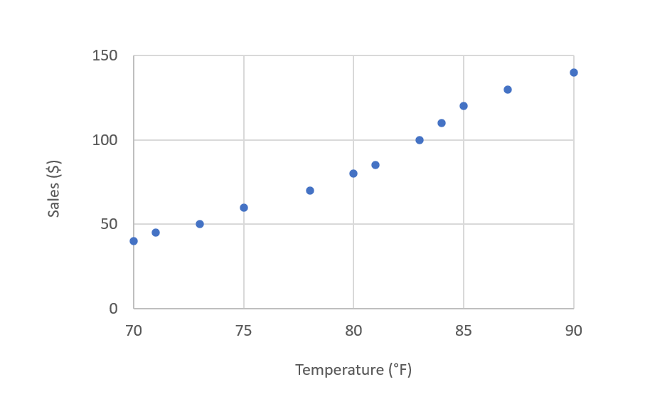
We have only collected data for days with temperatures from 70 to 90 degrees Fahrenheit. This means that our data range, or domain, is 70–90°F.
Interpolation
Interpolation is when you make a prediction between known values or within the domain of the training data. In our example, we haven't collected any sales data for a 77°F day. The value 77 falls between 70-90 so predicting sales for that day would be considered interpolation.
There is no data collected for 77°F
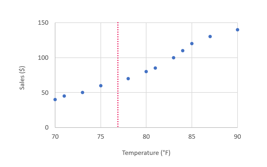
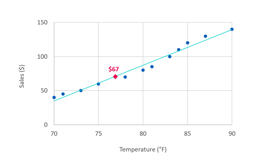
Say that we want to predict what the sales will be tomorrow if the temperature hits 77°F. The trendline shown in the chart represents what the machine learning model would predict for any given temperature. At 77°F, the model predicts $67 in sales.
Predicted value along the trendline of $67 at 77°F
Extrapolation
Extrapolation means that you are making a prediction beyond the known values or outside of the domain of the training data. We have no sales data for a day with maximum temperature below 70°F or above 90°F. Predicting sales for days below 70°F or above 90°F would be considered extrapolation.
If we want to predict how moving to a hotter or cooler location or season would affect sales, we need to extrapolate to 65°F and 95°F. The trendline can again be used to predict the values, extending it beyond the domain.
Predicted values along the trendline of $7 at 65°F and $157 at 95°F
The challenge with extrapolation
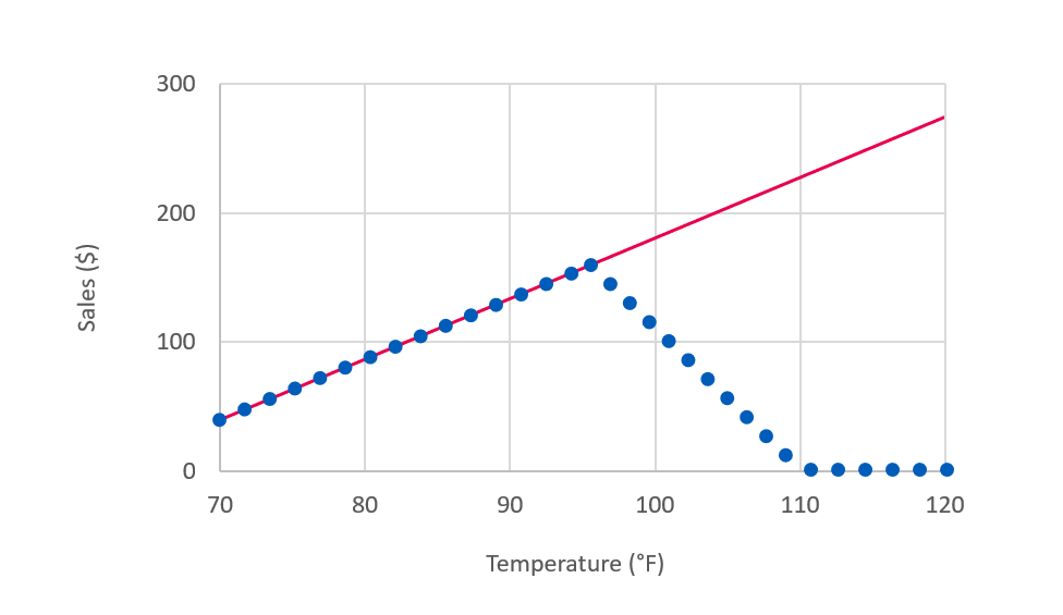
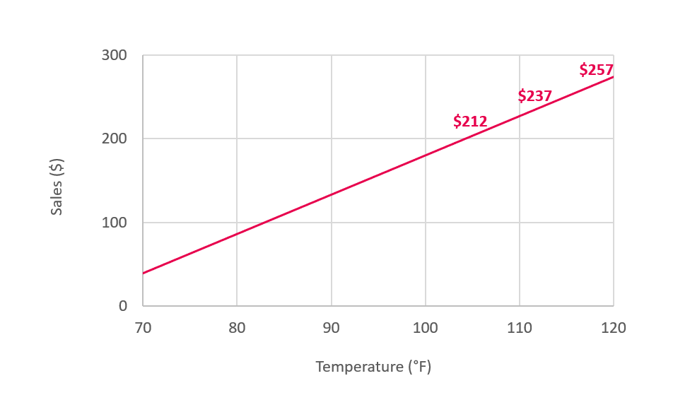
The question we need to ask is if the trendline really continues outside of the bounds of our data. Our model predicts higher sales in warmer weather, so should we start selling lemonade in Arizona where it hits 100°F? Would the sales continue increasing as in the following chart?
Predicted values for temperatures above 90°F
Say that we build a lemonade stand in Arizona and record sales data. Instead of increased sales, it turns out that the customers stay at home when it gets too hot and sales fall sharply! The challenge with extrapolation is that the pattern doesn't always stay the same. In our lemonade example, extrapolation led to a bad business outcome.
The predicted outcome follows the red line, but the actual outcome in blue has a different pattern
