Dimensions determine how the data in a visualization is grouped. For example: total sales per country or number of products per supplier. You typically find a dimension as the slices in a pie chart or on the x-axis of a bar chart with vertical bars.
Dimensions are created from fields in the data model tables.
Example:
Product Type is a field in the Product table that is loaded into the app. The values of this field are the different types that products are grouped into.
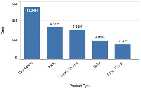
You can, for example, create a bar chart to visualize the cost of each type, by adding the Product Type dimension to the chart. To complete the visualization, you must add a measure (in this case Cost), which is grouped by the Product Type dimension.
Bar chart with the dimension Product Type and measure Cost.

You can also create different types of master dimensions:
Creating dimensions
When you load data into an app, all data is loaded as fields. At the same time, Qlik Sense identifies the fields from the data model that can be used as dimensions. These are shown to you as you populate visualizations with data or create master items.
The process of creating a dimension depends on whether you want to customize how data is grouped. Follow these guidelines:
-
To simply use a certain field to group data in your visualization, add the field as a dimension when you create the visualization. No additional configuration is needed.
-
Create a master dimension in the app if you want to:
-
Create a standalone entity in the app that is easily recognized as a useful way to group data.
-
Enhance and expand how the dimension fields group data. For example, you can create a drill-down or cyclic dimension for specific behavior, or set a specific color for the dimension.
-
Allow re-use of the dimension across the app, including by others.
After creating the master dimension, it can be added to any applicable charts as you configure them.
-
Learn more
- Fields
- Measures
- Reusing dimensions with master dimensions
- Creating a master dimension from the data model viewer
- Deleting a master dimension or master measure
- What is a dimension?
- Understanding dimensions and measures
