Adding tabular data
A chart can be added in tabular Excel form, either as an entire table or as one or more individual columns. Whether you add a chart as a single table tag or as single column tags, the underlying object you create is a table.
Charts with straight type hypercubes can be exported as tabular data.
When you add a chart as a table, the underlying fields representing the chart's data are added as columns to the report.
Click the icon on the top toolbar of the add-in. The Tables section appears.
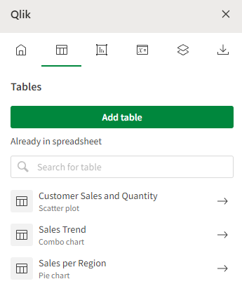
Tables tab in Excel add-in, allowing you to add a new table or re-visit a table that you have already added

When selecting a chart, refresh the list of available tables from the Qlik Sense app by clicking .
Adding an entire chart
You can add an entire chart in tabular form with a single tag. The chart data is inserted in the report as a straight table.
Do the following:
-
With the Tables section of the add-in opened, click Add table.
This shows the list of objects that can be added as a table.
-
Click the
icon next to the chart you want to add.
You can preview the chart directly in the add-in before adding it by clicking the chart's name.
-
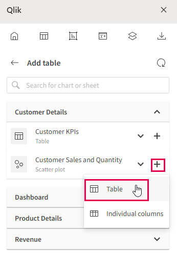
In the drop down menu, select Table. This inserts the Qlik Sense entity as a single table tag into the selected cell.
Adding a Qlik Sense chart as an entire table

-
The settings page for the table appears. It is recommended to provide a unique Name to the table so you can identify it in the add-in if you later need to change its settings.
-
Adjust any other parameters as needed.
Revisit any table you have added at any point for modifications to its configuration, to locate it in the workbook, or to add another instance of it to the workbook. Click the icon in the add-in to open the Tables landing page, and click
to navigate to the cell where it is inserted. Adjust any settings as needed in the add-in.
Adding a chart by column
A chart can also be added in tabular form as a set of single columns. This allows increased control over formatting within the report template as well, with the native Excel text formatting options.
The chart data is inserted in the report as a straight table.
Do the following:
-
With the Tables section of the add-in opened, click Add table.
This shows the list of objects that can be added as a table.
-
Click the
icon next to the chart you want to add one or columns from.
You can preview the chart directly in the add-in before adding it by clicking the chart's name.
-
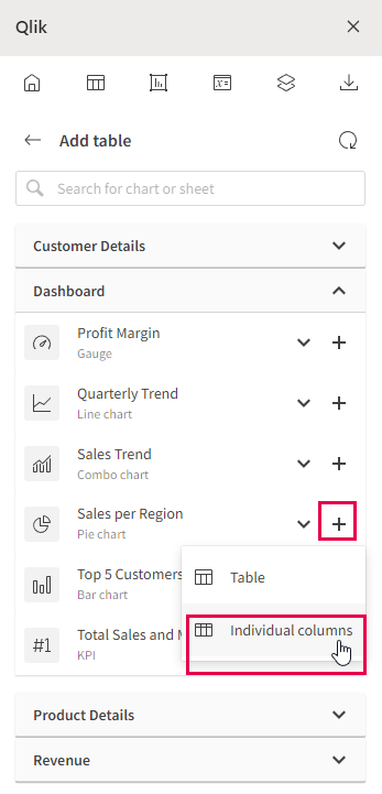
In the drop down menu, select Individual columns. The list of available columns appears.
Adding a Qlik Sense chart by columns

-
Select the columns you want to add, or click All to insert all columns from the chart.
-
Click Add. The columns are inserted into the template at the selected cell.
Two columns from a Qlik Sense app, added individually

-
The settings page for the table appears. It is recommended to provide a unique Name to the table so you can identify it in the add-in if you later need to change its settings.
-
Adjust any other parameters as needed.
Each column selected is added to the template as a single column tag. The set of columns is still considered a single object.
Header cells with the field names are automatically inserted above each column tag. This allows you to customize the headers separately. These headers can be removed if you prefer to use the header formatting options within the add-in. See Adding tabular data.
Revisit any table you have added at any point for modifications to its configuration, to locate it in the workbook, or to add another instance of it to the workbook. Click the icon in the add-in to open the Tables landing page, and click
to navigate to the cell where it is inserted. Adjust any settings as needed in the add-in.
Adding more columns from a chart
Into a chart added by column
After adding some columns of a table individually, you can add more at any time.
Do the following:
-
Select the column tag of the column directly to the left of where you need to add another column.
In the add-in, the chart table settings menu appears.
-
Under Columns, click the column you want to add to expand it.
-
Click Add column tag.
The tag of the selected column is added to the right of the selected cell.
Adjust any parameters as needed.
From a chart added as entire table
You can also add more columns to the template from a chart that was added as an entire table. When you do this with a column, the new column you add becomes a new, separate table object with a single column. You can then add more columns that object.
Do the following:
-
Select the cell containing the table tag.
In the add-in, the chart table settings menu appears.
-
Click Expand columns.
-
Select a cell outside of where the table tag's columns will end.
-
Click Add column tag.
