You can change the sorting order of dimensions and measures so that your data is presented in the way you intend.
Most visualizations have a Sorting section in the properties panel where you can put the cursor on the drag bars and drag the dimension or measure to rearrange the sorting order. In visualizations without a sorting section, you can still adjust the sorting to some extent.
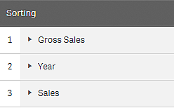
In the following screenshot, the primary sorting is on the measure Gross Sales.

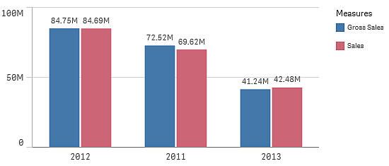
A bar chart with that sorting order will look as follows.

Since there are two measures, Gross Sales and Sales, the bars are by default grouped. Gross Sales is presented first, because it has sorting priority 1. If you were to drag Sales to the top of Sorting, the first bar would be Sales and the second bar Gross Sales.
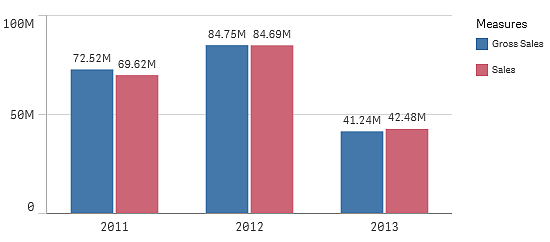
To sort by Year, instead, you need to drag Year to the top in Sorting. The bar chart is then updated and sorted by Year.

Sorting in the dimensions and measures sections
Although it is primarily under Sorting that you set the sorting order, you can also adjust the order in the properties panel section Data under Dimensions and Measures. In Dimensions you can change the priority order between the different dimensions by dragging them, and, likewise, in Measures, you can drag the measures to change the sorting order. Put the cursor on the drag bars and drag the dimension or measure to rearrange the order. Changes are reflected in the visualization.
Internal sorting
Apart from setting the sorting order between dimensions and measures, you can also set the internal sorting order, under Sorting.
Click the dimension or measure name to open the settings and click the sorting button to switch to Custom sorting. The following table shows the internal sorting priority order and sorting options. The sorting is either Ascending or Descending.
Sorting options:
- Sort by expression (Enter an expression to sort by. Only available for dimensions.)
- Sort numerically
- Sort alphabetically
Additionally, you can sort by load order by switching to Custom and leaving all sorting options unselected.
If you have set a custom order for a field that custom order will override any selected internal sort order in Sorting.
For more information, see Customizing the order of dimension values.
Default sorting
By default, the dimensions and measures are sorted in the order they were added, with the most recently added item last. Each dimension is sorted internally in the most common way for that type of data. Numbers are sorted numerically, ascending. Text is sorted alphabetically, ascending.
| Visualization | Description |
|---|---|
| Bar chart |
By default, a bar chart with one measure and one dimension is presented with vertical bars sorted descending on the measure. When a dimension has less than 10 values, the sorting is by dimension, alphabetically. |
| Box plot | By default, a box plot is sorted by the center line. You can also sort by first whisker, box start, box end or last whisker. |
| Combo chart | Sorted by the first item added, either the dimension or the measure. |
| Distribution plot | By default, a distribution plot is sorted by the outer dimension. |
| Filter pane |
By default, data in filter panes is presented ascending. |
| Gauge |
A gauge only uses a single measure value, the first one under Measures. |
| Histogram | The histogram does not have any sorting section. |
| KPI | By default, the first added measure becomes the main value. |
| Line chart |
By default, a line chart is sorted by the dimension. |
| Map | A map layer can only have one dimension. Sorting is used to determine the order points or areas are added to the map. |
| Pie chart |
A pie chart uses one measure and one dimension. By default, a pie chart is sorted by the measure in descending order. |
| Scatter plot |
The scatter plot does not have any sorting section, but the order of the measures decides where they are used. The first measure is used on the x-axis, the second measure is used on the y-axis, and the third (optional) measure is used for the bubble size (it is used to set the color on large data sets) in the scatter plot. You can only have one dimension in a scatter plot. |
| Straight table |
By default, the column presents the dimensions and measures in the order they were added. Sorting order of rows: By default, the straight table is sorted in ascending order by the first dimension or measure under Sorting. You can temporarily change the sorting by clicking the column header and selecting Sort ascending or Sort descending. |
| Table |
By default, the column presents the dimensions and measures in the order they were added. Sorting order of rows: By default, the table is sorted in ascending order by the first dimension or measure under Sorting. You can temporarily change the sorting by clicking the header of the row you want to sort on. One click - ascending order, two clicks - descending order. |
| Text & image |
The text & image visualization does not have any sorting section, but you can drag the measure tokens in the visualization to change the order. |
| Treemap |
The treemap does not have any sorting section. The sorting is automatically by measure size. |
| Write table |
By default, the column presents the dimensions and measures in the order they were added. Sorting order of rows: By default, the write table is sorted in ascending order by the first dimension or measure under Sorting. You can temporarily change the sorting by clicking the column header and selecting Sort ascending or Sort descending. |
