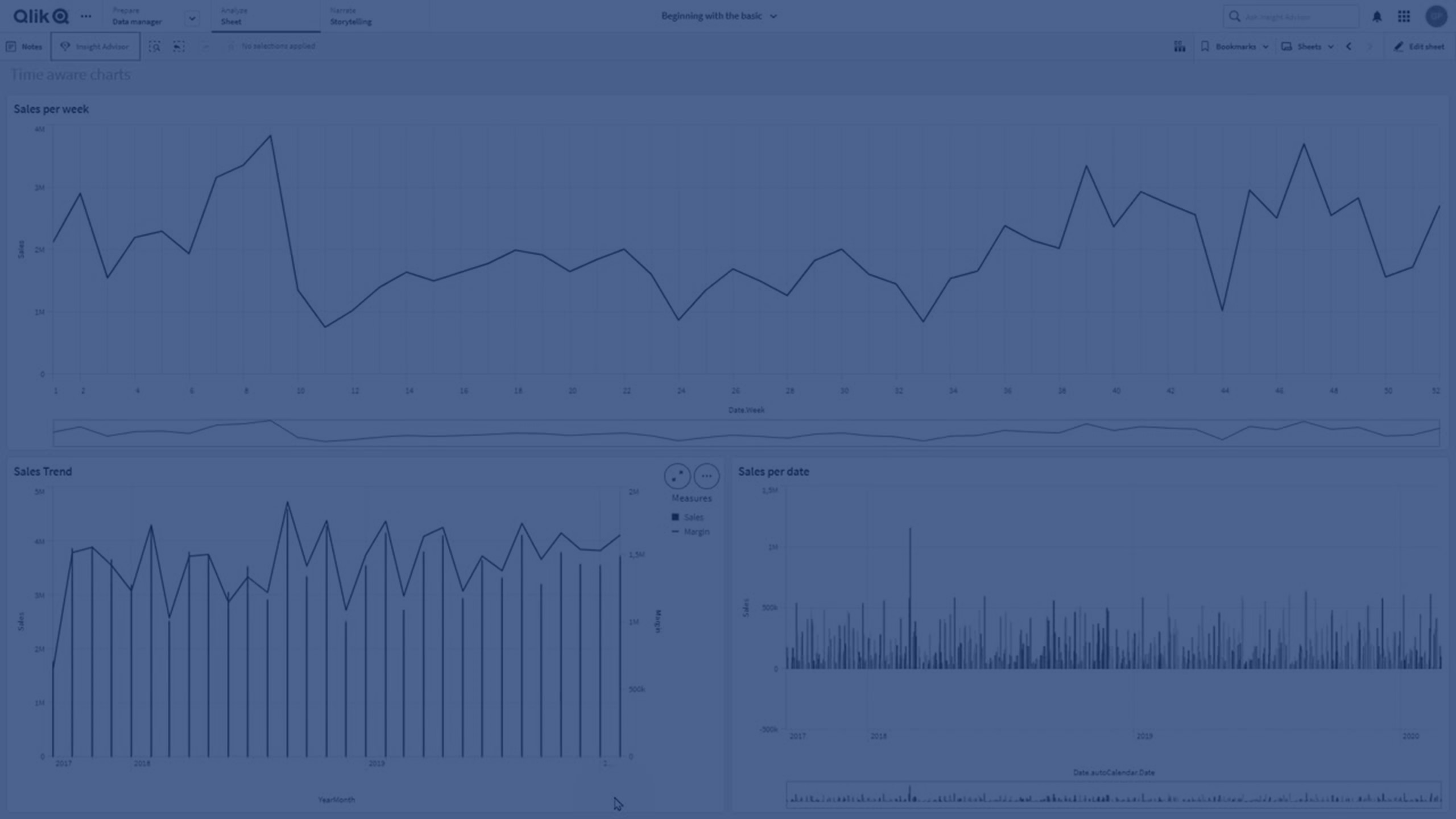
Time-aware charts are visualizations that use a continuous scale to provide a complete and accurate view of time-based data. That is, when you enable continuous scaling on the x-axis in a chart with date fields, data points are separated from each other by a distance relative to their associated time. As well, the axis labels are evenly separated whether or not there is data for that point and the chart view is compressed to avoid scrolling.

A continuous scale is most commonly used with date fields such as:
- Second
- Minute
- Hour
- Week
- Month
- YearMonth
- Quarter
- YearQuarter
- Year
- Date
- Timestamp
Adding a continuous scale
Do the following:
-
In sheet view, click
Edit sheet in the toolbar.
-
Click the chart that you want to edit.
-
In the properties panel, click the Appearance tab.
-
In the X-axis section, switch Continuous from Auto to Custom, and then check Use continuous scale. This explicitly sets the chart to use a continuous scale.
The chart is compressed and the data points and labels are readjusted.
-
For bar charts, you can set additional properties to adjust the width of the bars. See Configuring a continuous or discrete scale.
Making selections in a time-aware chart
When navigating a time-aware chart, you can zoom into a smaller time span to take snapshots of the data displayed and select data values. Selections made on a time axis using range selection select all data values (even those that are not visible). Selections made on the measure axis or using lasso selections only select visible values.
