Viewing and interpreting the results of a key driver analysis
After you run a key driver analysis, you can view the results to uncover metrics about the influencers driving data trends for your target. The results provide actionable insights that you can use to enhance decision-making processes across your organization.
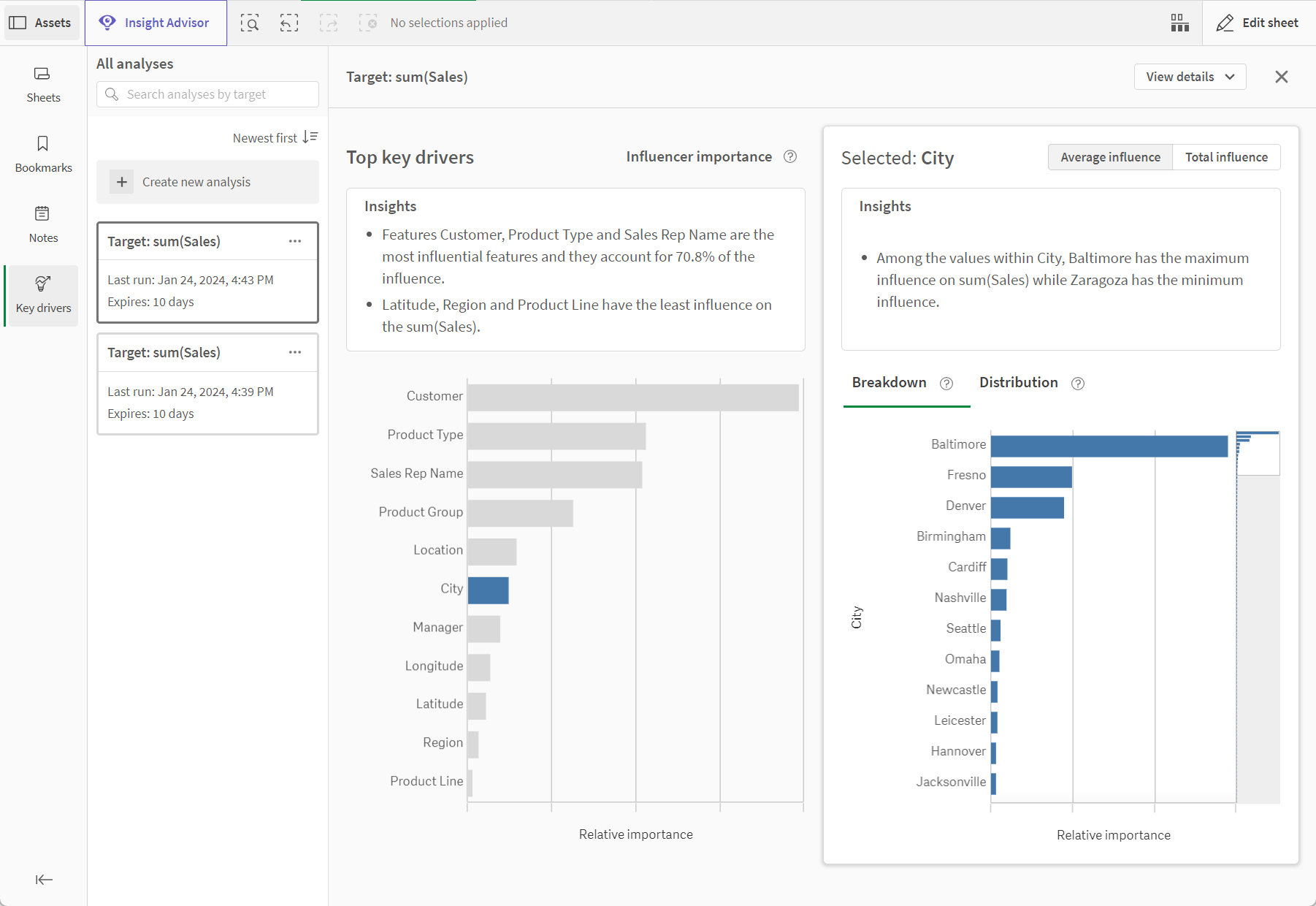
Results page for a key driver analysis within the app

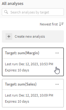
Open the Assets panel when viewing a sheet in analysis mode. Expand the Key drivers panel, and select an existing analysis from the panel to access the results.
Select an existing analysis to view results

The results of a key driver analysis expire and will be deleted 10 days after the analysis was last run.
Viewing analysis details
In the top right of the results page, click View details to view information about your analysis. The following information is provided:
-
When the analysis was created, last run, and when it expires
-
The target and features that were chosen for the configuration
-
Any selections that were applied in the app when the analysis was configured
Applying the selections behind the analysis to the app
The selections that were made at the time of the analysis configuration are saved in the key driver analysis. When viewing analysis details, click Apply selections to the app.
This allows you to revisit the app sheets and narrow down specific data that might be the source of anomalies.
Comparing the total influence of each feature
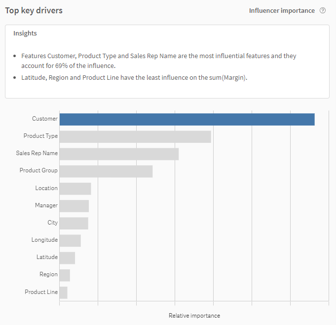
The Top key drivers section of the results page shows you the calculated total influence of each included feature compared to all other features in the analysis. This includes a bar chart and corresponding natural language insights. In the chart, the features are ranked from most to least influence on the target.
The influence values are shown as absolute values. Therefore, a feature could have a strong negative impact on Sales, but you might see that it is shown as having the highest influence on this target.
The most influential key driver is automatically selected in the chart, and determines the feature analyzed in the section to the right of the Top key drivers section. For more information about analyzing specific details about an individual feature, see Viewing detailed metrics for a single feature.
Top key drivers section on the results page for an analysis

Viewing detailed metrics for a single feature
More detailed information about the relative influence of a particular feature, compared to the other included features, is provided in the feature-specific section on the right-hand side of the page. The selected feature in the Top key drivers chart determines the feature you are analyzing in more depth. By default, the most influential key driver is selected.
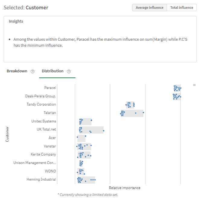
Analyzing the details behind a single feature with the Distribution chart

Make a different selection in the Top key drivers chart to view more details about how the unique values within that feature are influencing the target.
The following sections outline each available option.
Breakdown chart
The Breakdown chart ranks the influence that each unique feature value has on the target outcome. You can toggle between average and total influence.
The influence values are shown as absolute values. Therefore, a feature value could have a strong negative impact on Sales, but you might see that it is shown as having the highest influence on this target.
Distribution chart
The Distribution chart also breaks the feature down by unique value. Each instance of the feature value within a record in the dataset is visualized as a bubble. The bubbles are distributed and ranked according to influence on the target. You can toggle between average and total influence.
The influence values are shown as absolute values. Therefore, a feature value could have a strong negative impact on Sales, but you might see that it is shown as having the highest influence on this target.
You can use the Distribution chart to visualize where ranges of influence values typically cluster together. This allows you to spot outlier values and anomalies, and investigate why those values differ from overall trends.
Click a bubble in the chart to learn more about the data record which it is part of. This includes the values of the other included features that are associated to that feature in the dataset.
Viewing natural language about the results
Natural language insights are available for the total influence metrics, as well as the single-feature influence metrics. The insights can provide simple summaries of the results, such as which features are most influential and which features exert little or no influence over the target.
The insights can also help you identify when the analysis results might be skewed due to incorrect configuration or improper data preparation. Most importantly, if possible target leakage is detected, you can read about it in the insights.
Identifying invalid results
If the data in the results seems skewed, it is likely a good indicator that the analysis was not configured correctly, or that there are issues in the source data used to generate the analysis.
Target leakage in a key driver analysis
If you notice that one feature is exerting the vast majority of the influence over the target, it is possible that the analysis configuration is affected by target leakage. If this is the case, the analysis results are not reliable.
Target leakage is a phenomenon in which there is a dependency between the target and a feature that results in the feature being assigned an unrealistic and often incorrect amount of influence over the target. Here are some examples of how this could happen:
-
A feature and the target are directly derived from one another. For example, if your target is Margin and you include Sales as a feature, you would likely encounter results skewed by target leakage. This is because Margin is often a calculation obtained by subtracting Cost from Sales. The influence that Sales has on Margin is therefore going to dominate the analysis and will not be helpful in evaluating other influencers.
-
Incorrect data collection and preparation. For example, let's say your target is a binary Churned field, and you include a feature called DaysSinceLastService (a calculated field indicating how many days a customer has gone without a service ticket being created). If the calculation in that field does not automatically stop counting after a customer has canceled their service, this would lead DaysSinceLastService to be assigned an disproportionately large amount of influence over Churned.
Metrics affected by target leakage are considered invalid. It is recommended that you re-configure the target and features to exclude entities you suspect could indicate target leakage.
How to interpret and take action on the results
The results of a key driver analysis can indicate when a specific dimension or measure tracked in the app is driving changes and behavior in the data for the target.
The information you obtain from the results page can be translated into direct action to improve your organization's performance and efficiency.
Real-world example
For example, from the Top key drivers section, you might see that a Product field is driving data in a Customer Satisfaction target. This could be either positively or negatively impacting the target. To learn more about what in particular about what Product values are influencing Customer Satisfaction the most, you could switch to the feature-specific section of the results and assess the Product feature values as influencers.
With this, you might observe that a particular product, which is performing particularly well, is contributing heavily to the improved Customer Satisfaction scores.
From these insights, you might take action by increasing your investments into the product through marketing and development efforts.
