Examples from real life
Visualizations in Qlik Sense can give you insight in your data. Using expressions in your charts can bring results that specifically apply to your work. The range of functions in Qlik Sense allow you to customize your expressions to fit your needs, even if the option is not readily available.
Calculating the gross margin percentage
We define the margin as the difference between our sales and the cost of making these sales. We will calculate the margin for each month, as well as what percentage of the monthly sales is our margin.
To calculate the margin percentage we can use the following expression:
(Sum(Sales)-Sum(Cost))/Sum(Sales)
The expression can be simplified further
1-Sum(Cost)/Sum(Sales)
Inside the app, on the Examples from real life sheet, you will find a table titled Margin.
Do the following:
- Select the available table titled Margin.
The properties panel opens. - Click Add column and select Measure.
- Click on the
symbol.
The expression editor opens. - Enter the following: Sum(Sales)
- Add three more measures with the expressions: Sum(Cost), Sum(Sales) - Sum(Cost), and 1 - Sum(Cost)/Sum(Sales).
- Click Apply.
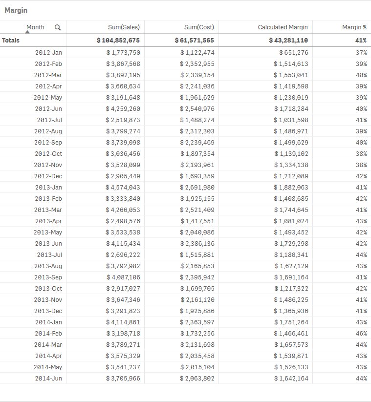
You can see the calculated margin for each month based on the sales and the cost. You can also see what percentage of the sales makes up our margin.
In the app data, we already have data for the monthly margin. This is a good opportunity to make a comparison between our original data and our calculation.
Do the following:
- Click Add column and select Measure.
- Click on the
symbol.
The expression editor opens. - Enter the following : Sum(Margin)
- Add another measure with the expression: (Sum(Sales) - Sum(Cost)) - Sum(Margin)
- Click Apply.
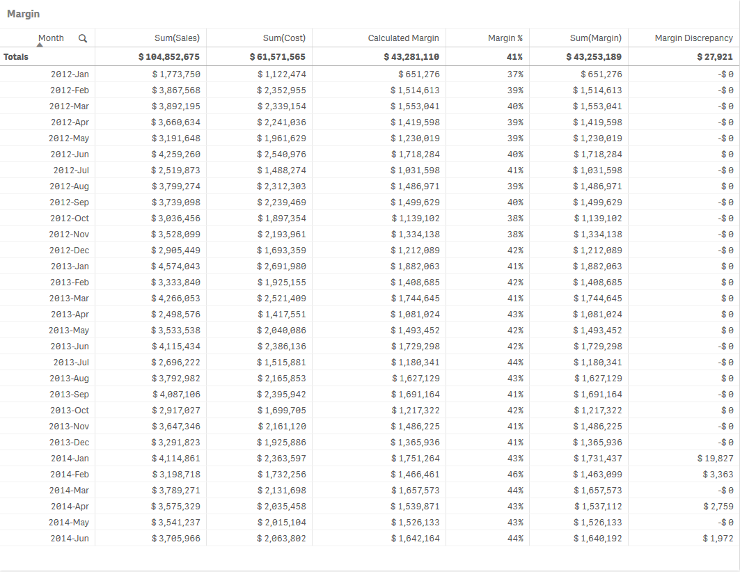
Some values in the calculated margin column differ from the values from the margin column coming directly from our data. The margin discrepancy column clearly shows that this takes place in a months during 2014. The difference between the calculated margin and the margin coming from the data set is small, but the fact that it takes place in a specific year creates some questions. What changed during that year? Looking into the data and asking the right questions might prove to be important for your business.
Invoicing delays
For this example we will be using data based on a company that collects dates both for the creation of invoices and the promised delivery of the goods they produce. The two dates are not always the same. Additionally some invoices might have two promised delivery dates. The shortest date is always the same as the invoice date, as it is automatically created by the invoicing system used by the company. The largest promised delivery date is the date when a delivery was agreed to be made between the company and the client.
Let us start by adding these dates on a table.
On the Examples from real life sheet you will find a table titled Invoicing delays.
Do the following:
- Select the available table titled Invoicing delays.
The properties panel opens. - Click Add column and select Measure.
- Click on the
symbol.
The expression editor opens. - Enter the following : Only([Invoice Date])
- Add another measure with the expression: Max([Promised Delivery Date])
- Click Apply.
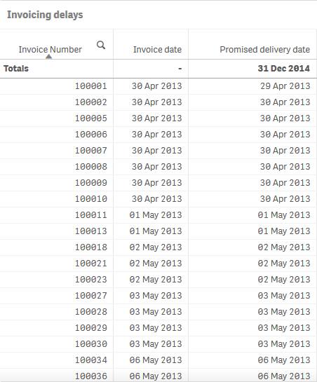
You can see that the invoice date and the promised delivery date are not always the same. When there are two promised delivery dates we need to use the largest one for our calculation.
Let us calculate the difference between the invoice date and the promised delivery date. We will use the following expression:
Max([Promised Delivery Date])-[Invoice Date]
There are three scenarios:
- The two dates are the same, and the result of the expression is 0.
- The products were promised after the invoice was created, and the result is a positive integer.
- The invoice was created after the products were promised to be delivered, and the result is a negative integer.
Do the following:
- Click Add column and select Measure.
- Click on the
symbol.
The expression editor opens. - Enter the following : Max([Promised Delivery Date])-[Invoice Date]
- Click Apply.
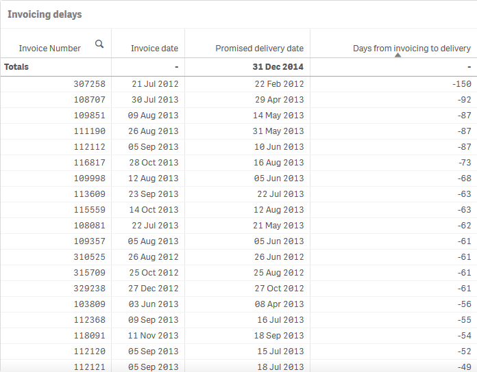
There is a range of differences between the dates. Negative values indicate that the invoice was delayed. Positive numbers indicate that the promised delivery was done after the invoice was created.
Let us calculate the number of invoices that were made after the promised delivery date.
Do the following:
- Click Add column and select Measure.
- Click on the
symbol.
The expression editor opens. - Enter the following: Count(Distinct If(Aggr(Max([Promised Delivery Date])<[Invoice Date],[Invoice Number]),[Invoice Number]))
- Click Apply.
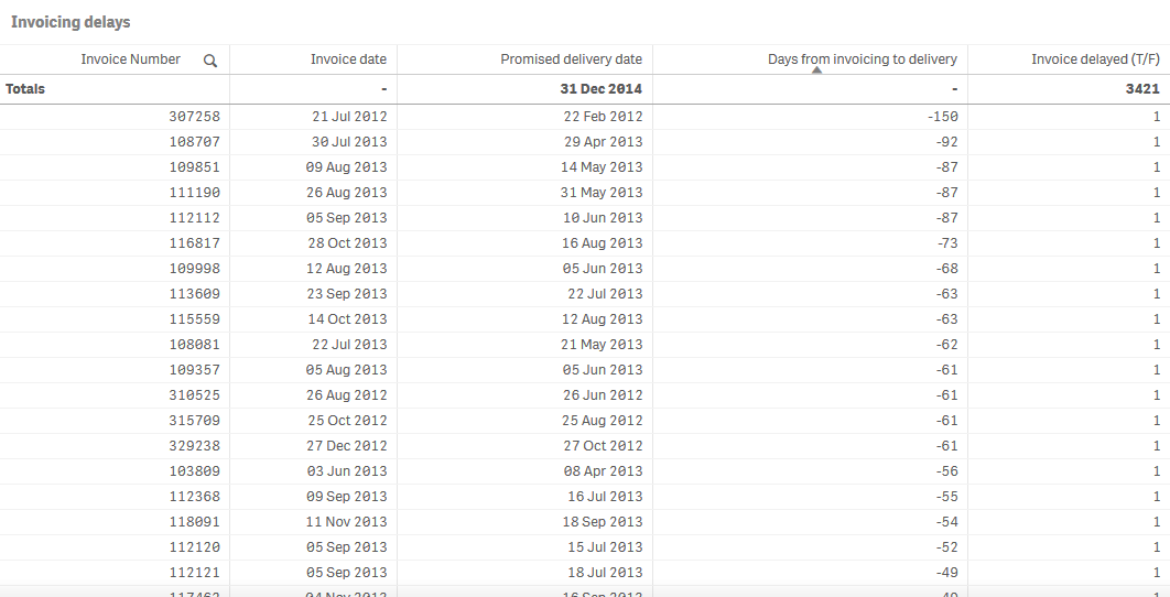
The last column makes more sense as a KPI as a percentage of the total number of invoices.
Do the following:
- Create a KPI.
- Click Add measure. Click on the
symbol.
The expression editor opens. - Enter the following: Count(Distinct If(Aggr(Max([Promised Delivery Date])<[Invoice Date],[Invoice Number]),[Invoice Number]))/Count([Invoice Number])
- Click Apply.

Let us calculate the average delay in invoicing.
Do the following:
- Create a new KPI.
- Click Add measure. Click on the
symbol.
The expression editor opens. - Enter the following: Avg(Aggr(If(Max([Promised Delivery Date])<[Invoice Date],(Max([Promised Delivery Date])-[Invoice Date])), [Invoice Number]))
- Click Apply.

Thank you!
Now you have finished this tutorial, and hopefully you have gained some basic knowledge about chart expressions in Qlik Sense. Please visit our website for more inspiration for your apps.
