This example shows how to make a mekko chart to compare the sales between different years as well as the impact specific product groups have on a year's sales, and how that compares to other years.

Dataset
In this example, we will use two data files available in the Qlik Sense Tutorial - Building an App. Download and expand the tutorial, and the files are available in the Tutorials source folder:
- Sales.xls
- Item master.xls
To download the files, go to Tutorial - Building an App.
Add the two data files to an empty app and make sure that they are associated by Item Number.
The dataset that is loaded contains sales data. The Item master table holds the information about the items ordered, such as product groups.
Measure
We use the sales volume as the measure by creating a measure in Master items with the name Sales, and the expression Sum(Sales).
Visualization
We add a mekko chart to the sheet and set the following data properties.
- Dimension: Date.autoCalendar.Quarter (year).
- Dimension: Product Group (product group)
- Measure: Sales; the measure that was created as a master item.
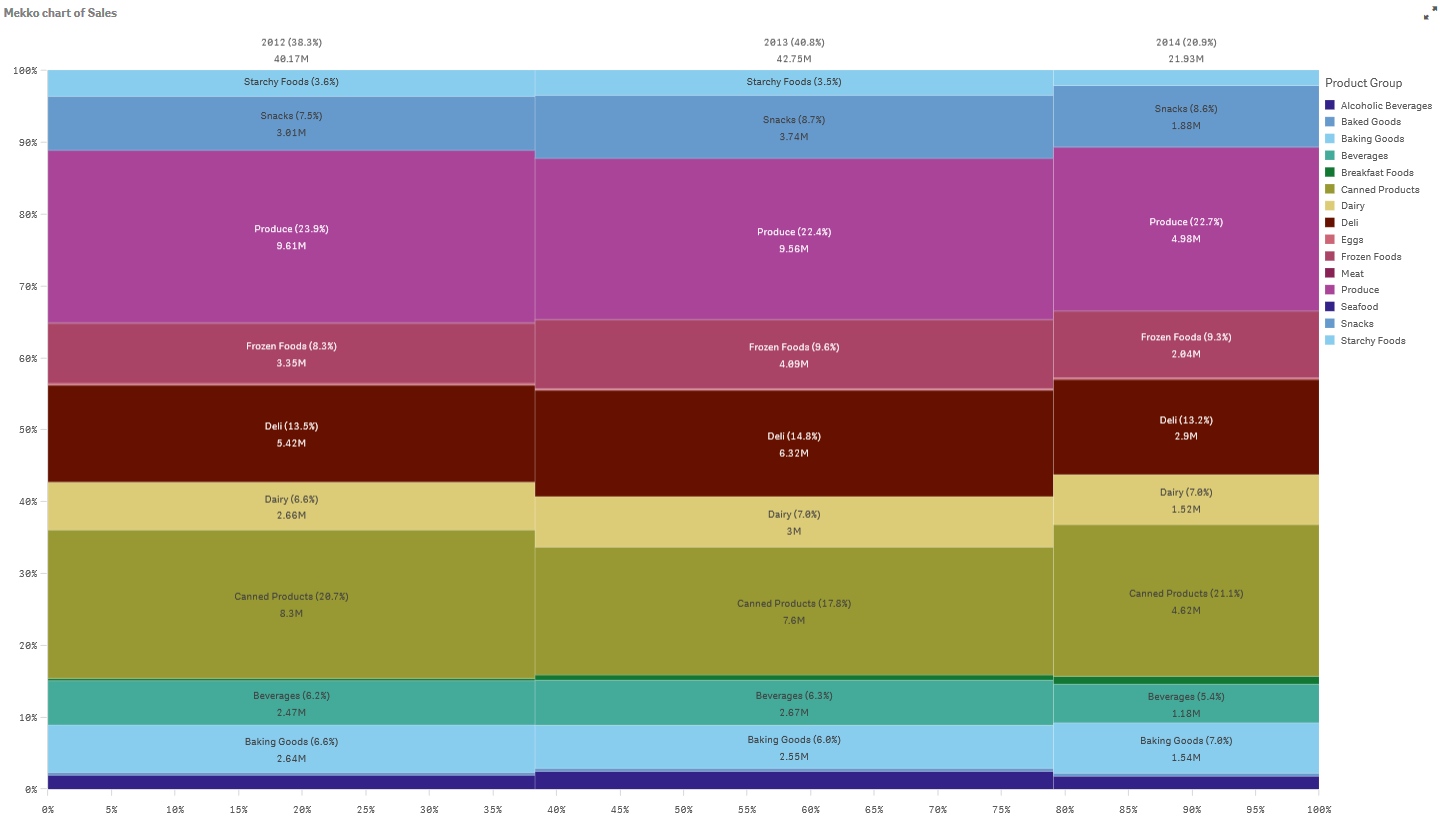
The following mekko chart is created:

The size of each column represents the volume of sales for each year. The size of the different sections inside each column represent the volume of sales for each specific product group during that year.
Notice how the sum of all three yearly percentages adds up to 100%. The same applies to the percentages of the product groups section of each year. This is because the percentages are normalized, so the size of each section is relevant to the total.
We want to have a better overview of how each product group's sales change from one year to the next. This is not obvious for product groups such as Baking Goods, Dairy, or Beverages which do not sit side by side from one column to the next. We want to display a different sorting, one based on the product groups.
This can be changed under Sorting in the properties panel.
Set the sorting order to the following:
- Date.Year
- Product Group
- Sum(Sales)
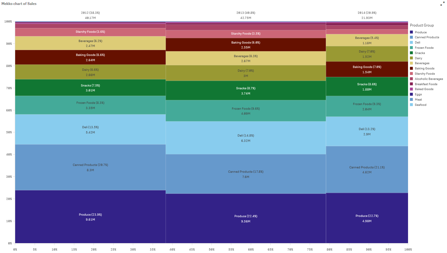
The chart becomes as follows:

Discovery
The mekko chart visualizes the normalized percentage of sales per year for different product groups, as well as the normalized percentage of sales of each year. The visualization is sorted in order of product group, per year. You can hover the mouse pointer over a product group and view the details.
In the mekko chart we can see that Produce has the highest sales volume throughout the three years.
