Navigating sheets in edit mode
Create and develop sheets in edit mode.
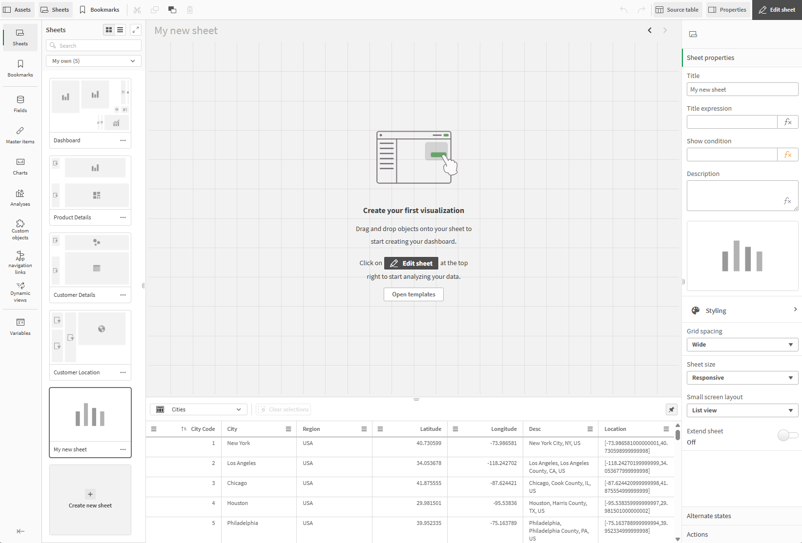
Edit mode has the following areas of interaction:
-
Assets: View and select available data sources for your visualizations. View and create sheets and bookmarks.
-
Properties: Create visualizations, add filters, and style their presentation.
-
Source table: Preview data in the source table viewer.
-
Grid editor: Add new visualizations, adjust sheet layout, and open a list of prebuilt sheet templates.
New sheet in edit mode

Interact with and explore sheets in analysis mode. For more information, see To learn more about selections and exploring data in visualizations, see Exploring with selections and Exploring data with visualizations.
Assets
In sheet edit mode, Assets contains both the fields and master items from the data in your app, as well as sheets, bookmarks, and notes available in your app. Build your visualizations from these assets. Switch between the tabs to view the assets that are available to you. Change the sheet you are editing or apply bookmarks while you work on the sheet.
Search for assets by name in the search box. Each field displays its classification, such as string, spatial, numeric, or dates. Expand each field to view its values. Make selections from these values to update your visualizations accordingly.
Assets, with the City field expanded and individual values selected

Depending on your permissions in the space that the app is in, you can reload app data and add new data from Assets. Reload app data from Assets by clicking . Add additional data sources to the app by clicking
and selecting Data catalog or Files and other sources.
If you want to add data from existing datasets, select Data catalog. If you want to select data from new data files or data connections, select Files and other sources. After adding data, Data manager opens, where you can load your new data into the app. For more information on loading data, see:
Properties panel
The properties panel contains settings for creating new charts and editing sheets. Click on a visualization to view the visualization properties. Click on the sheet to view sheet properties.
Visualization properties panel
The properties panel has the following sections for visualizations:
-
Data: Select the data to use in a visualization and add filters.
-
Sorting: Set how data is sorted in the visualization.
-
Add-ons: Add optional features such as data handling and reference lines.
-
Appearance: Customize the appearance of the visualization, such as colors, labels, and tooltips.
The properties panel for visualizations

Data
Select the data to use as dimensions and measures in your visualization. Click Add under Dimension or Measure to add fields as dimensions or measures. You can also drag and drop assets from the assets panel onto the visualization in the sheet.
You can add alternative dimensions and measures to your charts by clicking Add alternative. You can quickly switch between alternatives in charts.
You can add filters to quickly select the set of data to use. Click Add under Filters to add a field to filter with. Then select one of the following filter types:
-
Values: Select values from the field or master item to include or exclude from the visualization.
-
Search: Select string values to search for to determine what to include or exclude from your visualization.
-
Condition: Select ranges of values to include or exclude that match the conditions set in the filter. You can filter based on ranges of values from a field or filter based on comparisons with values from other fields.
-
Clear selection: Select a field for the visualization to ignore selections made in other visualizations. Selections made in this visualization are applied globally to other visualizations as expected.
For more information, see Applying filters to visualizations.
Sorting
Drag the dimensions and measures to set the sorting priority order. The numbers show the order.
Dimensions and measures can also be sorted internally:
Click the dimension or measure name to open the settings and click the sorting button to switch to Custom sorting. The following list shows the internal sorting priority order and sorting options. The sorting is either Ascending or Descending.
-
Sort by expression: Enter an expression to sort by. Only available for dimensions.
-
Sort numerically
-
Sort alphabetically
Additionally, you can sort by load order by switching to Custom and leaving all sorting options unselected.
If you have set a custom order for a field, that custom order will override any selected internal sort order in Sorting. For more information, see Customizing the order of dimension values.
Add-ons
Add-ons contains options for data handling and reference lines.
Data handling has the following otpions:
-
Include zero values: When unselected, measures that have the value ‘0’ are not included in the presentation. If there is more than one measure value, all the measure values must have the value ‘0’ to be excluded from the presentation.
-
Calculation condition: Specify an expression in this text field to set a condition that needs to be fulfilled (true) for the object to be displayed. The value may be entered as a calculated formula. For example: count(distinct Team)<3. If the condition is not fulfilled, the message or expression entered in Displayed message is displayed.
A calculation condition is useful when a chart or table is very big and makes the visualization slow to respond. A calculation condition can then help so that for example an object does not show until the user has filtered the data to a more manageable level by applying selections.
Reference lines and Dimension reference lines have settings to adding and configuring reference lines to your dimension and measures in your visualizations. For more information, see Reference lines.
Appearance
Appearance has the following sections.
-
General
-
Alternate states
-
Presentation
-
Color and legend
-
Tooltip
Some charts may have chart-specific options under Appearance. Bar charts, for example, have options for configuring the appearance of the X- and Y-axes.
Sheet properties panel
The properties panel has the following sections for sheets:
-
Sheet properties: Styling options for sheets. In Sheet properties, you can set the sheet title, description, and thumbnail. You can also customize the sheet size and grid spacing. You can add conditions for the sheet to display in the app.
-
Alternate states: Add alternate states to the sheet for comparitive analysis.
-
Actions: Add actions that trigger when users navigate to a sheet.
Grid editor
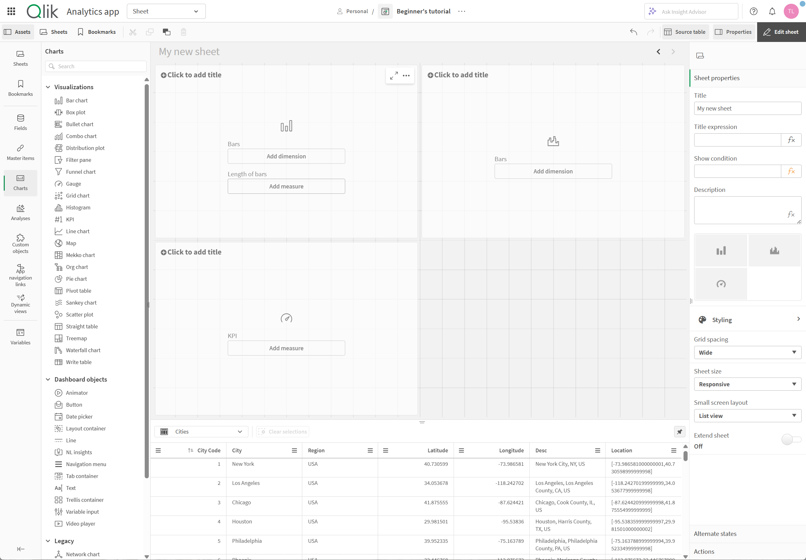
The grid editor displays your sheet, with the visualizations laid out using a grid. The grid helps quickly lay out visualizations in a sheet by dragging and dropping visualization or other assets from the assets panel.
A sheet in progress, with three new visualizations

If you have just created a new sheet, the Templates window might appear. In this window, you can optionally choose between prebuilt sheet arrangements for presenting your analytics. If you uncheck Show when creating a sheet, the window will not appear. With this setting turned off, you can still browse available templates at any time by clicking Open templates in a blank sheet. For more information about sheet templates, see Building sheets using templates.
You can rename a sheet by clicking the sheet title. You can rearrange visualizations by clicking and dragging the visualization into its new position.
As you add visualizations, you can make selections in them. This helps you conduct analyses while editing and see how your visualizations interact with one another as selections are made.
Source table
You can preview data in the source table viewer. This allows you to view fields and values from the selected table in your app data. You can select values from the table to apply selections. You can show or hide the source table viewer by clicking Source table. You can pin it open by clicking .
Source table viewer

The following types of visualizations are available:
