Example: Building a sheet
This example shows you how to quickly build a sheet. If you want to follow along to replicate the example, the base app and data used are available from the business logic tutorial. For the business logic tutorial, see Tutorial – Customizing how Insight Advisor interprets data.
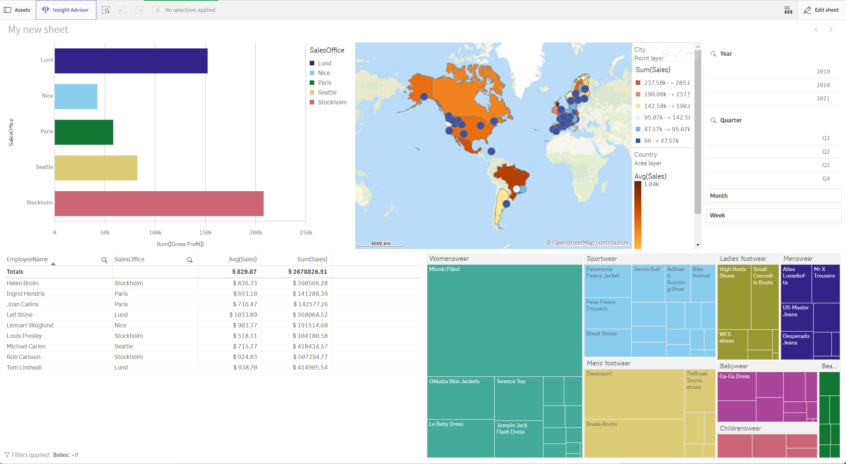
The sheet edit mode allows you to quickly develop useful visualizations. When you create a sheet, you should have an idea of the kinds of information you want to see. In this case, from the Tutorial - Business logic app we want to create a sheet that lets us exploration sales by different points of time. This sheet should let us see:
-
A geographic representation of sales by country and city.
-
Gross profits by sales office.
-
Employee sales figures.
-
The breakdown of specific products and categories.
-
A filter so users can filter data by year, quarter, month, and week.
Example sheet
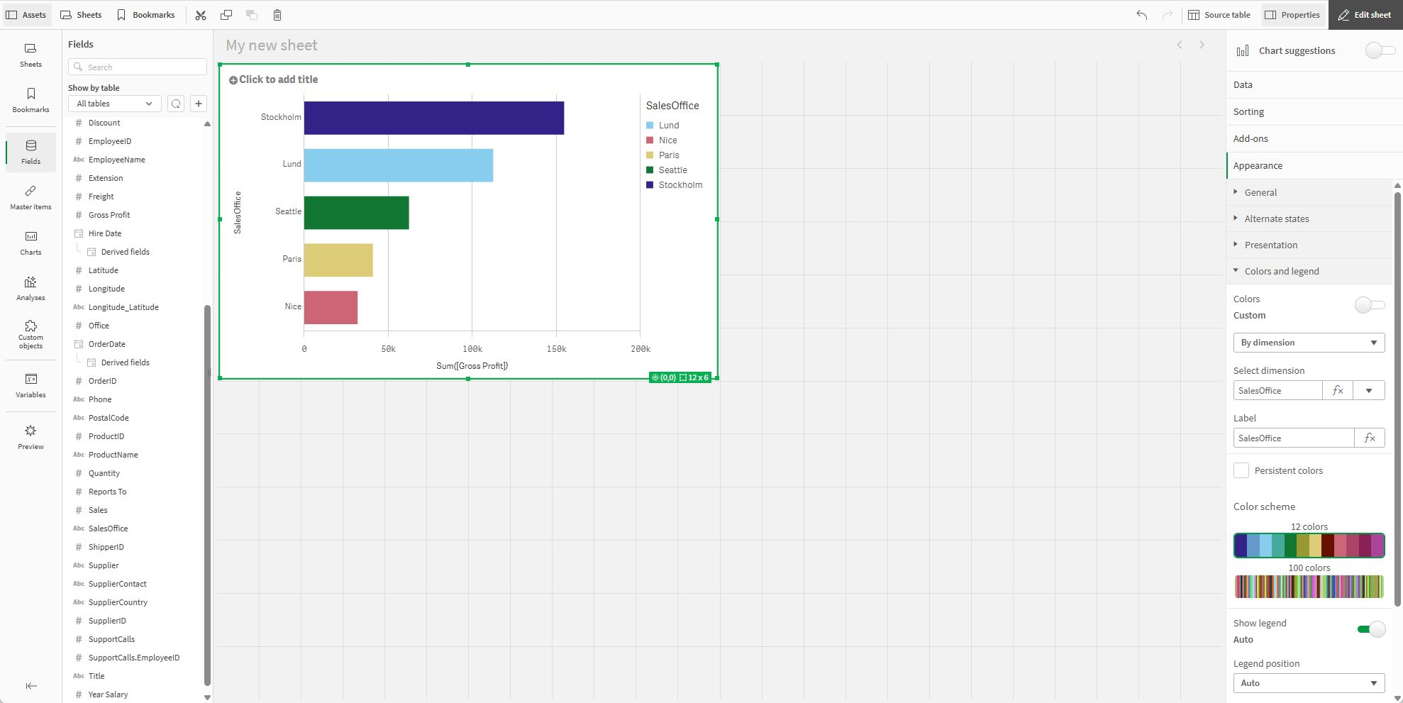
Creating the first visualization
For the first visualization, we will make a bar chart.
Do the following:
-
In the Tutorial - Business logic app, create a new sheet.
Information noteThe sheet templates picker might open when you create a new sheet. Sheet templates are not used for this example, so you can close the window or click Create without template.
To learn more about how you can use sheet templates, see Building sheets using templates.
-
In Assets, open Charts.
-
Under Visualizations, drag and drop a bar chart into the sheet.
-
From Assets, in Fields, drag and drop SalesOffice on the bar chart and select Add "SalesOffice".
-
From Assets, in Fields, drag and drop Gross Profit on the bar chart and select Add as measure > Sum([Gross Profit]).
-
In the properties panel, click Sorting.
-
Drag Sum([Gross Profit]) to the top of the sorting list.
-
Click Appearance > Presentation.
-
Select Horizontal.
-
In the properties panel, click Appearance > Colors and legend.
-
Under Colors, select to Custom.
-
Select By dimension.
First visualization
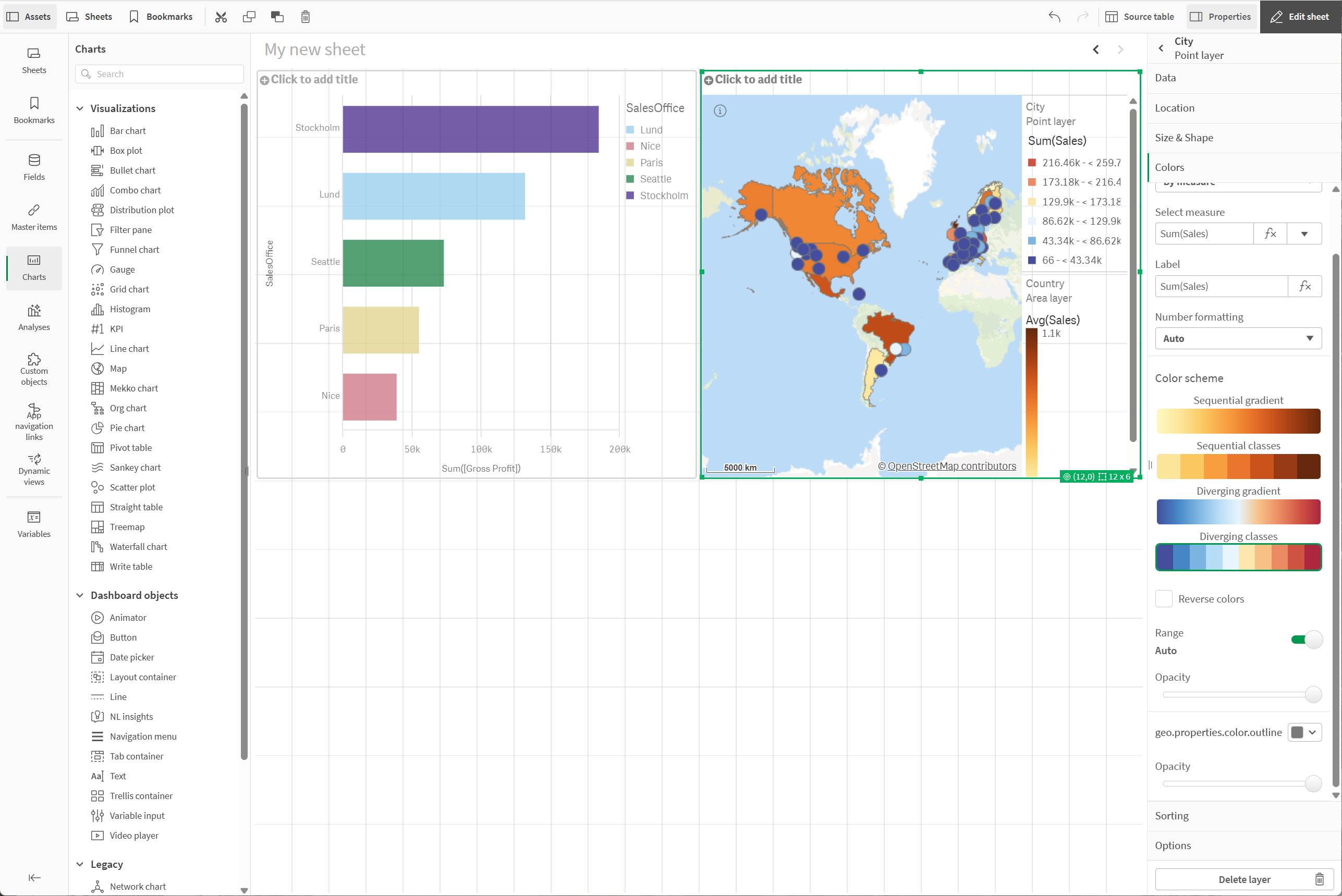
Adding a map
With the bar chart made, we can next make a map that visualizes both countries and cities.
Do the following:
-
In Assets, open Charts.
-
Under Visualizations, drag and drop a map into the sheet.
-
In the properties panel, click Layers > Add layer.
-
Select Area layer.
-
Under Dimensions, click Add and a select Country.
-
Under Colors, select Custom, select By measure, and color by Avg(Sales).
-
Click
to return to Layers.
-
Click Add layer and select Point layer.
-
Under Dimensions, click Add and select City.
-
Under Colors, select Custom, select By measure, and color by Sum(Sales).
-
Under Color scheme, select Diverging classes.
Sheet with map
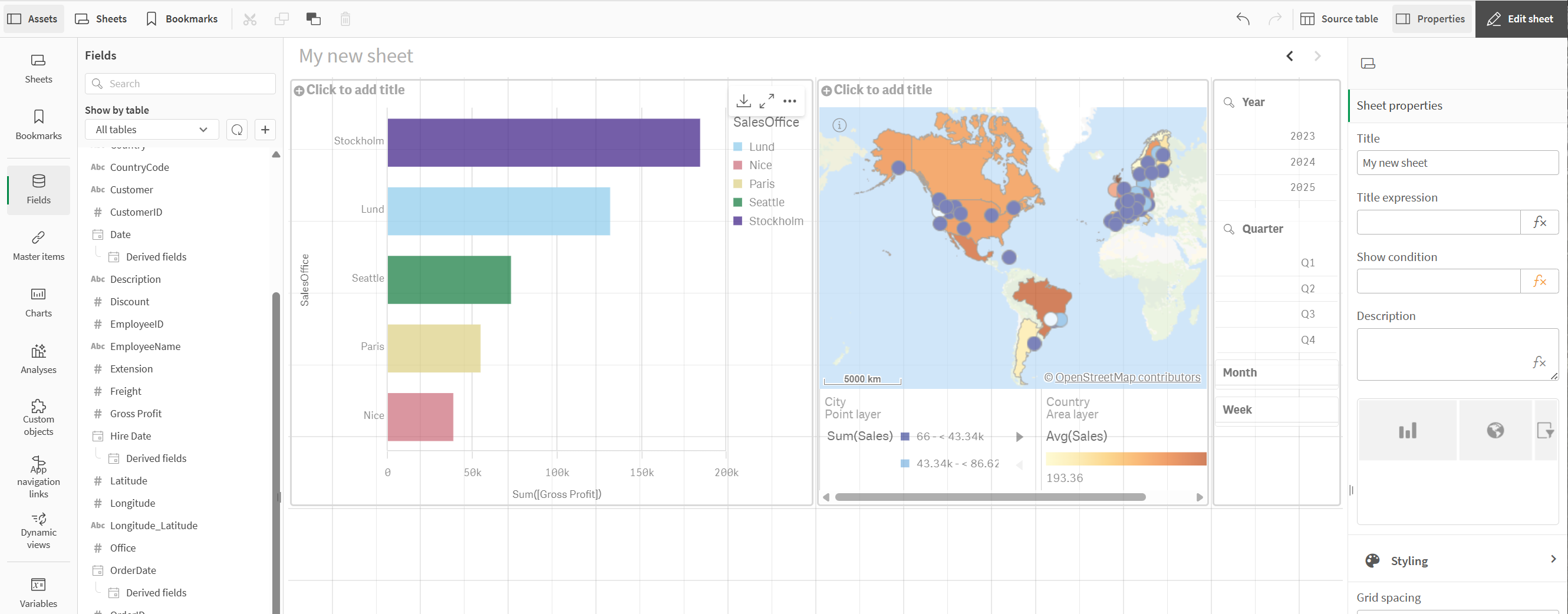
Adding a filter pane and rearranging the row
Next, we will add a filter pane so we can explore the data in our visualizations by specific periods of time. We will also rearrange our row of visualizations.
Do the following:
-
In Assets, open Charts.
-
Under Visualizations, drag and drop a filter pane to the right of the map.
-
Click Add dimension > click OrderDate > Year.
-
Click OrderDate.autoCalendar.Year and under Title, enter Year.
-
In the properties panel, click Add field > OrderDate > Quarter.
-
Click OrderDate.autoCalendar.Quarter and under Title, enter Quarter.
-
Click Add field > OrderDate > Month.
-
Click OrderDate.autoCalendar.Month and under Title, enter Month.
-
Click Add field > OrderDate > Week.
-
Click OrderDate.autoCalendar.Week and under Title, enter Week.
-
Click and drag the borders of the map and filter pane to resize them.
Adding a filter pane
Adding a new row with a table
We will add a new row of visualizations beneath the current row, starting with a table.
Filtered table
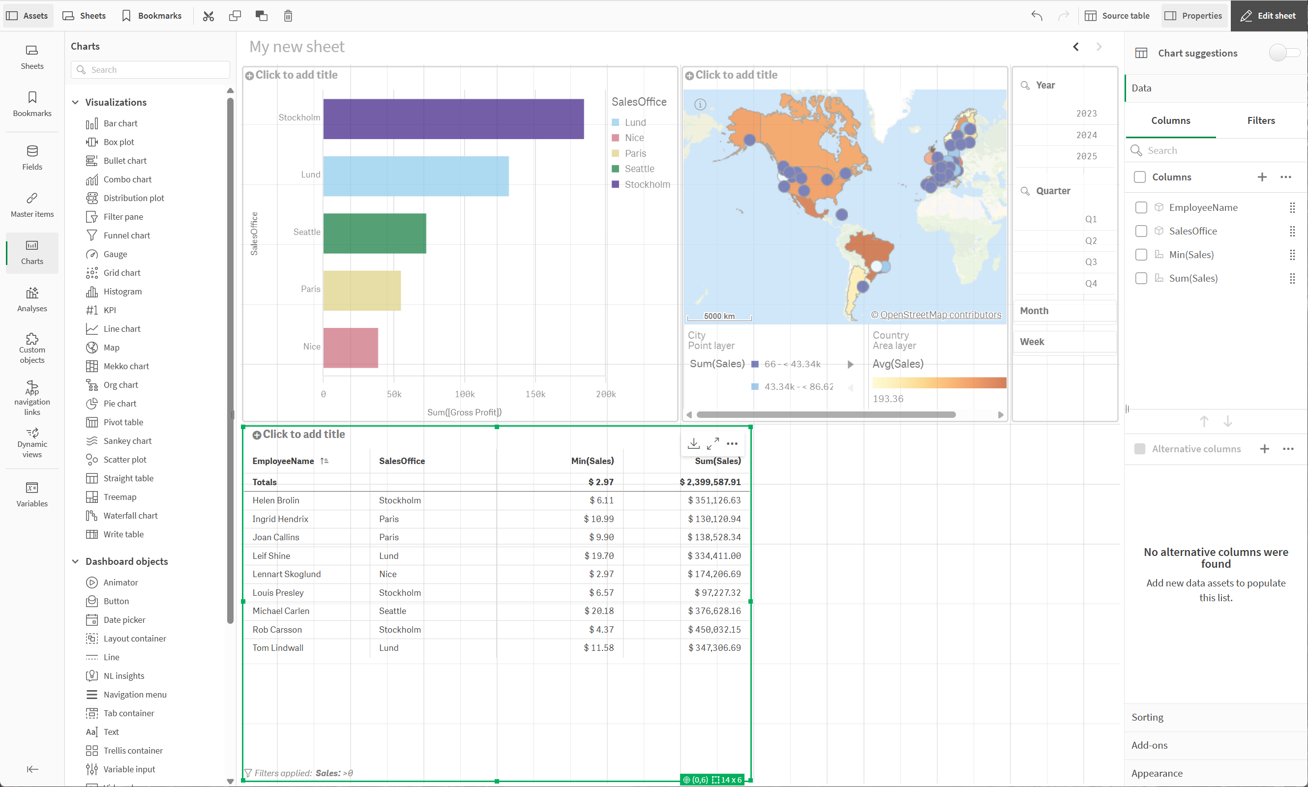
Do the following:
-
In Assets, open Charts.
-
Under Visualizations, drag and drop a Straight table into the sheet.
-
Click Add columns > Fields & master items.
-
Under Dimensions, select EmployeeName.
-
From Assets, drag and drop SalesOffice onto the table and select Add "SalesOffice".
-
From Assets, drag and drop Sales onto the table and select Add as measure > Avg(Sales).
-
Select Avg(Sales) and under Number formatting, select Money.
-
Under Format pattern, enter $ #,##0.00;-$ #,##0.00.
-
From Assets, drag and drop Sales onto the table and select Add as measure > Sum(Sales).
-
Select Sum Sales and under Number formatting, select Money.
-
Under Number formatting, select Money.
-
Under Format pattern, enter $ #,##0.00;-$ #,##0.00.
-
In the properties panel, in Data, under Filters, click
> Fields.
-
In the properties panel, in Data, under Filters, click
> Fields.
-
Select Sales and click Add.
-
Click the new filter to expand its properties.
-
Select Condition as the filter type.
-
Select Compare.
-
Under condition, select > and Fixed value.
-
Under Greater than, enter 0.
Adding a treemap
Now, we will add a treemap, so we can explore both our product categories but also the products within those categories.
New treemap
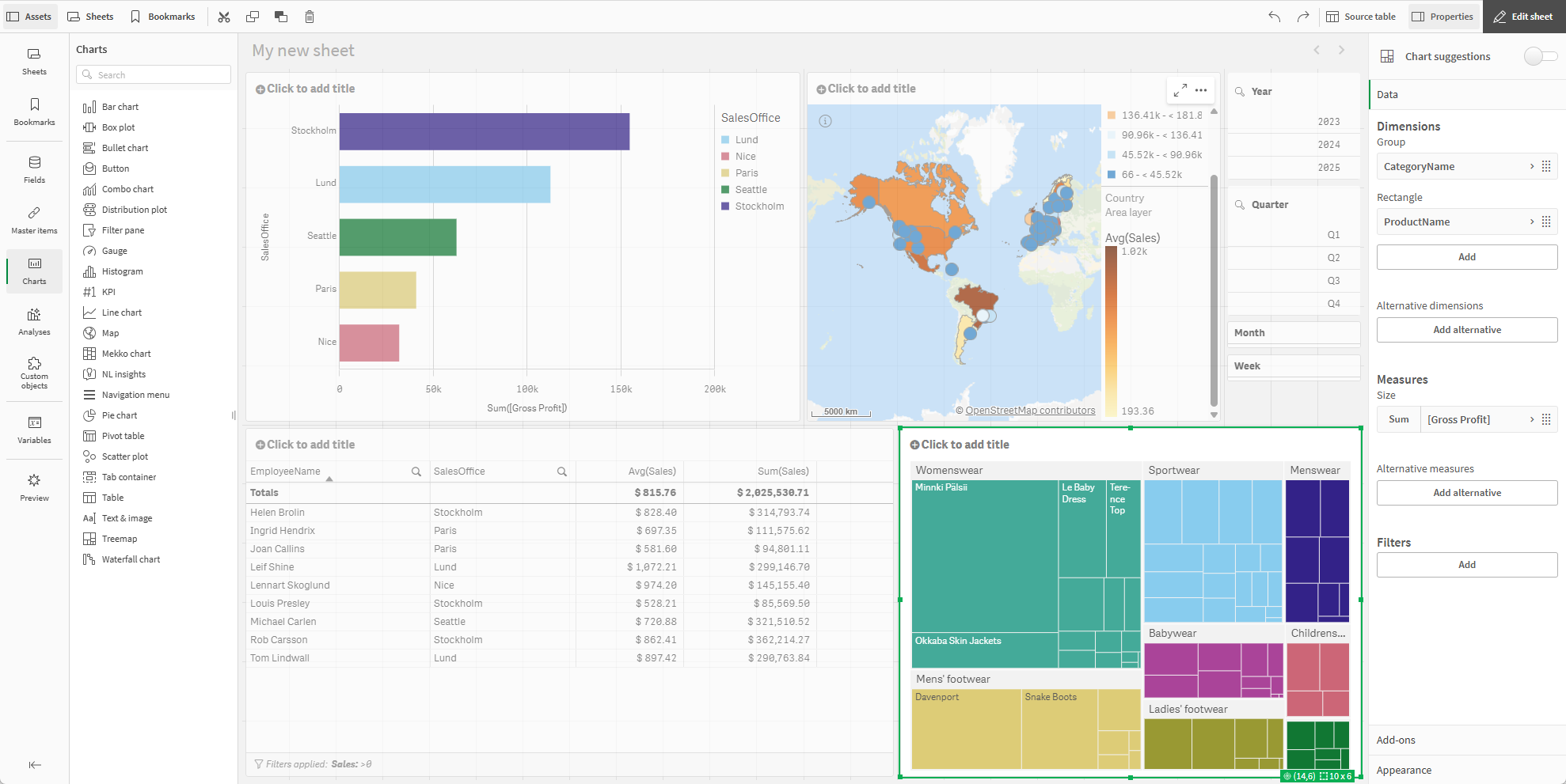
Do the following:
-
In Assets, open Charts.
-
Under Visualizations, drag and drop a treemap into the sheet.
-
In the properties panel, in Data, under Dimensions click Add > CategoryName.
-
Click Add > ProductName
-
Under Measures, click Add as measure > Sum([Gross Profit]).
-
Click and drag the on the borders of the table and treemap.
