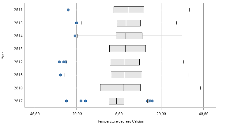
This example shows how to make a box plot to visualize range and distribution of numerical data using daily temperature measurements.

Dataset
In this example, we'll use the following weather data.
- Location: Sweden > Gällivare Airport
- Date range: all data from 2010 to 2017
- Measurement: Average of the 24 hourly temperature observations in degrees Celsius
The dataset that is loaded contains a daily average temperature measurement from a weather station in the north of Sweden during the time period of 2010 to 2017.
Measure
We use the average temperature measurement in the dataset as the measure, by creating a .measure in Master items with the name Temperature degrees Celsius, and the expression Avg([Average of the 24 hourly temperature observations in degrees Celsius]).
Visualization
We add a box plot to the sheet and set the following data properties:
- Dimension: Date (date) and Year (year). The order is important; Date needs to be the first dimension.
- Measure: Temperature degrees Celsius; the measure that was created as a master item.
In this example we use the default box plot preset, Standard (Tukey) with the whisker length 1.5 interquartile range.

Discovery
The box plot visualizes the distribution of the daily temperature measurements. The visualization is sorted in mean temperature order. The mean temperature for each year is illustrated by the middle line in each box. The box stretches from the first quartile to the third quartile, and the whiskers stretch 1.5 inter-quartile ranges. There are also a number of outlier values, the points that are placed outside the whiskers. You can hover the mouse pointer over an outlier point and view the details.
In the box plot we can see that the year 2010 has the longest box and whiskers. That shows that the year 2010 has the largest distribution of temperatures measured. It also seems to be the coldest year in average.
The range of 2017 is small, as the dataset only contains measurements from the first months of the year.
