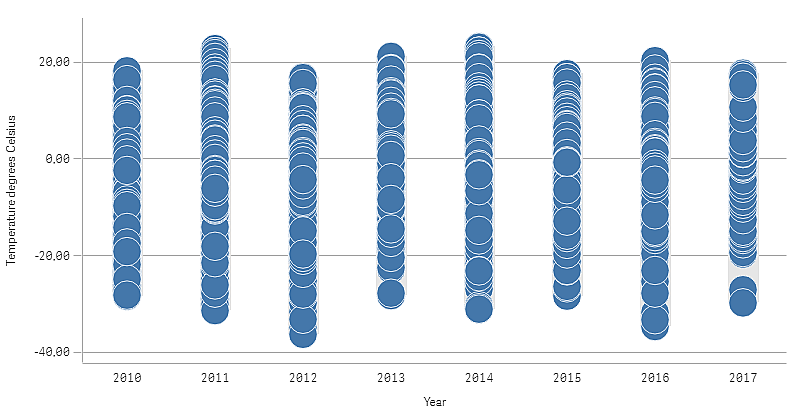
This example shows how to make a distribution plot to view the distribution of measure values in a dimension using weather data as an example.

Dataset
In this example, we'll use the following weather data.
- Location: Sweden > Gällivare Airport
- Date range: all data from 2010 to 2017
- Measurement: Average of the 24 hourly temperature observations in degrees Celsius
The dataset that is loaded contains a daily average temperature measurement from a weather station in the north of Sweden during the time period of 2010 to 2017.
Measure
We use the average temperature measurement in the dataset as the measure, by creating a .measure in Master items with the name Temperature degrees Celsius, and the expression Avg([Average of the 24 hourly temperature observations in degrees Celsius]).
Visualization
We add a distribution plot to the sheet and set the following data properties.
- Dimension: Date (date) and Year (year). The order is important, Date needs to be the first dimension.
- Measure: Temperature degrees Celsius, the measure that was created as a master item.
Distribution plot with the dimensions Date (date) and Year (year) and the measure Temperature degrees Celsius.

Discovery
The distribution plot visualizes the distribution of the daily temperature measurements. The visualization is sorted by year, and each point represents a temperature measurement.
In the visualization we can see that the year 2012 has the lowest extreme temperature measurement, close -40 degrees Celsius. We can also see that the year 2016 seems to have the largest distribution of temperature measurements. With this many points in the distribution plot, it can be hard to spot clusters and outliers, but the year 2017 has two low temperature measurements that stand out. You can hover the mouse pointer over a point and view the details.
