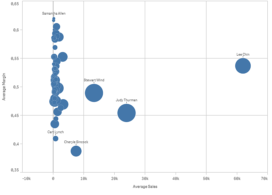
This example shows how to make a scatter plot to correlate two measures. We want to compare how the average sales volume correlates with the average margin for a group of sales persons, and find the outliers.

Dataset
In this example, we'll use two data files available in the Qlik Sense Tutorial - Building an App. Download and expand the tutorial, and the files are available in the Tutorials source folder:
- Sales.xls
- Sales rep.csv
To download the files, go to Tutorial - Building an App.
Add the two data files to an empty app and make sure that they are associated by Sales Rep ID - Sales Rep Number.
The dataset that is loaded contains sales data. The Sales rep table holds the information about the sales persons.
Measures
We need two measures that we create in Master items:
- AverageSales with the expression Avg(Sales). This is the average of the sales value for all orders.
- AverageMargin with the expression Avg(Margin/Sales). This is the average of the sales margin for all orders.
Visualization
We add a scatter plot to the sheet and set the following data properties.
- Dimensions > Bubble: Sales Rep Name (sales person)
- Measures > X-axis: AverageSales
- Measures > Y-axis: AverageMargin
A scatter plot is created, with a bubble for each sales person.
But we also want to have information about the total sales for each sales person, by adding the third measure Avg(Sales). The size of each bubble reflects the total sales for each sales person.

Discovery
The scatter plot visualizes the average sales versus average margin for each sales person, and we can see which sales persons distinguish themselves in performance. You can hover the mouse pointer over a sales person and view the details.
In the chart, we can see that Lee Chin has the highest average sale value. Stewart Wind has the largest total sales volume, followed by Judy Thurman. Cheryle Sincock has a significantly smaller average margin than other sales persons, while outperforming most of them in average sales volume.
