Measures are calculations based on fields, for example Sum(Cost). You can use modifiers to change how the measure is calculated over the available dimensions.
For example, you can have the values of a measure accumulate over one or two dimensions, or you can calculate the average of your measure over a specific number of steps.
For information about how to apply a modifier to measure, see Applying a measure modifier.
Which visualizations have modifiers
| Visualization | Accumulation | Difference | Moving average | Relative numbers | Time series decomposition |
|---|---|---|---|---|---|
| Bar chart | Yes | Yes | Yes | Yes | No |
| Combo chart | Yes | Yes | Yes | Yes | No |
| Line chart | Yes | Yes | Yes | Yes | Yes |
| Table | Yes | Yes | Yes | Yes | No |
| Straight table (Visualization bundle) | Yes | Yes | Yes | Yes | No |
Accumulation
The accumulation modifier allows you to accumulate the values of a measure over one or two dimensions. Accumulating values makes it easy to visualize how the effect of the measure builds up over a dimension.
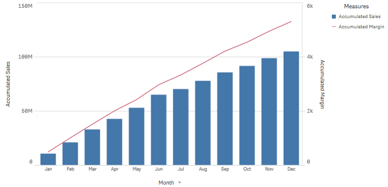
In the following combo chart, the bars and lines accumulate over time.
A combo chart where the line shows the accumulated profit margin and the bars show the accumulated sales figures.
Syntax:
RangeSum(Above {$M,0,Steps})
Difference
The difference modifier allows you to visualize the difference between consecutive values of a measure over one or two dimensions. The difference modifier is useful when you want to visualize the change in direction of grouped data.
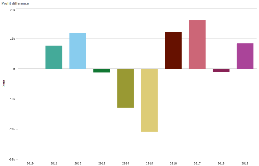
In the following bar chart, any drops in yearly profits over a 10 year period appear as negative bars.
A bar chart showing the profit differences from one year to the next.
Syntax:
$M - Above($M)
Moving average
The moving average modifier allows you to see the average values of a measure over a specific period. You can use it to filter out the action from short-term value fluctuations. You can change the number of steps over which the averaging takes place, depending on how strongly you want your modifier to follow the changes in your data. A moving average is commonly used with time series data to highlight longer-term trends or cycles.
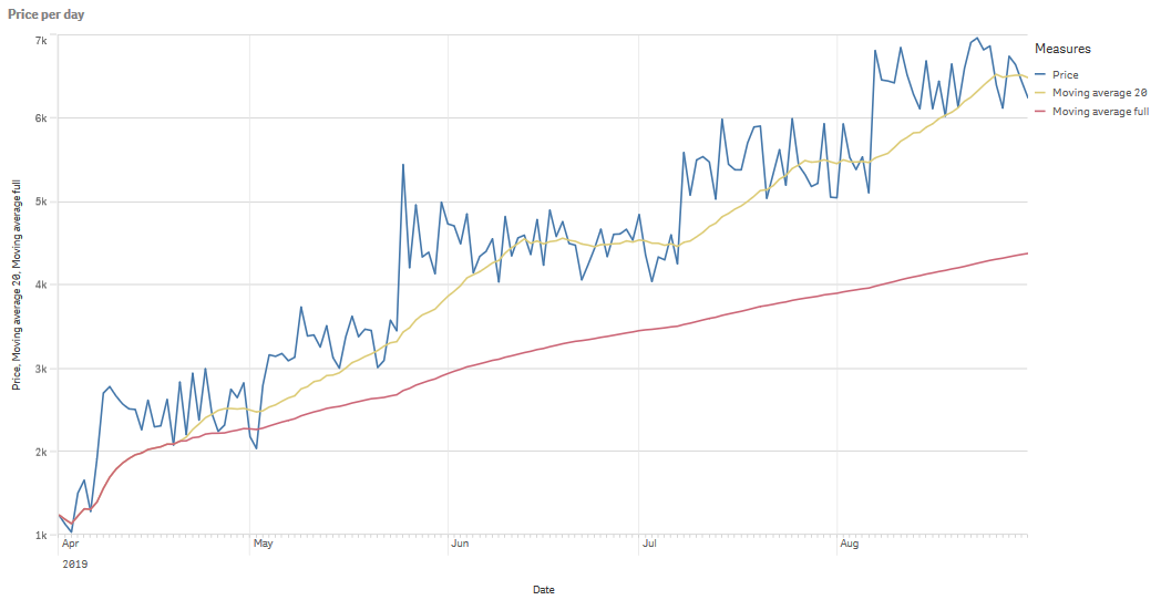
In the following line chart moving averages with two difference ranges are shown, one with a 20 step range, and one with a full range.
A line chart showing the price of a product over a five month period.
Syntax:
RangeAvg(Above ($M,0,Steps))
Relative numbers
The relative numbers modifier allows you to see relative percentages. You can use it to see the impact of specific selections, relative to the selection, relative to the total, or relative to other fields. You can change the basis upon which the relative number is calculated.
In the following table a column with sales of each year of a specific selection, and three columns with relative numbers are shown, one relative to current selection, one relative to total sales for all years, and one relative to the sales of each year.
A table showing different sales percentages relative to current selection, relative to total sales, and relative to each year's sales.
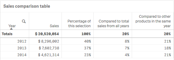
The following is an example of the syntax of the modifier relative to the total selection.
Syntax:
$M / Sum( total Aggr( $M, dim ) )
Time series decomposition
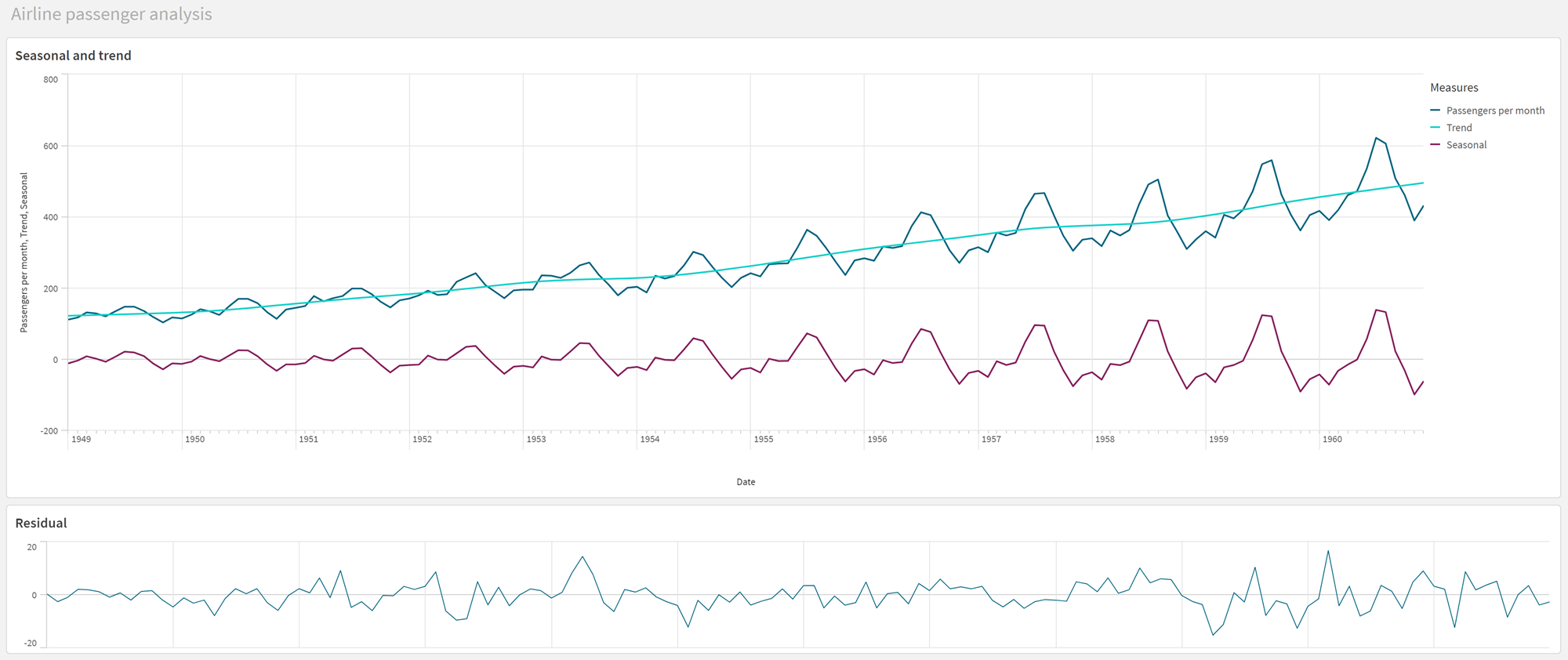
The time series decomposition modifier allows you to break down time series data to separately analyze a general trend and a recurring seasonal cycle. You can create four different measures, each displaying a different decomposition of the signal:
-
Observed (original target measure without any decomposition)
-
Trend
-
Seasonal
-
Residual
For more information about the chart functions used for this processing, see Time series decomposition functions.
A Qlik Sense sheet for airline passenger analysis, showing two line charts utilizing the time series decomposition modifier.
Syntax:
STL_Trend($M, Periods), STL_Seasonal($M, Periods),STL_Residual($M, Periods)
