This example shows how to make a treemap to view hierarchical data. You can display a large number of values in limited space and detect patterns that could be hard to spot with other charts.
We will look at sales numbers for different products which are categorized in four levels.
- Product group
- Product sub group
- Product item

Dataset
In this example, we'll use two data files available in the Qlik Sense Tutorial - Building an App. Download and expand the tutorial, and the files are available in the Tutorials source folder:
- Sales.xlsx
- Item master.xlsx
To download the files, go to Tutorial - Building an App.
Add the two data files to an empty app and make sure that they are associated by Item Number.
The dataset that is loaded contains sales data for food and beverage products. The Item Master table holds the information about the product categories.
Visualization
We add a treemap to the sheet and set the following dimensions and measures.
- Dimensions > Group: Product Group (product group)
- Dimensions > Group: Product Sub Group (product sub group)
- Dimensions > Rectangle: Item Desc (product item description)
- Measures > Size: Sum(Sales) (sum of sales)
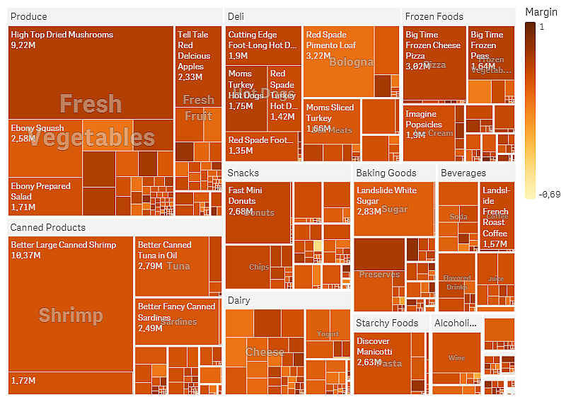
A treemap is created, with a rectangle for each product item. Rectangles are sized according to sales and grouped according to Product Group and Product Sub Group.
But we also want to add some more information to the chart. The rectangles are colored by the product group dimension but we want to color them by margin to also see which items are most profitable. You can do this in the properties panel in Appearance > Colors and legend.
- Set Colors to Custom.
- Set Color by measure to Avg(Margin/Sales)
We also want to see the sales values in the chart. You can turn them on with Value labels Appearance > Presentation.
Discovery

We can see in the chart that Produce has the largest sales, followed by Canned Products. The coloring by margin allows you to identify product items or groups that stand out. You can drill down in the tree by selecting a product group.

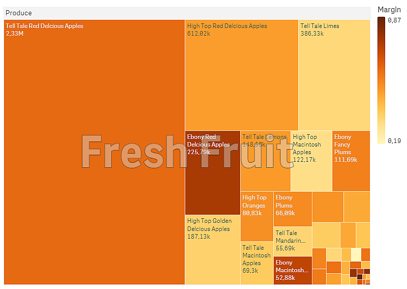
Here we have selected Produce, then Fresh Fruit. Tell Tale Red Delicious Apples are the number one sellers, but margins are higher on Ebony Red Delicious Apples.
