Visualizations in the app
Visualizations are charts, extensions, and other objects that visualize your data for exploration in a sheet.
Measures and dimensions
A visualization consists of at least one measure or one dimension. In most cases a visualization has both, and sometimes more than one dimension or measure.
Dimensions determine how the data in a visualization is grouped. Dimension values often refer to time, place, or category.
Measures are the result of some sort of calculation, often aggregations, such as Sum, Count, or Avg (average).
When dimensions and measures are combined in a visualization, it is possible to see, for example, how many bikes were sold in a certain area during a certain period of time.
Dashboard visualizations
Different visualizations serve different purposes. The point of a visualization in general is to communicate its data in a quick and meaningful way while remaining 100% accurate.
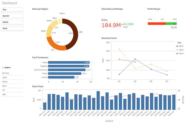
Dashboard sheet with different visualizations.

Filter panes
In the sheet Dashboard, there are two filter panes to the left: the time filter pane without title and Region. They are both filter panes, although they do not look the same. Region contains only one dimension, and shows the dimension values in a list. The time filter pane contains four dimensions, and because the space is limited, the lists are all compressed to panes. The purpose of the filter panes is to filter out a limited data set, which you can analyze and explore.
Pie chart
To the right of the time filter pane is a pie chart Sales per Region. Pie charts show the relationship between values, as well as the relation of a single value to the total. Each sector represents a value, and as long as there are a limited number of values (less than 10), you get a good overview of the relative size of the sectors. The values are ordered by size.
Bar chart
Below the pie chart is a bar chart, Top 5 Customers. Bar charts are useful when you want to compare multiple values. The bars give information about the relationship between different values. Bars can be grouped or stacked, and be displayed horizontally or vertically.
Combo chart
Beneath the bar chart is a combo chart, Sales Trend. Combo charts are usually used for displaying trends with bars and lines in the same visualization. A combo chart is especially useful when you want to combine values that normally are hard to combine, because they have totally different scales. The solution in the combo chart is to have two axes for the measures. In Sales Trend, the combo chart combines sales figures (millions of dollars, on the left axis) with margin (percent, on the right axis).
KPI
To the right of the pie chart is a KPI visualization, Total Sales and Margin. It can be very useful to track performance. In a KPI visualization, you can show one or two measure values with text labels. You can add conditional colors and symbols to the values.
Gauge
To the right of the KPI visualization is a gauge, Profit Margin. A gauge is used to display a single key measure value. In this case it is the profit margin. The colors reinforce the interpretation of the value.
Line chart
The final visualization is a line chart, Quarterly Trend. Line charts are often used to show trends, and this chart uses two dimensions, year and quarter that displays the trends for each quarter of the years 2012-2014.
Product Details visualizations
Do the following:
- In the top right corner, click
to go to the sheet Product Details.
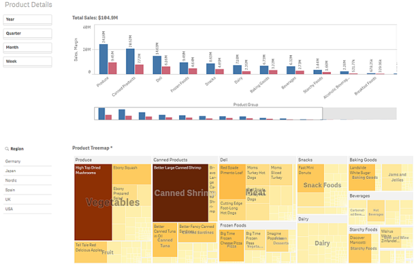
Product Details sheet with different visualizations.

Treemap
The second sheet, Product Details, contains one new visualization type compared to the sheet Dashboard, and that is the treemap. Treemaps are ideal when you want to display hierarchical data in a limited space. In this treemap the hierarchy consists of the dimensions Product Group, Product Type, and Item Desc. You start at the top level (Product Group), and when you make and confirm selections in the treemap you drill down to the next level (Product Type) to analyze the more detailed data. The items in the treemap are colored by measure. The darker the color, the higher the measure value.
The screenshot was taken in an app with reduced sheet width. As a consequence, the bar chart does not display all values at the same time. Therefore, it has a mini chart below the bar chart, which shows a miniature of the full chart. The mini chart has a scroll bar that can be used for navigation.
Customer Details visualizations
Do the following:
- In the top right corner, click
to go to the sheet Customer Details.
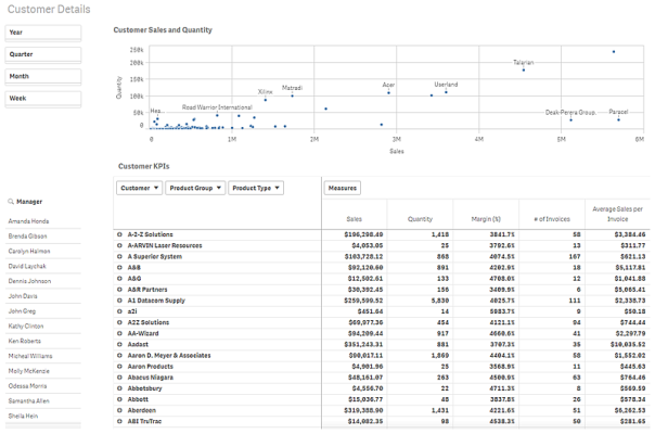
Customer Details sheet with different visualizations.

The Customer Details sheet has two new visualizations, a scatter plot, Customer Sales and Quantity, and a pivot table, Customer KPIs.
Scatter plot
With a scatter plot you can find potential relationships between values, and identify values that deviate from a group. The size of the bubbles can be used to show differences in values. In this scatter plot the bubbles show the relationship between sales and quantity, and each bubble is a dimension value: the customer.
Pivot table
The pivot table Customer KPIs shows key customer figures. You can rearrange how the data is displayed, and analyze data by multiple dimensions and measures at the same time to get different views of the data.
Customer Location visualizations
Do the following:
- In the top right corner, click
to go to the sheet Customer Location.
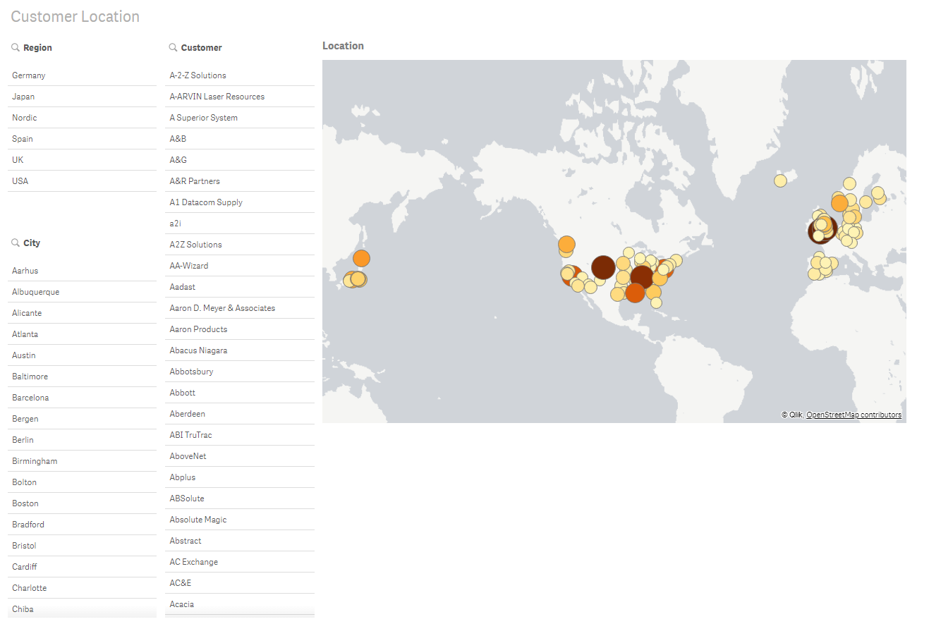
Customer Location sheet with different visualizations.

Map
The fourth sheet, Customer Location, contains three filter panes and one new visualization: a map. In Qlik Sense you can create maps that display data in point layers and area layers. The map we are using in this tutorial contains a point layer. A point layer is created using point coordinates (latitude and longitude) or location names to mark places of interest, for example cities.
Maps can, for example, be used for plotting sales data per region or per location. The map in this tutorial is used to show customer locations. You can filter by Region, City, or Customer. You can also make selections directly in the map by clicking on a point. If you hold down Shift before you make a selection you can select several areas to analyze.
