Configuring your calendar periods
Calendar periods use your calendar groups to create default periods of time for analysis in Insight Advisor.
Calendar periods are used to define time periods for analysis in Insight Advisor analysis. You create calendar periods from your calendar groups. Depending on your data, business logic may automatically create calender periods from your data model. If you navigate to Calendar periods, you can see calendar periods have already been made. Calendar periods can be relative, covering a period relative to the current date. For example, you could create a relative period to cover the current month. Calendar periods can also use the last recorded value in your data. For example, the three calendar periods created when you activated business logic all use last recorded values to make calendar periods for the last year, month, and quarter. app users can applly the calendar periods to Insight Advisor analysis in Sheets.
You can also define default calendar periods for groups in behaviors. This ensures that by default, Insight Advisor uses that calendar period when creating any charts for fields in that group.
Why define calendar periods?
Calendar periods are useful because they create specific periods of analysis for your data. If Insight Advisor is not given a specified time frame, such as in 2020 or for December, it will use the entirety of the data available. If you provide calendar periods, app users can more easily view and compare data for specific periods.
For example, you want to view sales by product. Navigate to Sheet, and search for show me sales by product. If you want to view specific periods of sales, such as a data for this month compared to last month or a comparison of the current quarter to a previous quarter, you would need to enter a new query. By making calendar periods, you can view these periods for your query without making new queries. Business logic has already made last recorded value calendar periods for the last month, quarter, and year in the data. It does not have relative periods, however. You could create a comparison for the current month to the same month last yea. You could also make a comparison between the current quarter (x) and the quarter two quarters ago (x-2).
Creating the Month comparison calendar period
This calendar period will display results for the most recent month in the data and compare it to the same month last year.
Do the following:
-
Click Create calendar period.
-
Select Sales_Order Date.
-
For Calendar period name, enter Month comparison.
-
For Calendar period grain, select Month of year.
-
Under Period comparison, select Year over year.
-
Select Last complete period.
-
Click Create.
Creating the Quarter comparison calendar period
This calendar period will display results for the current quarter (x) and compares it to the quarter two quarters ago (x-2).
Do the following:
-
Click Create calendar period.
-
Select Sales_Order Date.
-
For Calendar period name, enter Quarter comparison.
-
For Calendar period grain, select Quarter of year.
- Click Custom.
-
For Offset, select 0.
-
For Compare offset, select 2.
-
Click Create.
Results
Navigate to Sheet and search for show me sales by product. Select the matching result. In Analysis properties, there is a new property available, Analysis period. Select it and select Month comparison to apply the period to the chart.
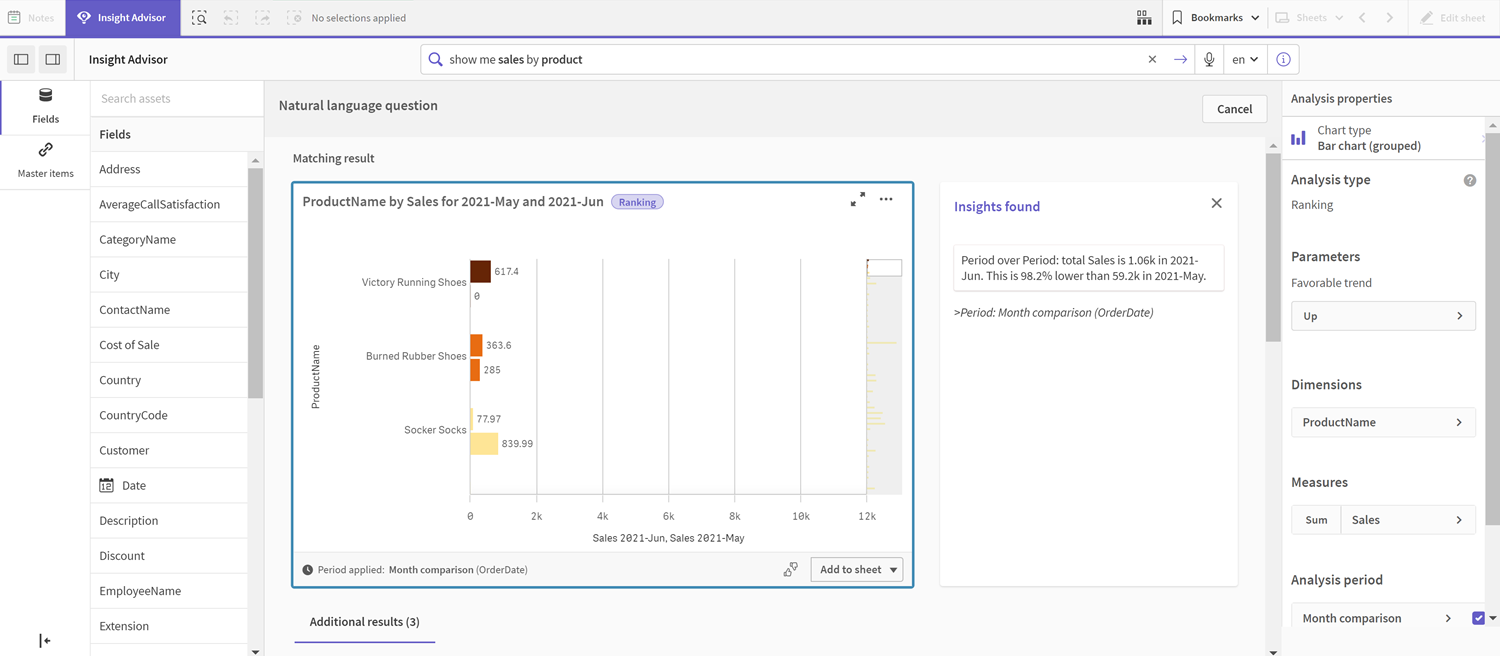
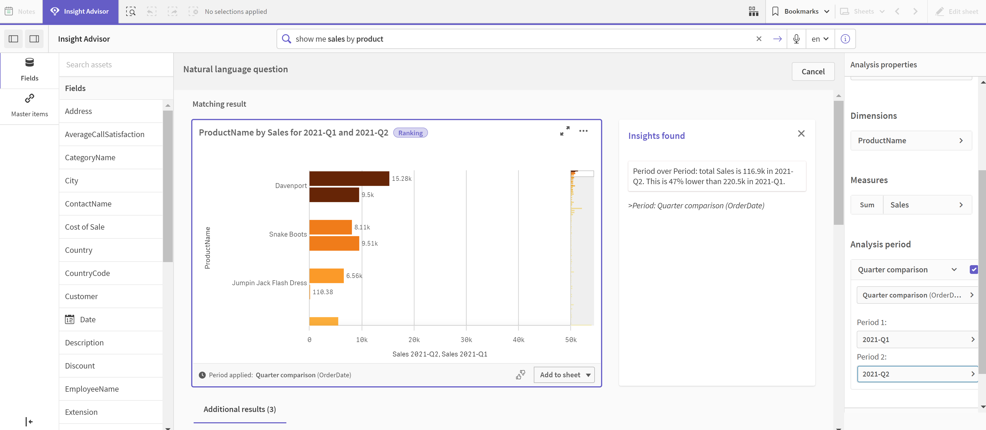
Next, apply the Quarter comparison calendar period.
Quarter comparison calendar period applied to a chart
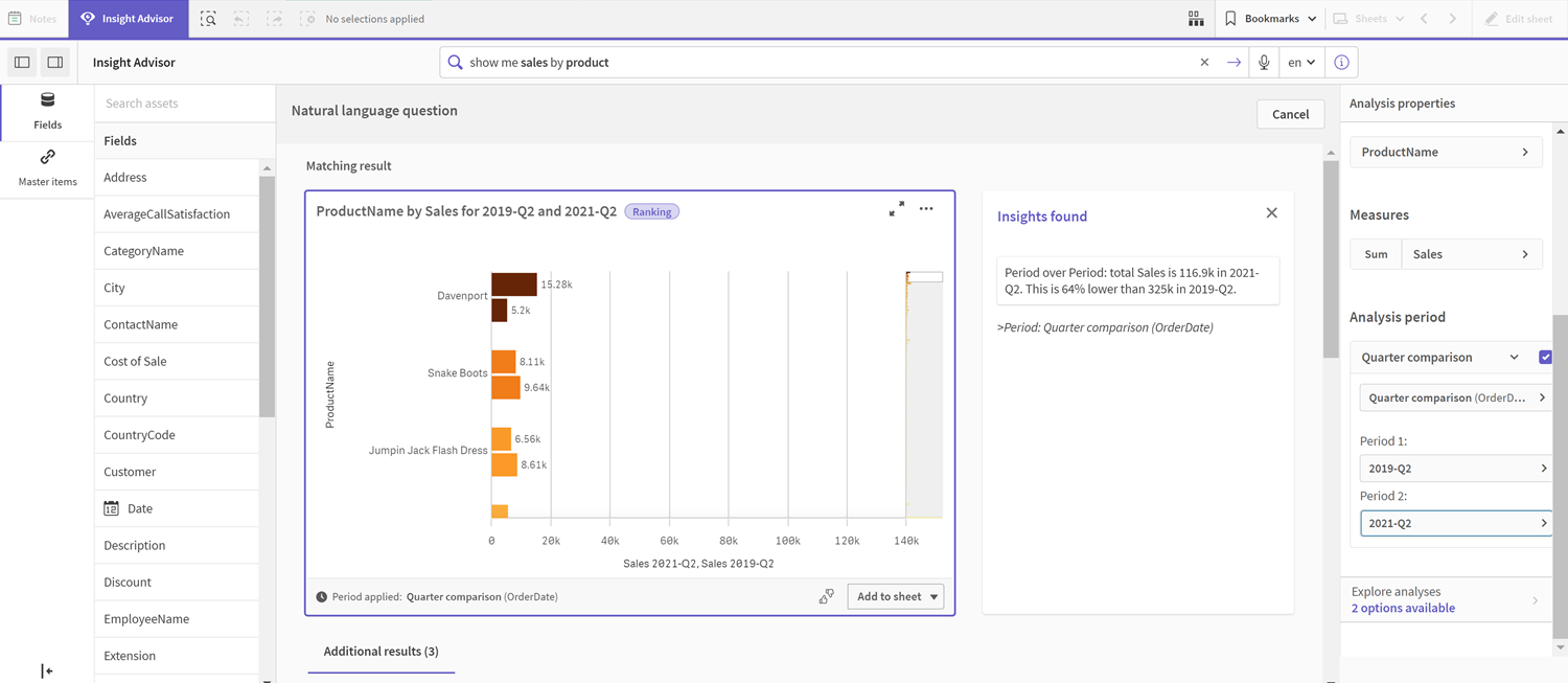
You can also adjust the time periods in an analysis period manually for individual charts in Insight Advisor by changing the values in Period 1 and Period 2. For example, under Period 1, change the value to 2019-Q2. The chart updates for the newly defined period.
Quarter comparison calendar period applied to a chart, now using 2019-Q2 and 2021-Q2
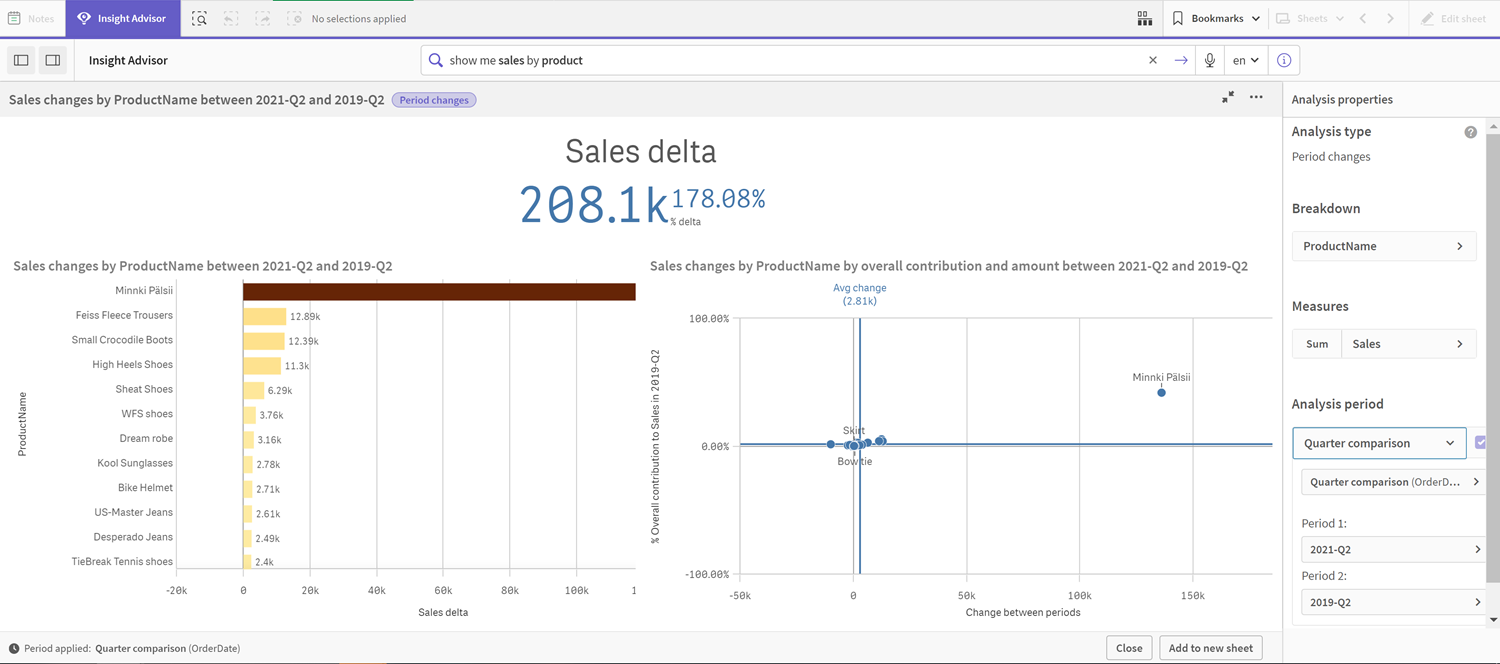
Additional analysis types are available in Insight Advisor when calendar periods are available: period changes, period changes (detailed), and period over period. These provide a suite of charts for analyzing the period and its changes.
Click Explore analyses under Analysis period. There are two analyses to select from. First, choose Period changes. Period changes shows a KPI and bar chart for the changes of the sum(Sales) delta between the two periods. When there is a small number of dimensions, a variance waterfall chart is displayed instead of a bar chart.
Period changes analysis
Click Close and scroll back to the bar chart. Click Explore analyses and now select Period analysis (detailed). This provides the period performance against a target. It displays four charts that measure if targets were met for this period. You can adjust the parameters to define what met, what almost met, and what did not meet the target in Analysis properties.
Period performance against target analysis
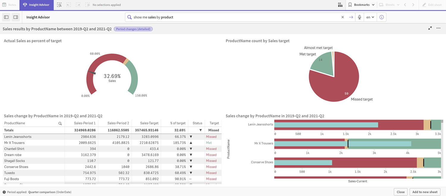
Under Parameters, adjust the limit for missing the target to 100 and the limit for meeting the target to 105. The detailed period analysis updates for the new targets.
Updated period performance against target analysis
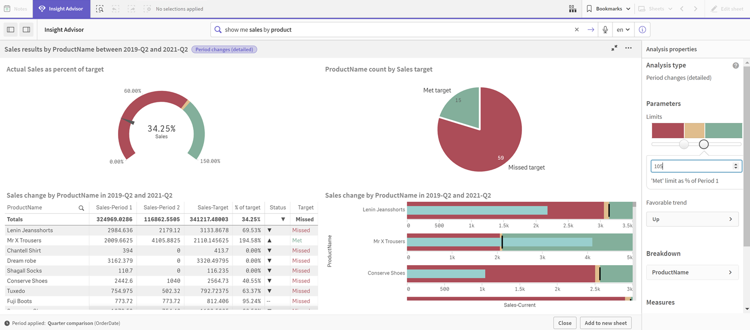
As you can see, calendar periods enable app users to quickly view different periods of interest in Insight Advisor.
