Creating a PixelPerfect chart with user-defined series
You can create a native PixelPerfect chart with manually added series. This method is simpler than using a series template.
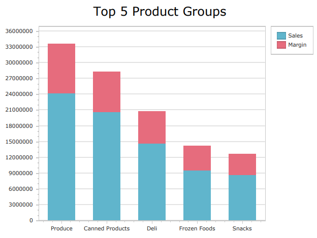
Native PixelPerfect stacked bar chart
Requirements
Before you start creating a native PixelPerfect chart, you need to have a chart in your Qlik Sense app with a source table that adapts well to what you want to visualize. In the Qlik Sense chart, select the appropriate dimensions and measures to filter the data sufficiently from the app's data model.
The data you use for a native PixelPerfect chart has to be added as a table data binding. To create this type of data binding, use the Field List menu and add an item under Tables.
Creating a simple PixelPerfect chart
This is the general workflow for creating a native PixelPerfect chart. Parts of it might not apply to every chart available. Each of the charts is different, serving a range of visualization needs ranging from simple to complex. Depending on what you need to visualize, some additional configurations might also be required.
Do the following:
-
Open the
Field List menu available from the right-side panel in the designer.
-
Click the plus icon next to Tables.
-
From the available sheets, select the Qlik Sense chart you want to add as a table. Click the
icon next to it.
The data binding is added.
-
From the toolbox panel on the left side of the designer, drag a
Chart onto the design surface.
-
Select the blank chart and then open the
Properties menu from the right side of the designer.
-
Under Chart Tasks > Data Member in the menu, select the table you added as a data binding.
-
Inside the chart, click Run Designer....
-
In the left panel in the Chart Designer, hover over Series and click the plus icon.
-
In the menu, select a chart type. For a list of available charts, see Available chart types.
The Properties for the new series are shown on the right side.
-
Under Name, add a name for the series. This is recommended, for example, if your chart requires more than one series.
-
For Argument Data Member, use the drop down menu to select a field containing independent categories that group the data.
Tip noteIn this context, selecting the Argument Data Member is similar to selecting a dimension in Qlik Sense. -
Expand Value Data Members. For Value, select a field containing the variable metrics you want to visualize. For certain advanced chart types (for example, Candle Stick chart), you might need to select more than one Value field.
-
If needed, add additional series. In the left panel in the Chart Designer, hover over Series and click the plus icon. Complete the remaining configuration steps as outlined above.
Additional tips for configuring the chart
The above workflow shows you how to create a simple native chart and connect it to Qlik Sense data sources. Here are some extra tips to help you make the most out of native PixelPerfect charts.
Labels and legends
You might need to configure labels and legends so that they appear correctly.
Changing the text
You can change the text shown in the labels and legend. You can do this by entering specific placeholders in the following properties:
-
Labels: Open the Properties for the series, and add a placeholder to Label > Text Pattern.
-
Legend: Open the Properties for the series, and add a placeholder to Legend Text Pattern.
The placeholders instruct PixelPerfect to generate dynamic text with commonly needed values. For example, to use the name of the series, enter {S}. To enter the name of specific field values, enter {A}.
For a full list of placeholders you can use, see Text definition placeholders for native PixelPerfect charts.
Turning labels and legends off
If your chart has a lot of data, it is often preferred to turn labels off (they are turned on by default). To turn off labels in a series, change the Labels Visibility setting in the Properties to False.
To turn the legend off, you need to return to the chart's global Properties in the Chart Designer. In the left-side panel, click Chart. In the Properties menu on the right side, expand Legend and set Visibility to False.
Charts with more than one series
Some native PixelPerfect charts will require you to add more than one series to the chart to visualize all the data. Common examples are grouped or stacked bar charts, stacked line charts, and nested pie charts. You might also need to add multiple series if you want to create a chart that, in Qlik Sense, would require more than one dimension or measure.
For example, to create a stacked bar chart with one independent grouping (Product Group) and two variable metrics (Sales and Margin), you would need to create two series:
-
Sales, with an Argument Data Member of Product Group and a Value of Sales
-
Margin, with an Argument Data Member of Product Group and a Value of Margin
Editing a chart with a user-defined series
Some additional steps are required to edit an existing PixelPerfect chart that is configured with a user-defined series. When you open the Chart Designer, the Properties that are initially shown are the global properties for the chart. To edit the elements that are defined in the visualization, you need to first select the series in the left-side panel.
Do the following:
-
In the Chart Designer, double-click Series in the left-side panel.
-
Select the series you want to edit.
-
Edit the Properties on the right side.
Refreshing source data for data bindings
Over time, the configuration of the source chart might change, requiring action in your PixelPerfect report template. You can refresh the source app data in data bindings that define your native PixelPerfect chart. This is helpful when:
-
Dimensions and measures have been added to or removed from the source chart since you created the data binding.
-
The definitions of dimensions and measures have been changed in the source chart since you created the data binding.
Refreshing data binding sources allows you to keep the same objects in your Field List menu without having to create new ones as chart configurations change.
Do the following:
-
Open the
Field List menu available from the right-side panel in the designer.
-
Double-click Tables to expand it.
-
Hover your cursor over the item that you want to refresh.
-
Click the refresh (Update columns) icon.
Refreshing a table data binding in the Field List menu

-
Continue with your template development according to your use case. This may involve re-configuring existing content or adding new content. After refreshing the data binding, newly added chart columns will now be available for use from the
Field List menu.
Available chart types
The following charts are shown as options when creating a PixelPerfect chart with manual series splitting.
Example - Creating a simple native bar chart
Refer to the example app sources here: Example materials - In-app reporting. Upload the app and data files into a space, and then reload the app. You are ready to complete the example.
In this example, we walk through a simple example of adding a native PixelPerfect bar chart to a report template.
Do the following:
-
Create a new PixelPerfect template.
-
Open the
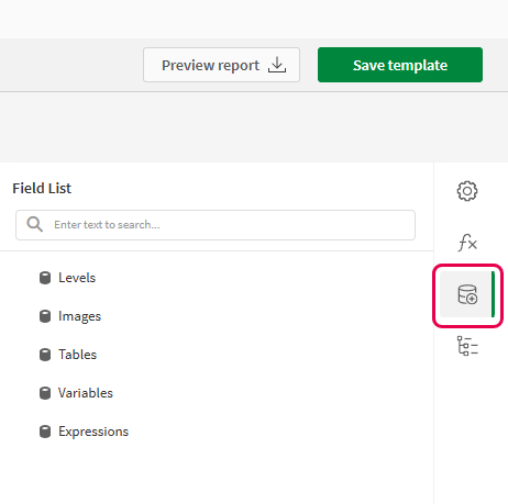
Field List menu available from the right-side panel in the designer.
Field List menu in the PixelPerfect designer
-
Click the plus icon next to Tables.
-
Expand the Dashboard sheet, and click the
icon next to the Sales per Region chart.
The data binding is added.
-
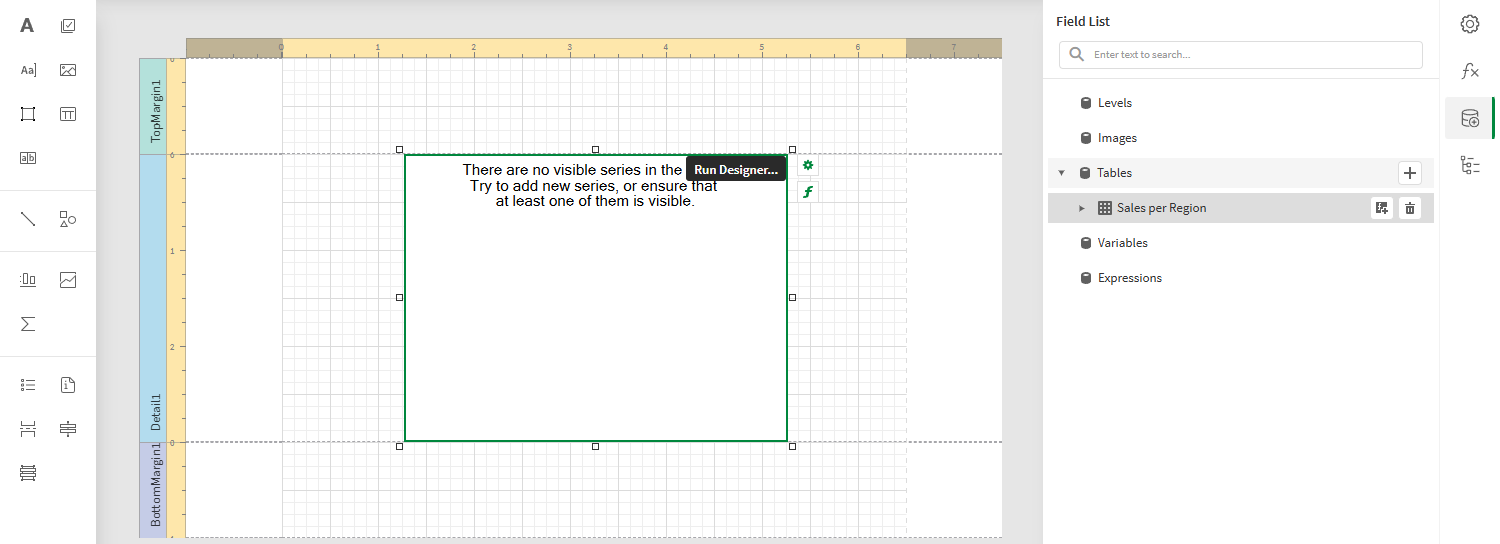
From the toolbox panel on the left side of the designer, drag a
Chart onto the Detail1 band.
Blank chart added to template. The image also shows the data source that will be used to bind to the chart.
-
Select the blank chart and then open the
Properties menu from the right side of the designer.
-
Under Chart Tasks > Data Member in the menu, select the Sales per Region table.
-
Inside the chart, click Run Designer....
-
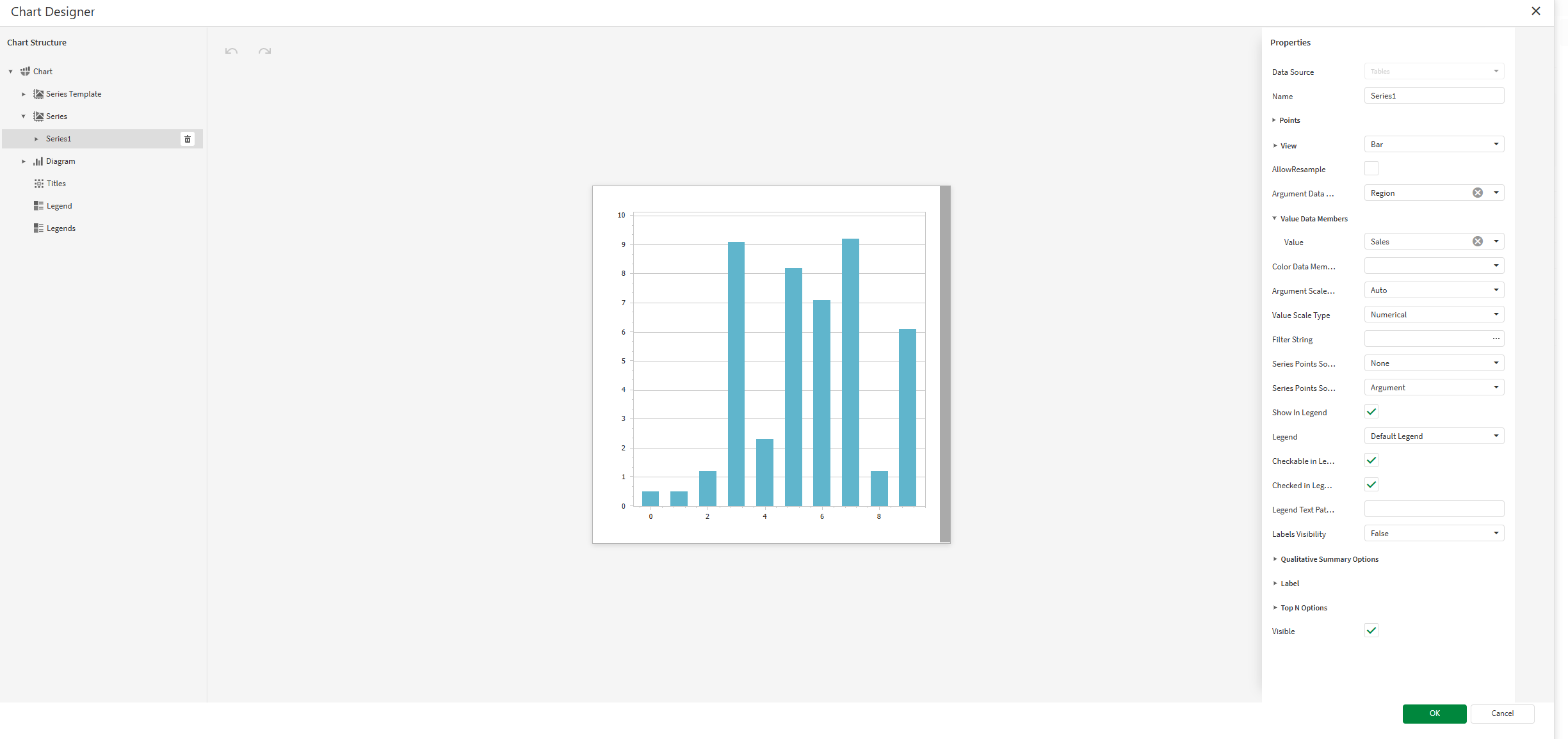
In the left panel in the Chart Designer, hover over Series and click the plus icon. In the menu, select Bar to create a bar chart series.
The Properties for the new series are shown on the right side.
-
For Argument Data Member, use the drop down menu to select Region.
Tip noteIn this context, selecting the Argument Data Member is similar to selecting a dimension in Qlik Sense. -
Expand Value Data Members. For Value, select Sales.
-
In this case, we want to remove the labels and legend. Do both of the following:
-
In the Properties for the series, change the Labels Visibility setting to False.
-
In the Properties for the entire chart (select Chart in the left panel), expand Legend and set Visibility to False.
Chart Designer with the bar chart series configured to use Qlik Sense data sources
-
-
Add a title to the chart. In the left panel in the Chart Designer, hover over Titles and click the plus icon. Select a title position using the popup menu.
-
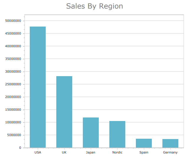
In the Properties for the title, enter Sales By Region for the Text property.
-
Click OK to exit the Chart Designer.
-
Increase the size of the chart and the Detail1 band.
-
In the top right corner, click Save template.
-
Click Preview report. Download the report and open it.
Chart preview
