Adding sparklines
A sparkline is a simple visualization, usually styled in the form of a line, that is helpful for analyzing trends for a single metric. You can add sparklines to your PixelPerfect report using the Sparkline object.
A sparkline generally consists of a field (equivalent to a dimension) and a value member (equivalent to a measure).

Sparkline

Requirements
The data you use for a sparkline has to be added as a table data binding. These data bindings are added under Tables in the Field List menu.
The source data for the sparkline should ideally contain a single dimension and a single measure. To use sparklines to visualize more complex, multi-dimensional data, it is recommended that you apply a level to the band where you add the sparkline. In this case, the level should be an additional dimension along which you want to cycle the generation of multiple filtered sparklines.
Creating sparklines
This is the recommended workflow for adding sparklines in your report.
Do the following:
-
Open the
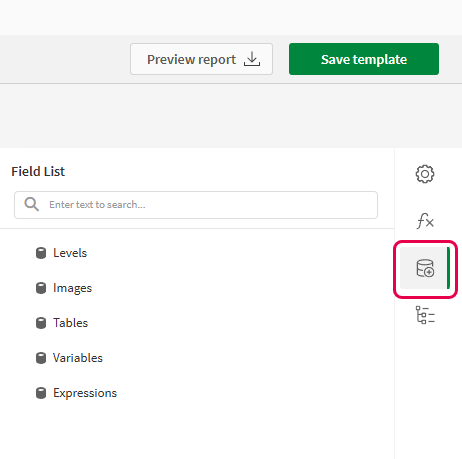
Field List menu available from the right-side panel in the designer.
-
Click the plus icon next to Tables.
-
From the available sheets, select the Qlik Sense chart you want to add as a table. Click the
icon next to it.
The data binding is added.
-
From the toolbox panel on the left side of the designer, drag a Sparkline onto the design surface.
-
Click the gear icon that appears next to the sparkline. In the pop-up menu, for Data Member, select the table data binding you created earlier.
-
Open the
Properties menu from the right side of the designer, and expand Data.
-
For Value Member, select the variable metric you want to visualize (for example, sales).
Refreshing source data for data bindings
Over time, the configuration of the source chart might change, requiring action in your PixelPerfect report template. You can refresh the source app data in data bindings that define your sparkline. This is helpful when:
-
Dimensions and measures have been added to or removed from the source chart since you created the data binding.
-
The definitions of dimensions and measures have been changed in the source chart since you created the data binding.
Refreshing data binding sources allows you to keep the same objects in your Field List menu without having to create new ones as chart configurations change.
Do the following:
-
Open the
Field List menu available from the right-side panel in the designer.
-
Double-click Tables to expand it.
-
Hover your cursor over the item that you want to refresh.
-
Click the refresh (Update columns) icon.
Refreshing a table data binding in the Field List menu

-
Continue with your template development according to your use case. This may involve re-configuring existing content or adding new content. After refreshing the data binding, newly added chart columns will now be available for use from the
Field List menu.
Example - Sparklines with a level
Refer to the example app sources here: Example materials - In-app reporting. Upload the app and data files into a space, and then reload the app. You are ready to complete the example.
We will create sparklines with monthly sales by region.
Part 1: Add data bindings
Do the following:
-
Create a new PixelPerfect template.
-
Open the
Field List menu available from the right-side panel in the designer.
Field List menu in the PixelPerfect designer

-
Click the plus icon next to Levels.
-
Expand Fields, and click the
icon next to Region.
The data binding is added.
-
You are brought back to the main
Field List menu. Click the plus icon next to Tables.
-
Expand the Sales Table sheet, and click the
icon next to the Regional Sales over Time chart.
The data binding is added.
Part 2: Add DetailReport band and connect it with data banding
You need to create a DetailReport band to use a level.
Do the following:
-
Right-click the Detail1 band, and then click Insert Band > DetailReport.
-
To bind the DetailReport1 band to the level, select the band and then open the
Properties menu. Under Detail Report Tasks > Data Member, select the Region level.
Part 3: Add a label and sparkline
Do the following:
-
Open the
Field List menu, and double-click Levels to expand it.
-
For Region, expand the level object and drag the Region field within it onto the DetailReport1 band.
Position the label at the top of the band, centered horizontally.
-
From the toolbox panel on the left side of the designer, drag a Sparkline onto the DetailReport1 band, below the Region label.
-
Resize the sparkline so that it occupies all horizontal space on the band, and its shape is a narrow rectangle.
-
Resize the DetailReport1 band so there is a small space at the bottom of the sparkline.
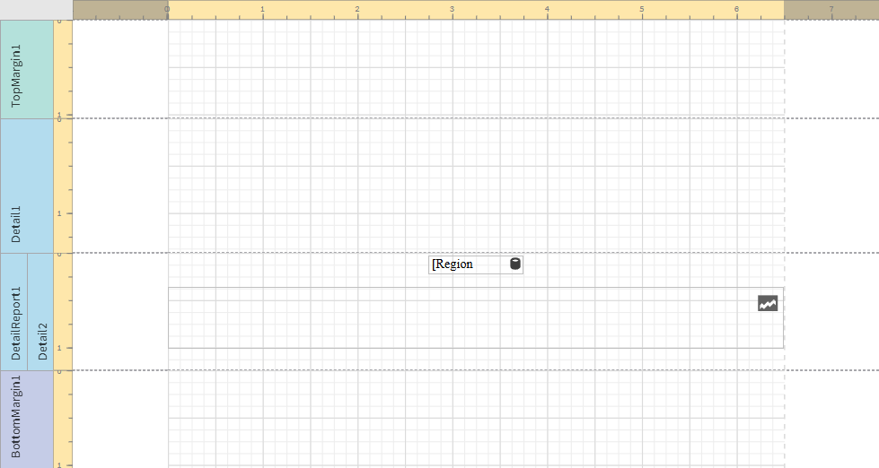
Region label and empty sparkline added to template

-
Select the sparkline and then open the
Properties menu.
-
Expand Appearance > View.
-
Check Highlight Max Point and Highlight Min Point.
-
For Color, expand the drop down menu. Paste the following hex code in the # field: 0d00ff. Click OK.
-
For Max Point Color, expand the drop down menu. Paste the following hex code in the # field: 0dff00. Click OK.
-
For Min Point Color, expand the drop down menu. Paste the following hex code in the # field: ff0000. Click OK.
-
In the top right corner, click Save template.
-
Click Preview report. Download the report and open it.
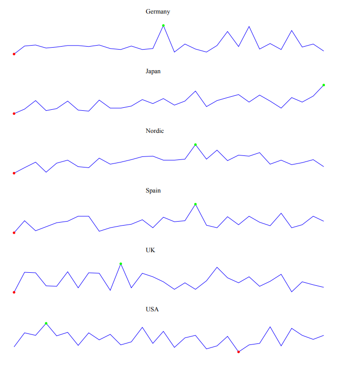
Report preview with sparklines

