Data storytelling
With data storytelling you can create a presentation based on the data in your app. You can take snapshots of selected visualizations and use them in your narrative together with text, shapes, and effects.

You create slides and design the story with your particular audience in mind. In your narrative, you focus on key elements and create a convincing story to make your message clear.
An additional, useful feature of data storytelling is that you can easily switch between a snapshot in the presentation and its context in the app. In the app context, you can make new selections and continue the analysis from where you left off in the presentation.
After the analysis, you can resume the presentation.
Taking snapshots
You will start the creation of your story by taking snapshots in the app. In the top right corner, use to move to the sheet Dashboard.
In the presentation you will focus on the three largest regions and analyze the sales trends.
Do the following:
-
Right-click the visualization Sales per Region and select Storytelling snapshots > Take snapshot.
-
In Region, select Nordic.
-
Right-click the visualization Top 5 Customers and select Storytelling snapshots > Take snapshot.
-
In the annotation dialog that opens:
- Type Nordic in the annotation text field.
- Click outside the annotation dialog to close it.
-
Right-click the visualization Quarterly Trend and select Storytelling snapshots > Take snapshot.
-
In the annotation dialog that opens:
- Type Nordic in the annotation text field.
- Click outside the annotation dialog to close it.
-
In Region, deselect Nordic and select USA.
-
Take snapshots from the same visualizations as for Nordic (Top 5 Customers and Quarterly Trend) and annotate them with USA.
-
In Region, deselect USA and select Japan.
-
Take snapshots from the same visualizations as for Nordic (Top 5 Customers and Quarterly Trend) and annotate them with Japan.
You have taken all the snapshots you need and can start creating your data storytelling slides.
Creating a simple story
You will create a short and simple story, where the focus is on creating a few slides with snapshots and titles. A screen shot of the slide is presented before the step-by-step instructions.
Slide 1
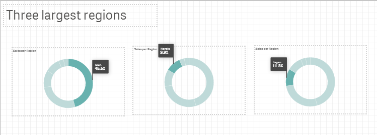
Slide with title 'Three largest regions' and three snapshots of pie charts

Do the following:
-
In the toolbar, open the app navigation menu and under Narrate, select Storytelling.
The data storytelling editor is opened.
-
Click
and drag a title to the slide.
-
Type the title Three largest regions.
-
Click
to see the snapshots that you took previously.
-
Drag the pie chart Sales per Region snapshot to the slide.
-
Resize the pie chart and place it to the leftmost on the slide.
-
Click
to open the Effect library.
-
Drag the option Any value to the pie chart.
The value USA is automatically highlighted.
-
Copy the pie chart and paste it next to the first one. You can either use Ctrl+C and Ctrl+V or
and
in the toolbar.
-
In the new pie chart, click
and select Nordic in the list Select data point.
- In the same manner as for the second pie chart, create a third pie chart and highlight Japan.
The slide is complete.
Slides 2-4
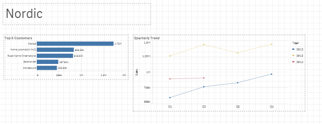
Slide with title 'Nordic' and two snapshots of a bar chart and a line chart.

Slides 2-4 show the top five customers and the quarterly sales trend for the three regions. The snapshots are stored in the library in the order they were taken, with the latest one at the top. If you have followed the procedures when taking these snapshots, the two at the top should be Japan, the two ones below, USA, and the remaining two, Nordic.
Do the following:
-
In the left-hand corner, click
and add a blank slide.
-
Click
to see the snapshots.
-
Drag the Top 5 Customers bar chart for Nordic to the slide.
-
Drag the Quarterly Trend line chart for Nordic to the slide.
-
Click
and drag a title to the slide.
-
Type the title Nordic.
- Resize and align the title and snapshots according to the screenshots.
- Right-click the sheet Nordic in the story timeline to the left and select Duplicate to create a new sheet that can be used as a template for the next sheet.
- Change the title to USA.
-
Select the Top 5 Customers snapshot and click
to open the Replace snapshot dialog where you select the second snapshot in the drop-down list. If you followed the instructions it has the annotation USA.
Tip noteYou can right-click the snapshot and select Go to source, if you want to see the selections in that version of the snapshot. Then, click Return to go back to the story. - Replace the Quarterly Trend snapshot just as you did with the Top 5 Customers snapshot.
- Duplicate the USA sheet and adjust it to present Japan. Now use the snapshots in the top of the list in the Replace snapshot dialog. If you followed the instructions they have the annotation Japan.
When analyzing these slides it is important to know that the figures for 2014 are half-year figures. Extrapolating the figures for the full year would then give different forecasts for the different regions.
The story is complete. Click Play story in the toolbar to play your presentation. You can navigate with the left and right arrow keys.
Close the story and make edits, if needed. Below the slide, you have tools for cutting, copying, and pasting that can be useful when you edit your presentation. And, of course, you can use the panel to the right.
Switching between data storytelling and the app context
In data storytelling, you can switch any time from the presentation to the app context. Right-click the snapshot and select Go to source to open the app sheet where the snapshot was taken. This gives you a dynamic option to leave the presentation and make data analysis in response to questions from the audience. When you have finished analyzing, you return to the presentation by clicking Storytelling in the toolbar.
The go to source option is also useful for the special purpose of verifying that the correct bar charts and line charts are used. When you select Go to source you will see which region is selected for that specific snapshot.
Additional options
There are many options that have not been used in this story. Experiment on your own. Try and add effects to the bar chart. Add a new slide and embed a complete app sheet where you can make selections when you are in play mode. Add URLs or bookmarks to text strings. There is plenty more to discover.
Thank you!
You have reached the end of this tutorial. We hope that you have learned a few things and realized that app creation sometimes can be pretty easy and even somewhat fun.
Qlik Cloud is a powerful tool that is capable of far more than what has been shown here. This is just the beginning!
