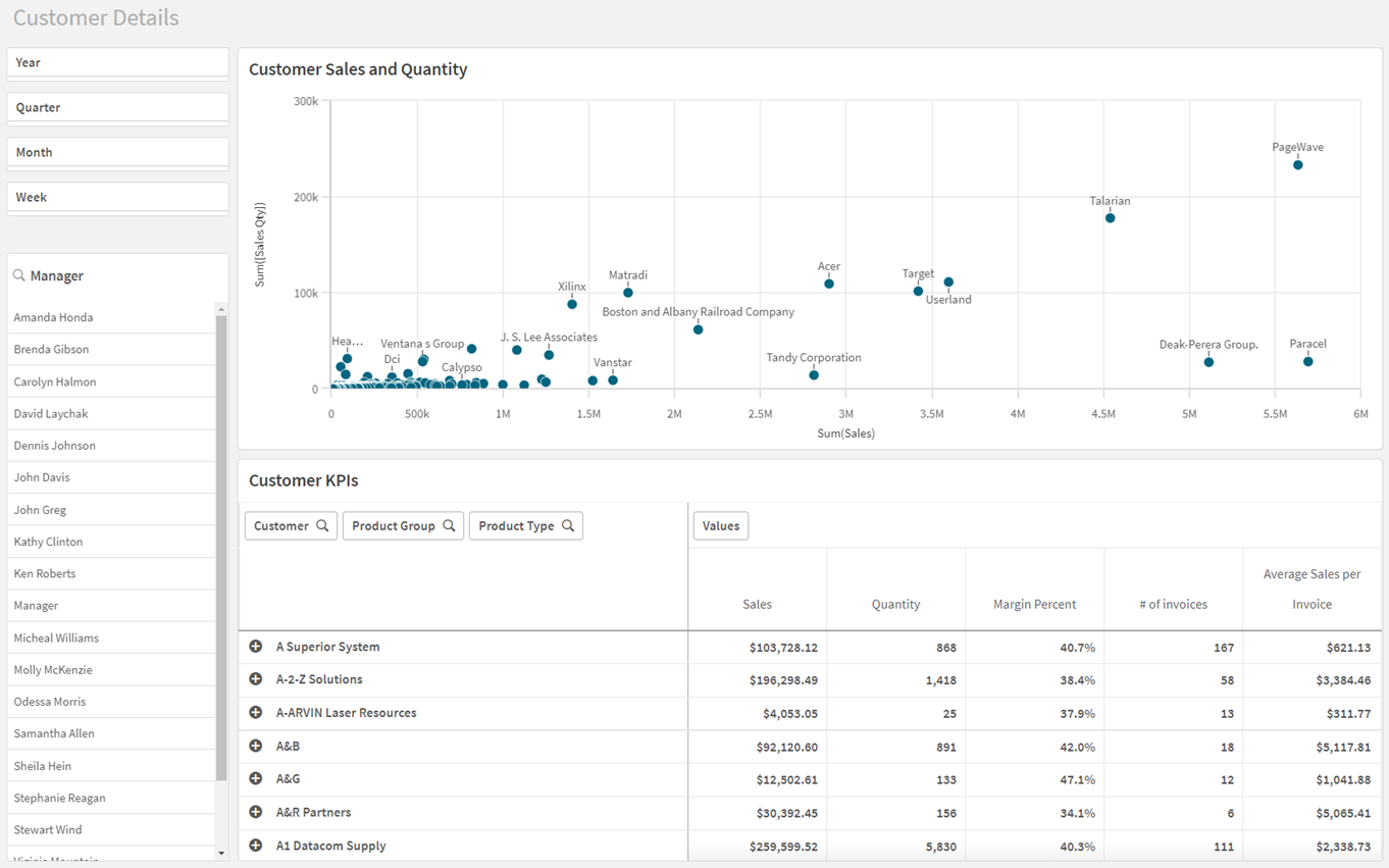
The third sheet: Customer Details
In the third sheet you will make a scatter plot and a pivot table that focus on customers. Then you will add filter panes so you can filter by date and manager.

By now you have so much experience from creating dimensions, measures, and visualizations that you do not need detailed procedures anymore. If you need reminders of what you have learned so far, you can refer back to the previous topics.
Customer Details sheet when finished

You will start your work in edit mode.
Adding the scatter plot
The next visualization is a scatter plot showing the Customer Sales and Quantity.
A scatter plot is used to visualize the relationship between two or three measures.
For more information, see Scatter plot.
In this case, the measures compared are Sales and Quantity. Each bubble represents a Customer dimension value.
Do the following:
-
In the assets panel, open Charts.
-
Under Visualizations, drag a scatter plot to the sheet.
-
Go to Fields and drag the Customer field to the sheet and add it as a dimension.
-
Go to Fields and add Sales and Quantity as measures. The Autochart turns the visualization into a scatter plot.
-
Go to Presentation > Axis. Set both the X and Y-axes to start at Zero. This removes negative values.
-
Give the scatter plot a title: Customer Sales and Quantity.
Adding the Customer KPIs pivot table
The pivot table presents dimensions and measures as rows and columns in a table. In a pivot table you can analyze data by multiple measures and in multiple dimensions at the same time.
You can rearrange the measures and dimensions to get different views of the data. The activity of moving measures and dimensions interchangeably between rows and columns is known as 'pivoting'.
One of the advantages of a pivot table is the interchangeability, that is, the ability to move row items to columns and column items to rows. This flexibility is very powerful and enables you to rearrange the data and have several different views of the same data set.
Depending on what you want to focus on, you move the dimensions and measures to bring forward data of interest and hide data that is either too detailed, or irrelevant for the analysis.
For more information, see Pivot table.
Do the following:
- In the assets panel, go to Charts.
- Under Visualizations, drag a pivot table to the area below the previous chart.
-
Go to Fields and add Customer as a dimension.
-
Add Sales and Sales Qty as measures by dragging both to the sheet.
-
Give the pivot table a title: Customer KPIs.
Now you have a very simple pivot table.
Customizing the pivot table
You will customize the pivot table in edit mode.
Creating measures with expressions
Do the following:
-
Select the pivot table.
-
Go to Data > Measures.
-
Margin Percent measure:
-
Click Add and click
. Insert this expression:
(Sum(Sales) - Sum(Cost)) / Sum(Sales) -
Click Apply.
-
Under Label, type: Margin Percent.
-
Set Number formatting to Number (12.3%).
-
-
# of Invoices measure:
-
Click Add and click
. Insert this expression:
Count (Distinct [Invoice Number]) -
Click Apply.
-
Under Label, type: # of Invoices.
-
- Average Sales per Invoice measure:
Click Add and click
. Insert this expression:
Sum(Sales)/Count(Distinct [Invoice Number])Click Apply.
Under Label, type: Average Sales per Invoice.
Set Number formatting to Money.
The qualifier Distinct is used in two of the expressions. By using Distinct, you ensure that an invoice number is only counted once, even if it occurs several times in the data source. Distinct sorts out unique numbers. Note that Distinct must be followed by a space before the field name.
Adjusting the other measures
Do the following:
-
Go to Data > Measures.
-
Click Sum (Sales) and set:
-
Number formatting to Money.
-
Label to Sales.
-
-
Click Quantity and set:
-
Number formatting to Number (1,000).
-
Label to Quantity.
-
Adding dimensions as rows
Do the following:
- Go to Data > Dimensions. Under Row, click Add.
- In the list, select Product Group.
- Select Add again and add a Product Type row.
You are now able to look at the sales for individual customers by product group and type. Click Customer, Product Group or Product Type, or selecting individual items in the table, filter the selections viewed in the table. By moving Product Group or Product Type to Measures and filtering you can achieve differing views of the data presented.
Adding filter panes
Now you will add two filter panes, so you can filter by time period and manager.
Do the following:
- Add the filter pane Period.
- Add a new filter pane with the dimension Manager.
This sheet is complete. In the assets panel, click Sheets and select Customer Location to move to that sheet.
