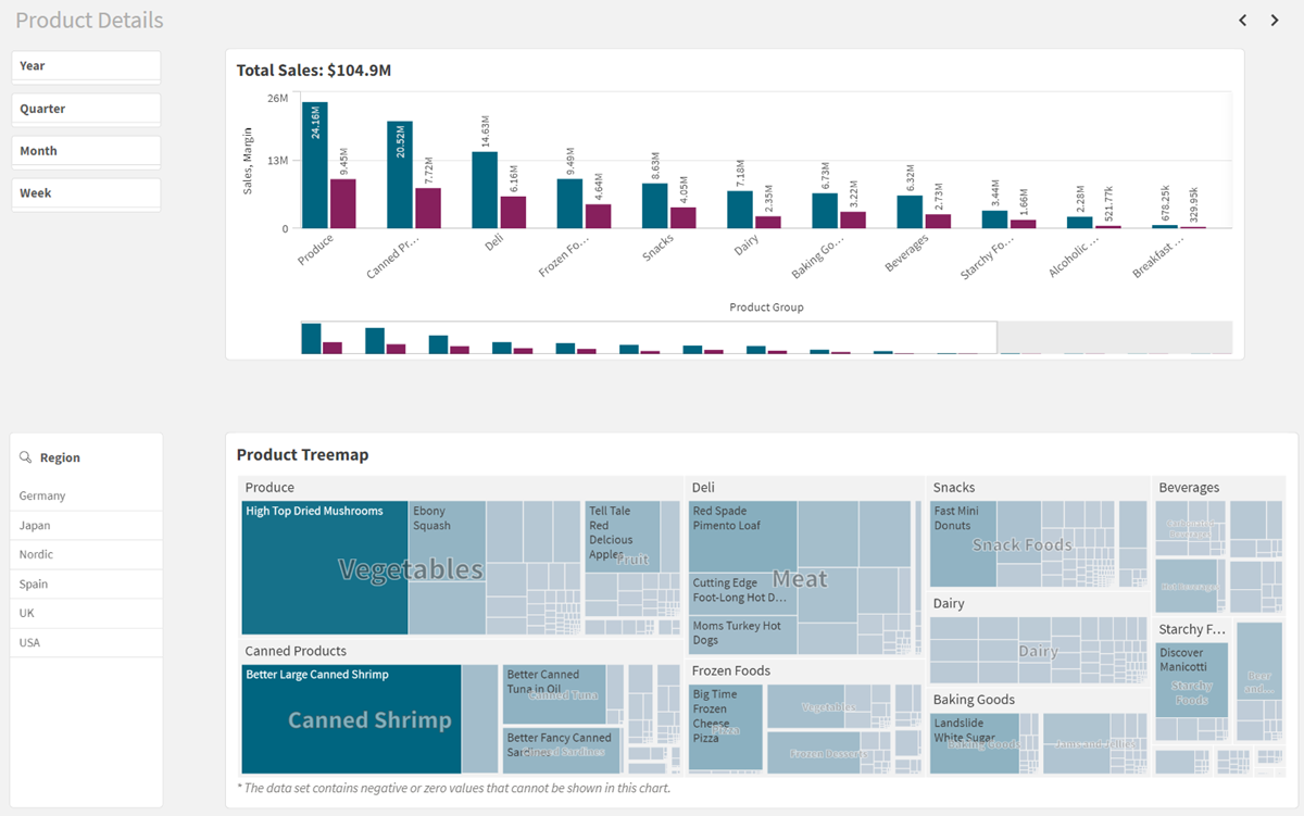
The second sheet: Product Details
In the second sheet you will make a bar chart and treemap that focus on products. Then you will add filter panes so you can filter by date and region.

Product Details sheet when finished

You will complete all work in editing mode.
Adding the bar chart
The next visualization is a bar chart showing the Top Sales.
Do the following:
-
In the assets panel, open Charts.
-
Under Visualizations, drag a bar chart to the sheet.
-
Go to Fields and add Sales and Margin as measures to the chart.
The treemap will be created on the sheet.
-
Under Presentation > Labels, toggle on Show value labels check box.
Adding the treemap
Treemaps display hierarchical data by using nested rectangles. Use a treemap when space is constrained and you have a large amount of hierarchical data that you need to get an overview of. Treemaps should primarily be used with values that can be aggregated.
For more information, see Treemap.
In this treemap you will create a product hierarchy.
Do the following:
- In the assets panel, open Charts.
- Under Visualizations, drag a treemap to the area below the bar chart.
-
Go to Fields and add Product Group, Product Type, and Item Desc as dimensions to the treemap.
-
Add Sales as a measure. The treemap will be created.
-
Click on the + icon at the top and add the title: Product Treemap.
Customizing your charts in edit mode
Now that all the visualizations have been created, they can be customized.
Customizing the bar chart
Do the following:
-
Select the bar chart.
-
Go to Sorting. Order your dimensions and measures like this:
-
Sum(Sales)
-
Sum(Margin)
-
Product Group
-
-
Click Sum(Sales). Set Sorting from Auto to Custom. Select Sort numerically.
Your bar chart is now ordered from best selling to worse selling.
-
You can add expressions in chart titles. Go to Appearance > General. Find Title, and click on
.
The expression editor opens.
-
This expression will resolve to show total sales:
='Total Sales: $'& Round(Sum(Sales)/1000000, 0.1) & 'M'
Customizing the treemap
Do the following:
-
Select the treemap.
-
Under Appearance > Colors and legend, set Colors from Auto to Custom.
-
Select By measure in the list.
Adding the filter panes
The purpose of the filter panes is to filter out a limited data set, which you can analyze and explore.
For more information, see Filter pane.
You will now reuse the Period filter pane and the Region filter pane that you saved as master items.
Do the following:
-
Resize the bar chart and treemap so that there is space on the left for two filter panes.
-
In the assets panel, click
to open Master items.
-
Click Visualizations.
-
Drag the filter pane Period to the sheet and resize it.
-
Drag the filter pane Region to the area below Period and resize it.
This sheet is complete. In the assets panel, click Sheets and select Customer Details to move to that sheet.
