The first sheet: Dashboard
In this first sheet, you will make a dashboard with different visualizations.

Overview
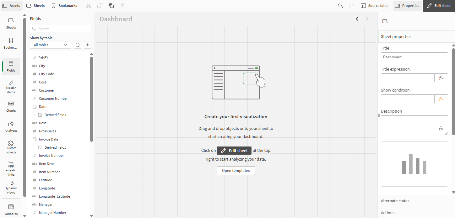
Open the Dashboard sheet you created earlier. Right now the sheet is empty, but it will not be for long.
Edit mode
Going from left to right, edit mode has the following layout:
-
Assets
-
Sheet area
-
Properties
Dashboard sheet with no visualizations in edit mode

Fields, dimensions, and measures
Visualizations are built using fields, dimensions, and measures.
Field
A field is a data asset containing values, loaded from a data source. At a basic level, a field corresponds to a column in a table. Fields are used to create dimensions and measures in visualizations.
For more information, see Fields.
Dimension
A dimension is an entity used to categorize data in a chart. For example, the slices in a pie chart or the bars of a bar chart represent individual values in a dimension. Dimensions are often a single field with discrete values, but can also be calculated in an expression.
For more information, see Data grouping with dimensions.
Measure
A measure is a calculation based on one or more aggregations. For example, the sum of sales is a single aggregation while the sum of sales divided by the count of customers is a measure based on two aggregations.
For more information, see Measures.
Purpose of this sheet
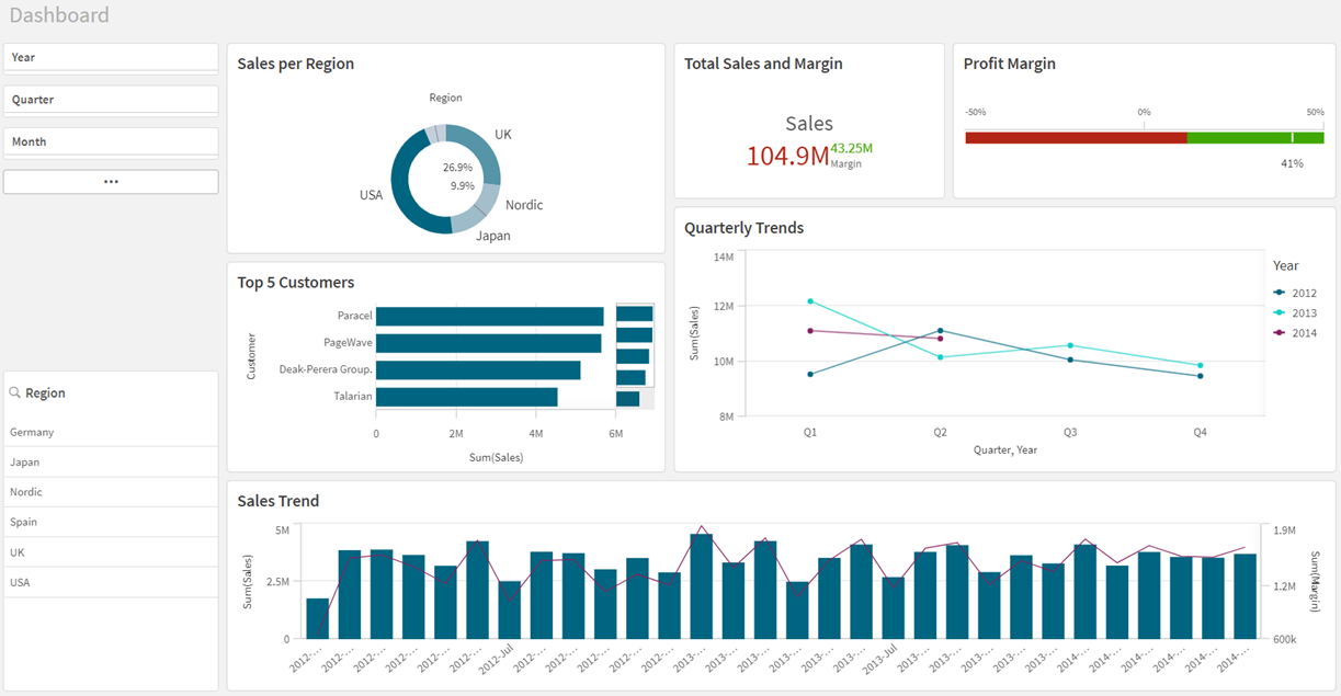
The purpose of a dashboard is to give a quick overview of the current state of affairs. The focus here is on sales trends and figures. The dashboard is not primarily designed for data exploration, but you can make selections and analyze the results.
Dashboard sheet when finished

Adding the donut chart
The first visualization that you will create is a Sales per Region donut chart. Pie charts and donut charts display the relation between values as well as the relation of a single value to the total. You can use a pie chart when you have a single data series with only positive values. You should use a donut chart when you have a single data series that includes negative values.
For more information, see Pie chart and donut chart.
Do the following:
-
In the assets panel, click Fields and right-click on Sales and select Create measure.
-
In the Create new measure dialog, under Expression, enter Sum(Sales).
-
Click Create.
The measure is added as a master item.
-
In the assets panel, click Master items, and drag Sales to the sheet and drop it onto the sheet.
-
In the assets panel, click Fields and drag the Region field to the sheet and drop it onto the suggested chart. The chart suggestion changes to a table.
-
Select the chart and in the properties panel, click Auto and select Pie chart.
-
Turn off Chart suggestions.
-
Under Appearance > General, add the title: Sales per Region.
-
Under Appearance > Presentation, select Donut.
-
Under Appearance > Colors and legend, turn off Auto.
-
Under Custom, click the drop-down and select By measure.
-
Turn off Show legend.
The donut chart is complete. The colors in the donut chart are set by measure, which means the higher the value, the darker the color.
You have many options when it comes to coloring the values. Remember that the colors should serve a purpose and not be used only to make the visualization more colorful.
Adding the KPI chart
The second visualization is the Total Sales and Margin KPI chart. A KPI visualization can show one or two measure values, and is used to track performance. Color coding and symbols indicate how the figures relate to the expected results.
For more information, see KPI.
Do the following:
- In the assets panel, click Charts.
- Under Visualizations, drag and drop a KPI onto the sheet to the right of the donut chart.
-
Click Add measure > Sales.
The sum of sales is added to the KPI.
-
In the assets panel, click Master items and after Measures, click
.
-
Under Expression, enter Sum(Margin).
-
Enter the name Margin and click Create.
-
In Master items, drag and drop Margin onto the KPI.
-
Under Appearance > Color, making sure First is selected, turn on Conditional colors and turn off Library colors.
-
Click Add limit.
-
Under Value, select the left side and then select a shade of red from the color palette.
-
Under Value, select the right side and then select a shade of green from the color palette.
-
Drag the value limit to the left to display the sales value as red in the KPI.
-
Select Second and turn on Conditional colors and turn off Library colors.
-
Click Add limit.
-
Under Value, select the left side and then select a shade of red from the color palette.
-
Under Value, select the right side and then select a shade of green from the color palette.
-
Drag the value limit to the right to display the margin value as green in the KPI.
-
Under Appearance > General, turn on Show titles and add the title: Total Sales and Margin.
Adding the gauge chart
The third visualization we want to create is the Profit Margin gauge chart. A gauge is used to visualize a single measure. A gauge is easy to read and understand and gives an instant indication of the performance within an area.
For more information, see Gauge .
This time, we are going to add an expression to calculate the profit margin.
Do the following:
- In the assets panel, click Charts.
- Under Visualizations, drag and drop a Gauge onto the sheet to the right of the KPI.
-
Click Add measure. Click on
.
The expression editor opens.
-
Enter:
(sum(Sales) - sum(Cost)) / Sum (Sales) -
Click Apply.
-
Under Presentation > Range limits, set the minimum value to -0.5 and the max value to 0.5.
-
Select the Bar option.
-
Toggle on Use segments and toggle off Use library.
-
Click the Add Limit button. Enter 0.12 in the field.
-
Click the Value bar. Select red for the values below the limit, and green for the values above the limit
-
Select Data. Click on the expression to see more options. Under Number formatting select Number from the drop-down menu. Under Simple, select 12%.
This will display a percentage without decimals.
-
Select Appearance > Measure axis. In the Labels and title drop-down menu, select Labels only.
-
Click the chart and add a title: Profit Margin.
Adding the bar chart
The next visualization is a bar chart showing the Top 5 Customers. A bar chart is suitable for comparing multiple values. The dimension axis shows the category items that are compared, and the measure axis shows the value for each category item. Grouping and stacking bars makes it easy to visualize grouped data.
For more information, see Bar chart.
Do the following:
-
In the assets panel, click Charts.
-
Under Visualizations, add a bar chart below the donut chart.
-
Under Fields, add Customer as the dimension and Sales as the measure.
-
Under Presentation, select Horizontal.
-
Select Data and click the Customer dimension.
-
In the Limitation drop-down menu, select Fixed number. In the expression field, type in: 5.
The chart will only show the top 5 customers.
-
Clear the Show others check box.
-
Click the chart and add a title: Top 5 Customers.
The bar chart is complete, showing the top five customers. When you make selections in other visualizations, these customers will change, accordingly.
If you had not cleared the selection Show others, the fifth bar would have been gray, summarizing all the sales values where the company name is missing. This value can be useful to get an understanding of how much of the sales that cannot be referred to a specific company.
Adding the line chart
The fifth visualization is the Quarterly Trend line chart. A line chart is used to show trends over time. The dimension is always on the x-axis, and the measures are always on the y-axis.
For more information, see Line chart.
This line chart will be used to show the quarterly sales trend for the years 2012-2014. The figures for 2014 are for the first half of the year.
Do the following:
-
In the assets panel, open Charts.
-
Under Visualizations, drag and drop a line chart next to the bar chart.
-
Under Fields, click Date >Derived fields. Add Quarter and Year as dimensions.
-
Add Sales as a measure.
-
Under Appearance > Presentation, select the Show data points check box.
-
Click the chart and add a title: Quarterly Trend.
Adding the combo chart
The last visualization we want to create here is the Sales Trend combo chart. The combo chart combines a bar chart and a line chart and is useful when you want to combine values that are normally hard to combine because of their different scales. A typical example is when you have a bar chart with sales figures and want to combine these figures with the margin values (in percent).
For more information, see Combo chart.
Do the following:
-
In the assets panel, open Charts.
-
Under Visualizations, add a combo chart to the sheet, placing it next to the line chart.
-
Under Fields, add Sales and Margin as measures.
-
Under Fields, click Date > Derived fields. Add YearMonth as a dimension.
-
In the properties panel, under Appearance > Colors and legend, toggle off Show legend.
-
Under X-axis, toggle off Continuous and clear the Use continuous scale check box.
-
Click the chart and add a title: Sales Trend.
Adding the filter panes
The purpose of the filter panes is to filter out a limited data set, which you can analyze and explore.
For more information, see Filter pane.
Do the following:
-
In the assets panel to the left, click
to open Charts.
-
Under Visualizations, drag a filter pane onto the sheet.
-
In the assets panel, click
to open Fields.
-
Click Date in the list to expand it.
- Drag the field Year to the center of the filter pane, then click it in the properties panel on the right-hand side to expand the dimension and change its Title to Year.
- Drag the field Quarter to the filter pane, then click it in the properties panel and change its Title to Quarter.
- Drag the field Month to the filter pane, then click it in the properties panel and change its Title to Month.
- Drag the field Week to the filter pane, then click it in the properties panel and change its Title to Week.
-
You can use the handles to resize the filter pane.
-
Right-click each filter pane and select Add to master items.
-
Type the name Period and click Add.
You have created a filter pane and saved it as a master item. This makes it easy to reuse in other sheets.
The second filter pane only contains one dimension, Region.
Do the following:
-
In the assets panel to the left, click
to open Charts.
-
Under Visualizations, drag a filter pane onto the sheet.
-
Click Add dimension and scroll down and select the field Region.
-
You can use the handles to resize the filter pane.
-
Right-click the filter pane and select Add to master items.
-
Type the name Region and click Add.
The two filter panes are complete.
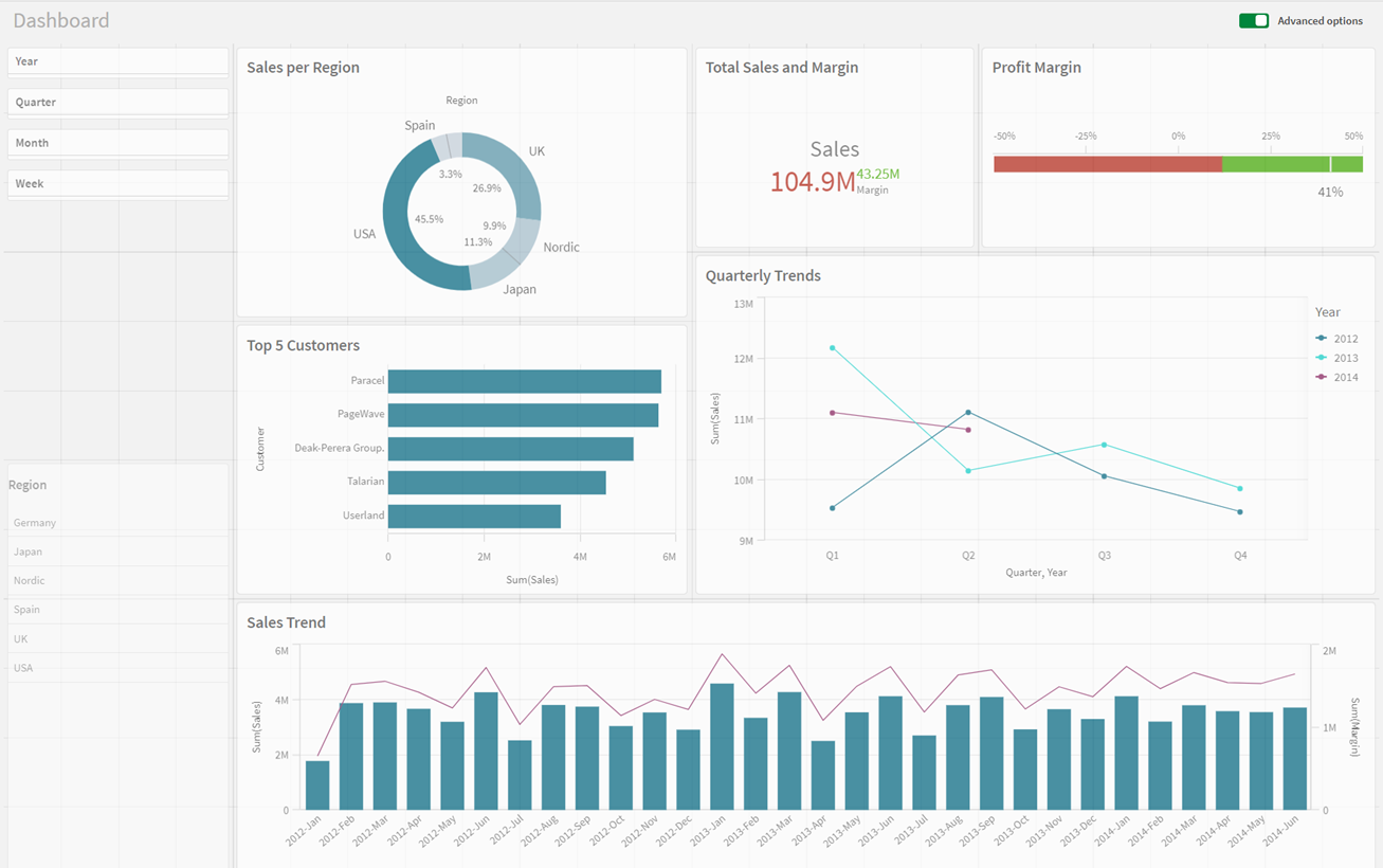
Feel free to adjust the positioning and size of the visualizations in your sheet.
Dashboard sheet after customizing

You have completed the first sheet. In the assets panel, click Sheets and select Product Details to move to that sheet.
