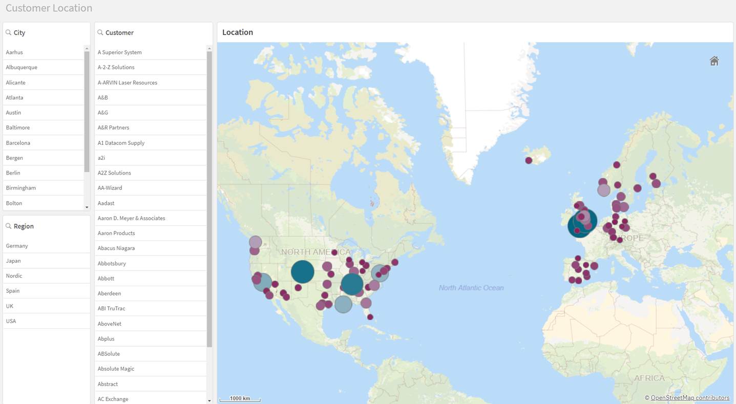
The fourth sheet: Customer Location
In the fourth sheet, you will make a map that shows where customers are located, and how much they buy. Then you will add filter panes so you can filter by city, region, and customer.

You can create a map by adding point layers and area layers to display your data. You need to select a base map to provide the context for the layer data. You can add a measure value or an expression to the dimension values, and use the size of the points or color by measure to reflect the size of the measure.
Customer Location sheet when done

Adding filter panes
You will make filter panes in edit mode.
Do the following:
- In the assets panel, open Charts.
- Under Visualizations, drag a
filter pane to the sheet.
- Go to Fields and add Region as the dimension.
- Add two new filter panes to the sheet. Add the dimension City to the first and the dimension Customer to the second filter pane.
Use the filter pane to select a subset of data after you create the charts below.
Creating a map in edit mode
In Qlik Cloud you can create two types of maps, point maps and area maps. You can create maps that display data in point layers and area layers. The map we are using in this tutorial contains a point layer. A point layer is created using point coordinates (latitude and longitude) or location names to mark places of interest, like cities.
Do the following:
-
Resize the filter panes so they are positioned to the left, and taking up as little space as possible.
- In the assets panel, open Charts.
- Under Visualizations, drag a map onto the sheet.
- In the assets panel, click
and drag the field City onto the map.
- Select Add as new layer.
- Select Add as point layer.
- In the properties panel, in Layers, click the City point layer.
- In Location, after Location field, select Longitude_Latitude.
- Go to Size & Shape. In the Size by field, type in: Sum(Sales)
-
Adjust the Bubble size range slider, if needed.
If there is too small a minimum, then the bubble representing sales for one location may not be visible when compared to a location with a large sales volume.
- In Colors, set Colors from Auto to Custom.
- Select By measure in the list and in Select measure, type in: Sum(Sales).
- Set Color scheme to Diverging gradient.
- Go to Appearance > Legend. Toggle off Show legend.
-
Add the title Location to the map.
-
Click Edit sheet to stop editing.
The map size adjusts according to the selections made in the filters. For example, selecting Nordic will zoom the map to the North European area showing the locations of sales in that area.
Specific areas of the map can be selected by holding down the shift key, while using the mouse to draw a lasso around the area to be viewed. The selections in the filter panes then reflect the selection made on the map.
Selecting a specific location on the map shows the customers at that location in the filter panes. Selections in other sheets also affect the data shown in the Customer Location sheet.
This sheet is complete. In the assets panel, click Sheets and select Insights to move to that sheet.
