Early Access: The content on this website is provided for informational purposes only in connection with pre-General Availability Qlik Products.
All content is subject to change and is provided without warranty.
Skip to main content Skip to complementary content

Layout container

Layout containers allow you to add visualizations in a limited space. You can also show or hide the visualizations inside the layout container based on conditions.

Layout container
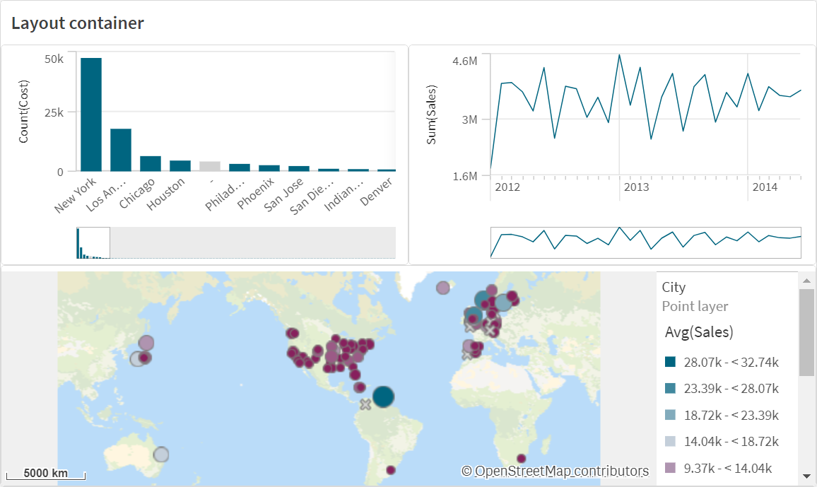
A layout container with a bar chart, line chart, and map. The bar chart is in the upper left, the line chart on the upper right, and the map chart across the bottom.
Information noteContainers can only be added in the advanced edit mode.

A layout container can hold a range of visualizations while occupying a small amount of space on a sheet. When expanded to full sheet, each chart expands as well.

When to use it

The layout container is useful when you want to build a custom display containing multiple charts as a single unit. Unlike the container, which uses tabs to cycle through charts, the layout container is a space where you are free to customize your own layout of the charts in the layout container. As the layout container offers sheet-like arrangement of visualizations, you can functionally store multiple sheets within a sheet that can be expanded for more detail.

You can place visualizations on top of one another. You can use conditions in the layout container to control which visualizations display. For example, you could show visualizations based on:

  • Which user is accessing the chart.
  • The value of a variable.

As a best practice, be aware the more visualizations that are added to a container, the longer is can take to display visualizations. Too may objects in a layout container might overwhelm the user and make the app slower to render visualizations.

Creating a container

You can create a container on the sheet you are editing.

  • In the advanced edit mode assets panel, open Custom objects > Dashboard bundle and drag Layout container to the sheet.

You now have a layout container. You can start adding and configuring charts to your layout container.

Adding charts to a layout container

Tip note

You can copy and paste charts in and out of the layout container, but you must use the right-click context menu.

  1. Select a layout container.
  2. Click Add under Content in the properties panel.

    Alternatively, click Add content in the layout container.

  3. Select a visualization in Charts.

  4. Click Add dimension and Add measure to add data to the chart.

  5. To resize the chart, do one of the following:
    • Click and drag the corners or edge of the chart.
    • In properties, enter the width and height of the chart in percent.
  6. To reposition the chart, do one of the following:

    • Click and drag the chart into position.

    • In properties, enter the x-axis and y-axis positions of the chart, in percent.

    To show grid lines for layout, in properties, under PresentationStyling, turn on Show grid lines. You can also set the number of rows and columns in the grid, and snap visualizations to the grid lines.

    To keep charts within the borders of the layout container, under PresentationStyling, turn on Keep charts within bounds.

  7. To reorder the layers of visualizations in the layout container, right-click on the visualization in the layout container, select Reorder chat layers, and choose to bring the visualization forward or back. Alternatively, click and drag the visualizations in the properties panel.
  8. To configure the chart with all properties available for that chart type, click Edit properties.
  9. Repeat for any additional charts you want to add to the layout container.

Adding show conditions

You can add show conditions on the tabs you have created.

  1. Click on the chart you want to add a show condition to, under Content in the property panel.
  2. Add a show condition for the chart in Show condition. Typically you would use an If() function.

    See if - script and chart function.

  3. Add another show condition to a different chart.

    The charts will now be shown or hidden depending on the result of the conditions you added. If the condition of a chart results in True, it is shown, and if it is False, it is hidden.

Customizing the text

You can set the text for the title, subtitle, and footnote under Appearance > General. To hide these elements, turn off Show titles.

The visibility of the different labels on the chart depends on chart-specific settings and label display options. These can be configured in the properties panel.

You can style the text that appears in the chart.

  1. Click Advanced options.

  2. In the properties panel, expand the Appearance section.

  3. Under AppearancePresentation, click Styling.

  4. On the General tab, set the font, emphasis style, font size, and color for the following text elements:

    • Title

    • Subtitle

    • Footnote

Customizing the background

You can customize the background of the chart. The background can be set by color and image.

  1. Click Advanced options.

  2. In the properties panel, expand the Appearance section.

  3. Under AppearancePresentation, click Styling.

  4. On the General tab of the styling panel, you can select a background color (single color or expression). You can also set the background to an image from your media library or from a URL.

    Information note

    To add a background image from a URL, the URL's origin needs to be added to the allowlist in your tenant's Content Security Policy. The origin must be added with the following Directive: img-src. This is done by a tenant administrator.

    For more information, see Creating a CSP entry.

    When using a background color, use the slider to adjust the opacity of the background.

    When using a background image, you can adjust image sizing and position.

Customizing the border and shadow

You can customize the border and shadow of the chart.

  1. Click Advanced options.

  2. In the properties panel, expand the Appearance section.

  3. Under AppearancePresentation, click Styling.

  4. On the General tab of the styling panel, under Border, adjust the Outline size to increase or decrease the border lines around the chart.

  5. Select a color for the border.

  6. Adjust the Corner radius to control the roundness of the border.

  7. Under Shadow in the General tab, select a shadow size and color. Select None to remove the shadow.

Limitations

Layout containers have the following limitations:

  • You cannot create a chart inside a layout container by dropping measures or dimensions on the container.
  • You cannot add a container, trellis container, or layout container inside a layout container.
  • Keyboard shortcuts are not supported for copying and pasting charts in a layout container.

Did this page help you?

If you find any issues with this page or its content – a typo, a missing step, or a technical error – let us know how we can improve!