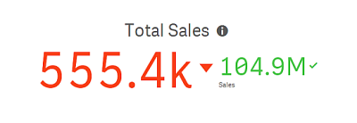
The KPI visualization can show one or two measure values, and is used to track performance.
A KPI visualization with two measure values, using conditional colors and symbols.


When to use the KPI
Use KPIs to get an overview of performance values that are central to an organization. Use color coding and symbols to indicate how the figures relate to the expected results.
Advantages
KPIs give a quick understanding of the performance within an area.
Disadvantages
The KPI is somewhat limited when it comes to graphical components. You can use symbols to help illustrate the performance, but if you want a more conspicuous component, consider using a gauge.
