Treemaps display hierarchical data by using nested rectangles, that is, smaller rectangles within a larger rectangle.

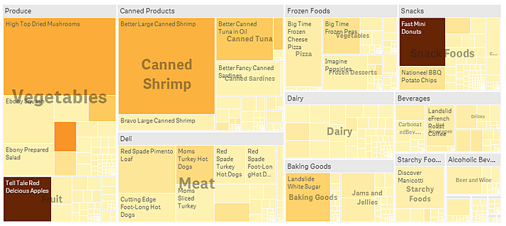
In this image you have several product groups, such as Produce, Canned Products, and Frozen Foods. Each product group consists of a large rectangle. You can regard the product groups as branches of the tree. When you select a product group, you drill down to the next level, the product type, for example, Vegetables, Meat, and Dairy. You can regard the product types as sub-branches of the tree. The branches have leaves. A leaf node's rectangle has an area proportional to a specified dimension of the data. In this example, the items Ebony Squash, Bravo Large Canned Shrimp, Red Spade Pimento Loaf, and so on, are the leaves. The leaf nodes are colored to show a separate dimension of the data.
Sorting is automatic according to size. By default, the coloring is by dimension, with 12 colors, but that can be changed in the properties panel. When you have more than one dimension, you can decide which dimension to color by. In this example, the coloring is not by dimension, but by expression (Avg(Margin)), a calculated measure and by using this expression, you can see which items have the highest average margin. The darker the color, the higher the average margin.
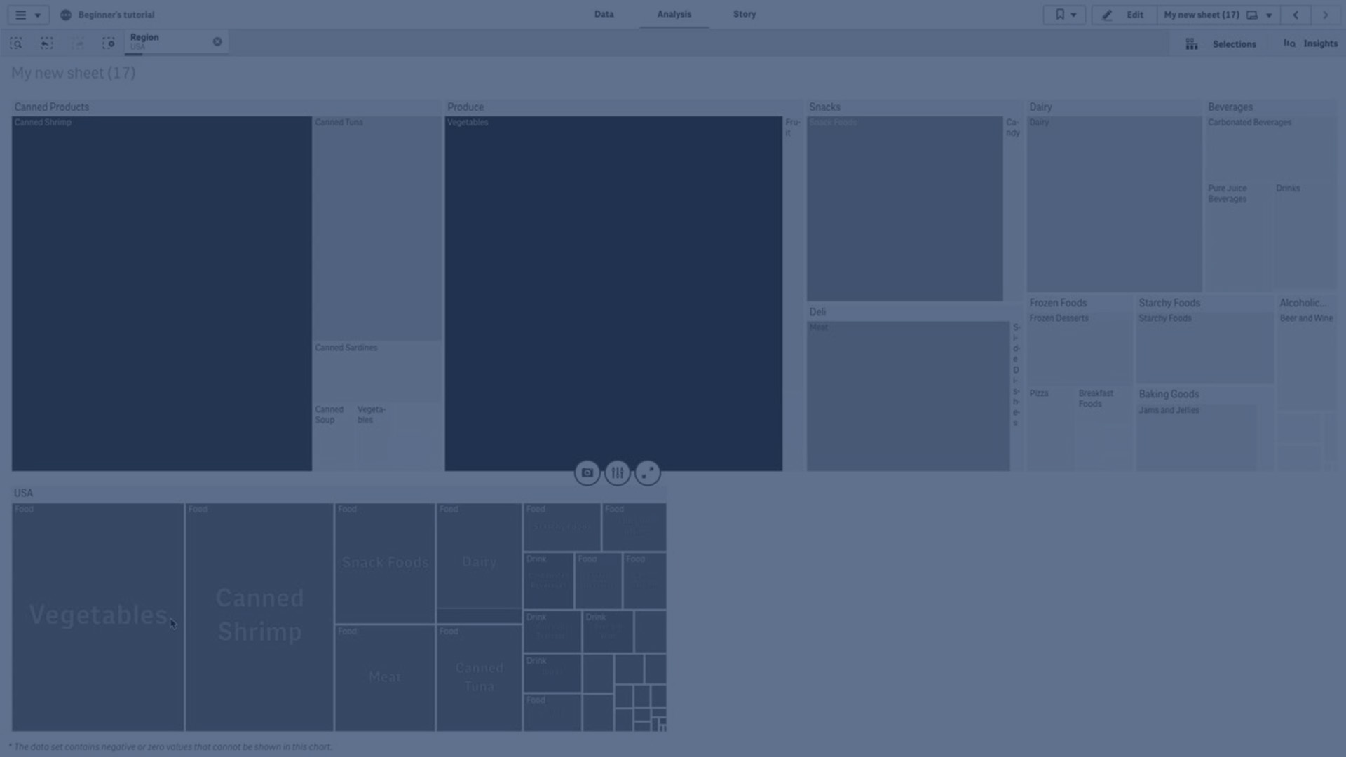
If the data set contains negative values, a text message is shown stating that the negative values cannot be displayed.

When to use the treemap
Use a treemap when space is constrained and you have a large amount of hierarchical data that you need to get an overview of. Treemaps should primarily be used with values that can be aggregated.
Advantages
Treemaps are economical in that they can be used within a limited space and yet display a large number of items simultaneously.
When there is a correlation between color and size in the tree structure, you are able to see patterns that would be difficult to spot in other ways, for example, when a certain color is particularly relevant.
Disadvantages
Treemaps are not good when there is a big difference in the magnitude of the measure values. Nor is a treemap the right choice when mixing absolute and relative values.
Negative values cannot be displayed in treemaps.
Display limitations
Large amounts of data
When displaying large amounts of data in a treemap, there may be cases when not each dimension value within a rectangle is displayed with correct color and size. These remaining values will instead be displayed as a gray, striped area. The size and total value of the rectangle will still be correct, but not all dimension values in the rectangle will be explicit.
To remove the gray areas, you can either make a selection or use dimension limits in the properties panel.
Colors and legend
When coloring by dimension is used in this chart, a maximum of 100 unique dimension values and 100 unique colors can be plotted on the legend.
