Early Access: The content on this website is provided for informational purposes only in connection with pre-General Availability Qlik Products.
All content is subject to change and is provided without warranty.
Skip to main content Skip to complementary content

Pivot table

The pivot table (Pivot) presents dimensions and measures as rows and columns in a table. In a pivot table you can analyze data by multiple measures and in multiple dimensions at the same time.

Pivot table, with expansions
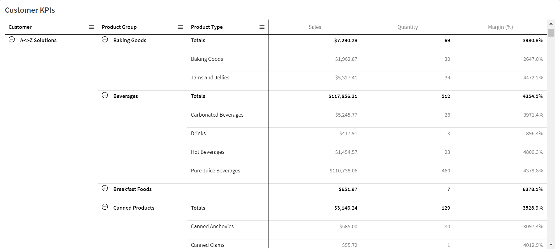
Pivot object showing Sales, Quantity, and Margin % as measures for Customers. Customers is expanded into Product Group and Product type, showing measure results for these categories.

When to use it

Pivot tables are useful when you want to include several dimensions or measures in a single table, and then want to reorganize them to see different subtotals. The Qlik Visualization bundle pivot table offers several different layout and styling options than the pivot table visualization, including:

  • Headers for all dimensions

  • Header menu options for all dimensions

  • Custom null representation

  • Customizable column widths by pixel or percentage

  • Adjust column widths using mouse

  • Totals at top or bottom

Creating pivot tables

  1. In the advanced edit mode assets panel, open Custom objects > Qlik Visualization bundle and drag Pivot to the sheet.
  2. Click Add and select a field or master dimension for the row dimension.

    Optionally, add more dimensions as rows. The pivot table drills down rows in the order they are added. You can click and drag the dimensions to reorder them.

  3. Click Add and select a field or master measure for the measure.

    Optionally, add more measures.

You can adjust appearance and other settings in the advanced properties panel.

Pivoting your data in the properties panel

In the properties panel, you can add measures and dimensions to the pivot table, as well as pivot rows or columns.

Data

In the data pane, you can add dimensions and measures. You can move items between rows and columns. You can also change item order inside rows or columns. When you use more than one measure, they are grouped and a Values item is created.

Properties panel, Data section.

Sorting

On the sorting pane in advanced properties, you can change the internal order of dimensions and measures.

Properties panel, sorting pane.

Information noteWhen sorting pivot tables, NULL values are always displayed first.

Sort by first measure

If you have more than one measure, a measure group is created. Sort by first measure will sort dimension values by the numeric value of the first measure. This sort order will affect all dimensions and take precedence before any other sort order defined under the dimensions.

For example, you have two measures: Quantity and Sales. In the properties pane, under Data> Measures, Quantity is listed first. If you Sort by first measure in descending order, your table is sorted starting with the dimension with the highest Quantity.

If Sort by first measure is turned off, the table uses the sort order configured for the dimensions.

Pivot table in Edit mode. Sort by first measure has been toggled on.

Pivot object with sorted by first measure.

Limitations:

  • This option is only supported if subtotals are calculated. You can calculate subtotals by doing one of the following:
    • In the properties pane, go to Data, and click on a dimension. Toggle on Show totals.
    • In the properties pane, go to Appearance > Presentation. Toggle on Indent rows.
  • This option is not supported for calculated dimensions.
  • This option is only supported if all dimensions are in the Row section and all measures are in the Column section.

Dimension sorting

With Sort by first measure turned off, the table can be sorted by dimension values. Each dimension can have Auto or Custom sorting. With Auto sorting, field values are sorted alphabetically and numerically in ascending order. With Custom sorting, you can turn each of the following settings on or off:

  • Sort by expression: Sorts by custom expression. Sort by expression overrides the Sort numerically and Sort alphabetically settings. This option should only be used with the first (outermost) dimension in the table.

  • Sort numerically: Sorts field values starting with a number.

  • Sort alphabetically: Sorts field values starting with a letter.

Ascending and Descending options are available for all three settings.

Sorting in search

The user can click a dimension name in the table to expand a listbox. In the listbox, the user can search and select individual dimension values. The Sorting in search setting controls the sort order of the values in a dimension listbox.

You have the following options for the listbox sort order:

  • Auto: Uses the default sort order. Numbers are sorted numerically in ascending order. Text is sorted alphabetically in ascending order.

  • Inherit from dimension: Uses the sort order defined for the individual dimension.

Formatting dimension and measure columns

You can format your dimension and measure columns with additional options. You can:

  • Limit displayed dimensions

  • Format dimension representation

  • Format measure numbers

  • Create conditional columns

  • Set background color of cells using expressions

  • Set text color with expressions

  • Setting column width

Limiting displayed dimensions

Limit the number of displayed values for a dimension. When you set a limitation, the only dimensions displayed are those where the measure value meets the limitation criterion.

  1. Under Data, select a dimension and expand the properties.

  2. Under Limitation, select one of the following limitations:

    • No limitation: The default value.

    • Fixed number: Select to display the top or bottom values. Set the number of values. You can also use an expression to set the number. Click Expression to open the expression editor.

    • Exact value: Use the operators and set the exact limit value. You can also use an expression to set the number. Click Expression to open the expression editor.

    • Relative value: Use the operators and set the relative limit value in percent. You can also use an expression to set the number. Click Expression to open the expression editor.

Formatting dimension representation

You can format dimension columns to show values, links, or images using Representation in the properties panel. You can select the following representations: 

  • Text: Displays the dimension values as text. This is the default value.
  • Link: Displays values as clickable links. Either the dimension value is used or the URL or you can add other URLs to the displayed dimension values.

  • Image: Displays values that contain an absolute URL to an image display as images.

Formatting links

Information note

The character ; is not supported as a query parameter separator in a URL.

  1. Under Data, select a dimension and expand the properties.

  2. Under Representation, select Link.

  3. Under Link setting, select one of the following:

    • Add label: The dimension contains the destination URL in either the dimension expression or the data table. The links are displayed and ordered by destination URL expression.

      Under Link label, enter a descriptive text label for the destination URL. Click Open Expression editor to open the expression editor.

    • Add URL: The dimension values become selectable text links that are labels for the URLs.

      Under Link URL, enter the destination URL expression. Click Open Expression editor to open the expression editor.

Formatting images

Warning note

Images in pivot tables are only accessible from servers and domains that have been safe-listed. Administrators make these resources available in Administration by adding Content-Security-Policies (CSP) for each server or domain. CSP helps to prevent cross-site scripting attacks by controlling what resources a browser can request from a server.

Information note

The character ; is not supported as a query parameter separator in a URL.

  1. Under Data, select a dimension and expand the properties.

  2. Under Representation, select Image.

  3. Under Image setting, select one of the following:

    • Add label: The dimension contains the absolute URL to the image in either the dimension expression or the data table. The links are displayed and ordered by the URL expression.

      Under Image label, enter a descriptive text label for the image that displays as alternative text when the image is hovered over. Click Open Expression editor to open the expression editor.

    • Add URL: The dimension values become labels for the alternative text that displays when the image is hovered over.

      Under Image URL, enter the destination URL expression. Click Open Expression editor to open the expression editor.

  4. Under Sizing, select one of the following sizing options:

    • Always fit

    • Fit to width

    • Fit to height

    • Stretch to fit

    • Original size

  5. Under Position, select the image position within the cell.

Formatting measure numbers

You can format measure numbers under Number formatting in the properties panel.

If you want to change the number format at app level, and not just for a single measure, it is better to do that in the regional settings in the SET statements at the beginning of the script in the data load editor.

  1. Under Data, select a measure and expand the properties.

  2. Under Number formatting, select the format:

    • Auto: Qlik Sense automatically sets a number formatting based on the source data.

      To represent numeric abbreviations, the international SI units are used, such as k (thousand), M (million), and G (billion).

    • Number: By default, the formatting is set to Simple, and you can select the formatting from the options in the list. Change to Custom to and enter the format pattern under Format pattern.

      Examples:  

      • # ##0 describes the number as an integer with a thousands separator. In this example " " is used as a thousands separator.
      • ###0 describes the number as an integer without a thousands separator.
      • 0000 describes the number as an integer with at least four digits. For example, the number 123 will be shown as 0123.
      • 0.000 describes the number with three decimals. In this example "." is used as a decimal separator.

      If you add the percent sign (%) to the format pattern, the measure values are automatically multiplied by 100.

    • Money: By default, the format pattern used for money is set by the preferred region settings in your profile. Use Format pattern to change the format pattern.
    • Date: By default, the formatting is set to Simple, and you can select the formatting from the options in the list. Change to Custom to and enter the format pattern under Format pattern.
    • Duration: By default, the format pattern used for duration is set by the preferred region settings in your profile. Duration can be formatted as days, or as a combination of days, hours, minutes, seconds and fractions of seconds. Use Format pattern to change the format pattern.
    • Custom: By default, the format pattern used for custom is set by the preferred region settings in your profile. Use Format pattern to change the format pattern.

Creating conditional columns

Columns can be conditional, so that they only appear when certain conditions are met.

  1. Under Data, select a dimension or measure and expand the properties.

  2. Under Show column if, click Expression to open the expression editor.

  3. Enter the expression to determine the conditions for the column to appear.

  4. Click Apply.

Example

Suppose you have a Pivot table or Pivot object that contains the following:

  • Dimensions are Product Type and Product Name.

  • Measures are Sum(Sales) and Count (distinct InvoiceNumber).

  • The items under Columns are Values (default) and the field Quarter.

You might have a large number of years of data in your app, so you do not want to add too much clutter to the visualization. At the same time, you want to encourage granular and interactive analysis.

For the Quarter column, you could add the following expression for Show column if:

GetSelectedCount(Year)=1

With this expression, if the user selects a single year in the app, the pivot table breaks down each measure by quarter. If not, the total measure values are shown.

You can use variables to encourage interactive analysis. Suppose you also create a variable vUserInteraction with a blank definition. Then, you create two Button charts on your sheet, configured with the Set variable value action:

  • Show more detail: Clicking this button sets vUserInteraction to a value of ='Yes'.

  • Show less detail: Clicking this button sets vUserInteraction to a value of ='No'.

In your pivot table, you could add a number of additional measures to the chart, such as Count(Quantity) and Sum(Cost). Then, configure each measure column to have the following value for Show column if:

'$(Reference)'='Yes'

This allows the chart to adapt to whether or not the user wants additional information. If the user clicks the Show more detail button, additional measures are added to the table. If not, or if they click Show less detail, the additional measures are removed.

Setting background color with expressions

You can define the background color for a column using expressions. For example, you can have cells in the column change background color depending on the values in the column cell. The text color automatically changes to white when a dark background color is used.

  1. Under Data, select a dimension or measure and expand the properties.

  2. Under Background color expression, click Expression to open the expression editor.

  3. Enter the expression to determine the conditions for the column to appear.

  4. Click Apply.

Setting text color with expressions

You can define the text color for a column using expressions. For example, you can have cells in the column change text color depending on the values in the column cell.

  1. Under Data, select a dimension or measure and expand the properties.

  2. Under Text color expression, click Expression to open the expression editor.

  3. Enter the expression to determine the conditions for the column to appear.

  4. Click Apply.

Setting column width

By default, column width is automatically set. You can manually set column width by:

  • Content

  • Pixels

  • Percentage

You can also manually size the columns by dragging the header borders.

  1. Under Data, select a dimension or measure and expand the properties.

  2. Under Column width, select how you want to set column width:

    • Fit to content: Columns are sized by the width of the content in the column.

    • Pixels: Set the width of the column in pixels.

    • Percentage: Set the width of the column by percent.

    • Auto: Automatically set the column width with Qlik Sense.

Changing how data is presented

There are several options available for customizing the data presentation in the pivot table. These options are available in the properties panel under AppearancePresentation.

Fully expanded

When selected, all values in the pivot table are displayed, rather than some being collapsed. This setting is noticeable when more than one dimension is added.

Indent rows

This setting is also noticeable when more than one dimension is added.

When the setting is turned on, dimensions are nested within each other and expandable. When you expand a top-level dimension row, nested dimensions are displayed with an indentation at the beginning of each row.

With the setting turned off, dimensions after the first dimension are displayed in separate columns in the table and become visible if you expand a top-level dimension row.

Customizing styling

With Advanced options turned on, you have a number of styling options available under Appearance in the properties panel.

Click Styling under Appearance > Presentation to further customize the styling of the chart. The styling panel contains various sections under the General and Chart tabs.

You can reset your styles by clicking next to each section. Clicking Reset all resets styles for all available tabs in the styling panel.

Customizing the text

You can set the text for the title, subtitle, and footnote under Appearance > General. To hide these elements, turn off Show titles.

The visibility of the different labels on the chart depends on chart-specific settings and label display options. These can be configured in the properties panel.

You can style the text that appears in the chart.

  1. In the properties panel, expand the Appearance section.

  2. Under AppearancePresentation, click Styling.

  3. On the General tab, set the font, emphasis style, font size, and color for the following text elements:

    • Title

    • Subtitle

    • Footnote

  4. On the Chart tab, set the font, emphasis style, font size, and color for the following text elements:

    • Header: Style the text of the headers for all dimensions.
    • Dimension values: Style the text dimension values.
    • Measure values: Style the text of the measure values.
    • Measure labels: Style the text of the measure headers.
    • Total values: Style the text of the totals.
    • Null values: Style the text of the null values.

Customizing the background

You can customize the background of the chart. You can also color individual dimensions or measures by expression.

  1. In the properties panel, expand the Appearance section.

  2. Under AppearancePresentation, click Styling.

  3. On the General tab of the styling panel, you can select a background color (single color or expression). You can also set the background to an image from your media library or from a URL.

    Information note

    To add a background image from a URL, the URL's origin needs to be added to the allowlist in your tenant's Content Security Policy. The origin must be added with the following Directive: img-src. This is done by a tenant administrator.

    For more information, see Creating a CSP entry.

    When using a background color, use the slider to adjust the opacity of the background.

    When using a background image, you can adjust image sizing and position.

  4. On the Chart tab, customize the background color for the following elements:

    • Header
    • Dimension values
    • Measure values
    • Measure labels
    • Total values
    • Null values

Customizing the grid

You can customize the pivot table grid.

  1. In the properties panel, expand the Appearance section.

  2. Under AppearancePresentation, click Styling.

  3. On the Chart tab, customize the grid with the following elements:

    • Row height: Set the height of rows in lines.

    • Border: Set the color of the cell borders.

    • Divider: Set the color of the divider between that divides both dimensions and measures as well as header and rows.

    • Background: Set the color of the empty area created when you have dimensions in Column.

Customizing null values

You can change how null values are represented in the pivot table.

  1. Click AppearancePresentation in the properties panel.

  2. Under Null value text, enter the text you want to replace null values with.

Expanding the pivot table fully

You can set the pivot table to always be fully expanded.

  1. Click AppearancePresentation in the properties panel.

  2. Select Fully expanded.

Customizing the border and shadow

You can customize the border and shadow of the chart.

  1. Click Advanced options.

  2. In the properties panel, expand the Appearance section.

  3. Under AppearancePresentation, click Styling.

  4. On the General tab of the styling panel, under Border, adjust the Outline size to increase or decrease the border lines around the chart.

  5. Select a color for the border.

  6. Adjust the Corner radius to control the roundness of the border.

  7. Under Shadow in the General tab, select a shadow size and color. Select None to remove the shadow.

Selecting active fields from cyclic dimensions in pivot tables

If a pivot table uses a cyclic dimension, users can select the active fields from the cyclic dimension.

  1. Click Menu icon on a cyclic dimension column.

  2. Click Cycle icon <Dimension name> and select a dimension from the cyclic dimension.

Limitations

Pivot tables have the following limitations:

  • You cannot pivot data in your Visualization bundle pivot table when your sheet is in analysis mode as you can with the visualization pivot table.

Did this page help you?

If you find any issues with this page or its content – a typo, a missing step, or a technical error – let us know how we can improve!