Controlling visible map data with drill-down layers
This example will show you how to build a map with a top-level area layer that drills down into with two point layers.
When creating a map that has multiple points of data located in a wide geographical area, you can use drill-down dimensions to display your layers in a hierarchy. As users make selections in a layer, the dimension displayed in the layer changes to the next dimension in the drill-down dimension. This enables you to use display data at different selection levels within your map, ensuring only the most relevant information is being displayed.
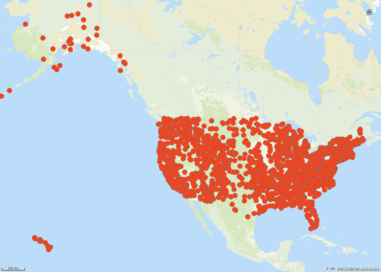
We have a list of all historical sites in the United States National Park Service's National Register of Historic places. When we add the cities that historical sites are located in to a map as a point layer, we get accurate locations for our bubbles. It could be made more understandable with better organization, however.

How then can we organize this information better, especially if we also want to add in another point layer containing airports to help plan how to get to the different sites?
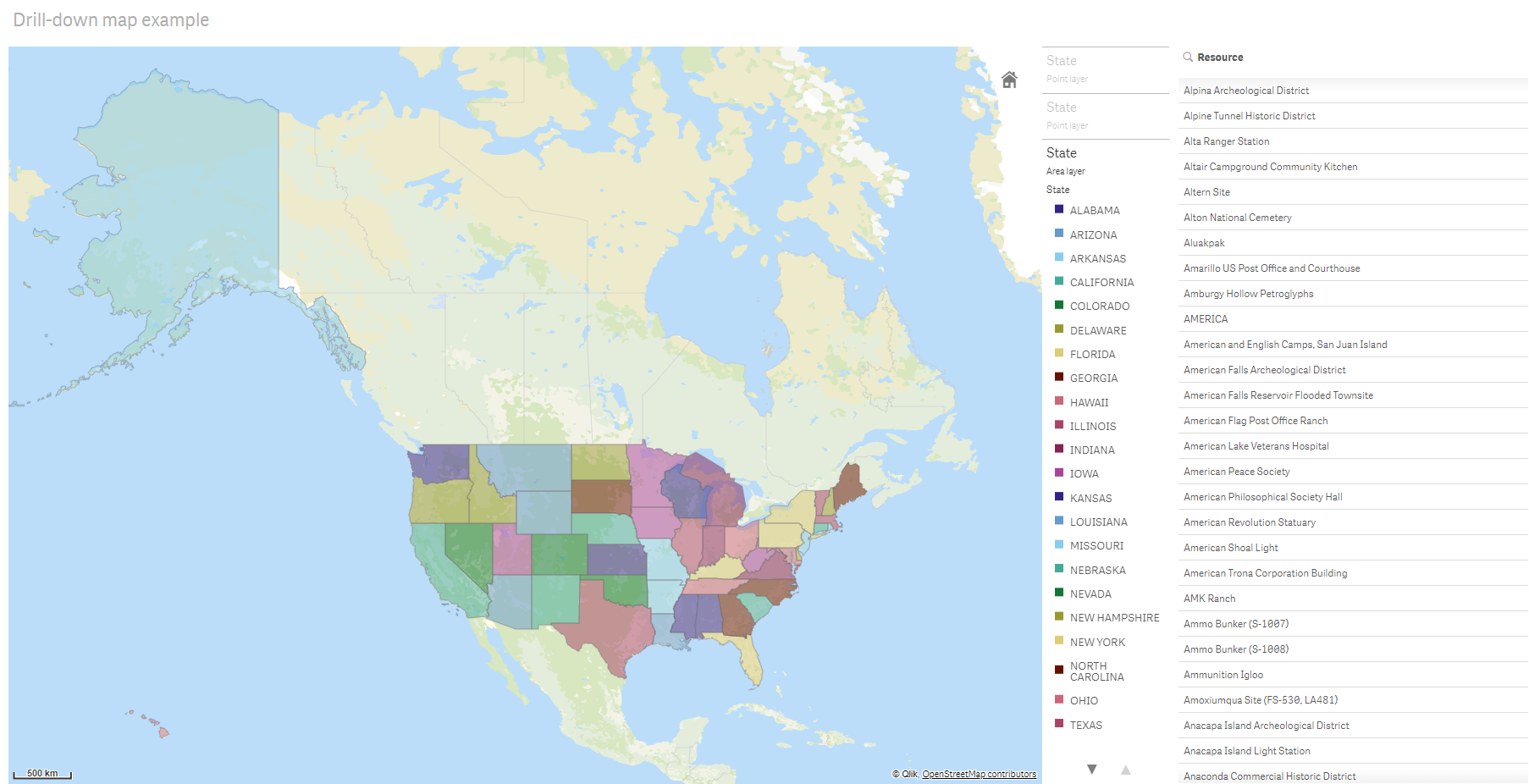
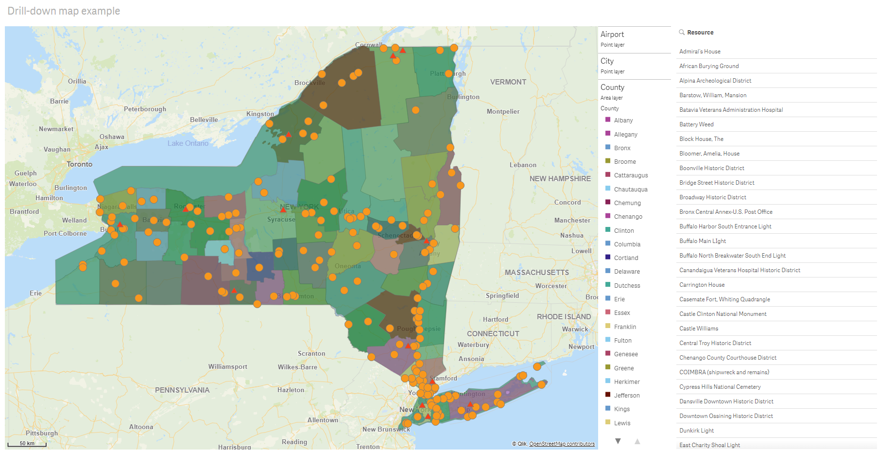
To solve this problem, we will create a map of the United States of America with a layer of states that drills down to the county level. Drilling down to the county level will also show the cities that contain the historical sites as data points, as well as all airports for that state and the surrounding states.


Dataset
This example uses two sets of data:
-
Federal listings: National Register of Historic Places listed properties from federal agencies (federal_listed_20190404.xlsx)
This data set is available from the National Park Service National Register of Historic Places. It contains data about all registered history places, their location, and the federal agencies associated to them.
-
Airport data
This table contains data for airports in the United States. It consists of each airport's International Air Transport Association (IATA) code, city, and state or territory.
You must import this data into Qlik Sense either by adding to a spreadsheet that you then import into Qlik Sense or by importing the table from this help page as a web file.
Airport data Airport AirportCity AirportState ABE Allentown/Bethlehem/Easton, PA PA ABI Abilene, TX TX ABQ Albuquerque, NM NM ABR Aberdeen, SD SD ABY Albany, GA GA ACT Waco, TX TX ACV Arcata/Eureka, CA CA ADK Adak Island, AK AK ADQ Kodiak, AK AK AEX Alexandria, LA LA AGS Augusta, GA GA ALB Albany, NY NY ALO Waterloo, IA IA AMA Amarillo, TX TX ANC Anchorage, AK AK APN Alpena, MI MI ART Watertown, NY NY ASE Aspen, CO CO ATL Atlanta, GA GA ATW Appleton, WI WI AUS Austin, TX TX AVL Asheville, NC NC AVP Scranton/Wilkes-Barre, PA PA AZO Kalamazoo, MI MI BDL Hartford, CT CT BET Bethel, AK AK BFL Bakersfield, CA CA BGR Bangor, ME ME BHM Birmingham, AL AL BIL Billings, MT MT BIS Bismarck/Mandan, ND ND BJI Bemidji, MN MN BKG Branson, MO MO BLI Bellingham, WA WA BMI Bloomington/Normal, IL IL BNA Nashville, TN TN BOI Boise, ID ID BOS Boston, MA MA BPT Beaumont/Port Arthur, TX TX BQK Brunswick, GA GA BQN Aguadilla, PR PR BRD Brainerd, MN MN BRO Brownsville, TX TX BRW Barrow, AK AK BTM Butte, MT MT BTR Baton Rouge, LA LA BTV Burlington, VT VT BUF Buffalo, NY NY BUR Burbank, CA CA BWI Baltimore, MD MD BZN Bozeman, MT MT CAE Columbia, SC SC CAK Akron, OH OH CDC Cedar City, UT UT CDV Cordova, AK AK CEC Crescent City, CA CA CHA Chattanooga, TN TN CHO Charlottesville, VA VA CHS Charleston, SC SC CIC Chico, CA CA CID Cedar Rapids/Iowa City, IA IA CLD Carlsbad, CA CA CLE Cleveland, OH OH CLL College Station/Bryan, TX TX CLT Charlotte, NC NC CMH Columbus, OH OH CMI Champaign/Urbana, IL IL CMX Hancock/Houghton, MI MI COD Cody, WY WY COS Colorado Springs, CO CO COU Columbia, MO MO CPR Casper, WY WY CRP Corpus Christi, TX TX CRW Charleston/Dunbar, WV WV CSG Columbus, GA GA CWA Mosinee, WI WI CVG Cincinnati, OH KY DAB Daytona Beach, FL FL DAL Dallas, TX TX DAY Dayton, OH OH DBQ Dubuque, IA IA DCA Washington, DC VA DEN Denver, CO CO DFW Dallas/Fort Worth, TX TX DHN Dothan, AL AL DIK Dickinson, ND ND DLH Duluth, MN MN DRO Durango, CO CO DSM Des Moines, IA IA DTW Detroit, MI MI EAU Eau Claire, WI WI ECP Panama City, FL FL EGE Eagle, CO CO EKO Elko, NV NV ELM Elmira/Corning, NY NY ELP El Paso, TX TX EUG Eugene, OR OR EWN New Bern/Morehead/Beaufort, NC NC EWR Newark, NJ NJ EVV Evansville, IN IN EYW Key West, FL FL FAI Fairbanks, AK AK FAR Fargo, ND ND FAT Fresno, CA CA FAY Fayetteville, NC NC FCA Kalispell, MT MT FLG Flagstaff, AZ AZ FLL Fort Lauderdale, FL FL FNT Flint, MI MI FOE Topeka, KS KS FSD Sioux Falls, SD SD FSM Fort Smith, AR AR FWA Fort Wayne, IN IN GCC Gillette, WY WY GCK Garden City, KS KS GEG Spokane, WA WA GFK Grand Forks, ND ND GGG Longview, TX TX GJT Grand Junction, CO CO GNV Gainesville, FL FL GPT Gulfport/Biloxi, MS MS GRB Green Bay, WI WI GRI Grand Island, NE NE GRK Killeen, TX TX GRR Grand Rapids, MI MI GSO Greensboro/High Point, NC NC GSP Greer, SC SC GTF Great Falls, MT MT GTR Columbus, MS MS GUC Gunnison, CO CO GUM Guam, TT TT HDN Hayden, CO CO HIB Hibbing, MN MN HLN Helena, MT MT HNL Honolulu, HI HI HOB Hobbs, NM NM HOU Houston, TX TX HPN White Plains, NY NY HRL Harlingen/San Benito, TX TX HSV Huntsville, AL AL IAD Washington, DC VA IAH Houston, TX TX ICT Wichita, KS KS IDA Idaho Falls, ID ID ILG Wilmington, DE DE ILM Wilmington, NC NC IMT Iron Mountain/Kingsfd, MI MI IND Indianapolis, IN IN INL International Falls, MN MN ISN Williston, ND ND ISP Islip, NY NY ITO Hilo, HI HI JAC Jackson, WY WY JAN Jackson/Vicksburg, MS MS JAX Jacksonville, FL FL JFK New York, NY NY JLN Joplin, MO MO JNU Juneau, AK AK KOA Kona, HI HI KTN Ketchikan, AK AK LAN Lansing, MI MI LAR Laramie, WY WY LAS Las Vegas, NV NV LAW Lawton/Fort Sill, OK OK LAX Los Angeles, CA CA LBB Lubbock, TX TX LCH Lake Charles, LA LA LEX Lexington, KY KY LFT Lafayette, LA LA LGA New York, NY NY LGB Long Beach, CA CA LIH Lihue, HI HI LIT Little Rock, AR AR LMT Klamath Falls, OR OR LNK Lincoln, NE NE LRD Laredo, TX TX LSE La Crosse, WI WI LWS Lewiston, ID ID MAF Midland/Odessa, TX TX MBS Saginaw/Bay City/Midland, MI MI MCI Kansas City, MO MO MCO Orlando, FL FL MDT Harrisburg, PA PA MDW Chicago, IL IL MEM Memphis, TN TN MFE Mission/McAllen/Edinburg, TX TX MFR Medford, OR OR MGM Montgomery, AL AL MHK Manhattan/Ft. Riley, KS KS MHT Manchester, NH NH MIA Miami, FL FL MKE Milwaukee, WI WI MKG Muskegon, MI MI MLB Melbourne, FL FL MLI Moline, IL IL MLU Monroe, LA LA MMH Mammoth Lakes, CA CA MOB Mobile, AL AL MOD Modesto, CA CA MOT Minot, ND ND MQT Marquette, MI MI MRY Monterey, CA CA MSN Madison, WI WI MSO Missoula, MT MT MSP Minneapolis, MN MN MSY New Orleans, LA LA MTJ Montrose/Delta, CO CO MYR Myrtle Beach, SC SC OAJ Jacksonville/Camp Lejeune, NC NC OAK Oakland, CA CA OGG Kahului, HI HI OKC Oklahoma City, OK OK OMA Omaha, NE NE OME Nome, AK AK ONT Ontario, CA CA ORD Chicago, IL IL ORF Norfolk, VA VA ORH Worcester, MA MA OTH North Bend/Coos Bay, OR OR OTZ Kotzebue, AK AK PAH Paducah, KY KY PBI West Palm Beach/Palm Beach, FL FL PDX Portland, OR OR PHF Newport News/Williamsburg, VA VA PHL Philadelphia, PA PA PHX Phoenix, AZ AZ PIA Peoria, IL IL PIH Pocatello, ID ID PIT Pittsburgh, PA PA PNS Pensacola, FL FL PPG Pago Pago, TT TT PSC Pasco/Kennewick/Richland, WA WA PSE Ponce, PR PR PSG Petersburg, AK AK PSP Palm Springs, CA CA PVD Providence, RI RI PWM Portland, ME ME RAP Rapid City, SD SD RDD Redding, CA CA RDM Bend/Redmond, OR OR RDU Raleigh/Durham, NC NC RHI Rhinelander, WI WI RIC Richmond, VA VA RKS Rock Springs, WY WY RNO Reno, NV NV ROA Roanoke, VA VA ROC Rochester, NY NY ROW Roswell, NM NM RST Rochester, MN MN RSW Fort Myers, FL FL SAF Santa Fe, NM NM SAN San Diego, CA CA SAT San Antonio, TX TX SAV Savannah, GA GA SBA Santa Barbara, CA CA SBN South Bend, IN IN SBP San Luis Obispo, CA CA SCC Deadhorse, AK AK SCE State College, PA PA SDF Louisville, KY KY SEA Seattle, WA WA SFO San Francisco, CA CA SGF Springfield, MO MO SGU St. George, UT UT SHV Shreveport, LA LA SIT Sitka, AK AK SJC San Jose, CA CA SJT San Angelo, TX TX SJU San Juan, PR PR SLC Salt Lake City, UT UT SMF Sacramento, CA CA SMX Santa Maria, CA CA SNA Santa Ana, CA CA SPI Springfield, IL IL SPS Wichita Falls, TX TX SRQ Sarasota/Bradenton, FL FL STL St. Louis, MO MO STT Charlotte Amalie, VI VI STX Christiansted, VI VI SUN Sun Valley/Hailey/Ketchum, ID ID SUX Sioux City, IA IA SWF Newburgh/Poughkeepsie, NY NY SYR Syracuse, NY NY TLH Tallahassee, FL FL TOL Toledo, OH OH TPA Tampa, FL FL TRI Bristol/Johnson City/Kingsport, TN TN TTN Trenton, NJ NJ TUL Tulsa, OK OK TUS Tucson, AZ AZ TVC Traverse City, MI MI TWF Twin Falls, ID ID TXK Texarkana, AR AR TYR Tyler, TX TX TYS Knoxville, TN TN VLD Valdosta, GA GA VPS Valparaiso, FL FL WRG Wrangell, AK AK XNA Fayetteville, AR AR YAK Yakutat, AK AK YUM Yuma, AZ AZ
Instructions
Once you have loaded the data sets into a new app in Qlik Sense, you can begin building your map. To make the example map, you must complete the following tasks:
- Create the drill-down dimensions.
- Add the map to our sheet.
- Add the State-County area layer.
- Add the State-City point layer.
- Add the State-Airport point layer.
- Add the Resource filter pane.
Creating the drill-down dimensions
First, you need to create three drill-down dimensions. This will create the relationships between State and the fields County, City, and Airport, enabling the County, City, and Airport layers to become visible after a state from the State layer has been selected.
Do the following:
- In sheet view, click
Edit sheet in the toolbar.
- In Assets, click Master items.
- In Dimensions, click Create new.
- Select Drill-down.
- Add the field State to the dimension.
- Add the field County to the dimension.
- After Name, type State-County.
- Click Create.
- Add the field State to the dimension.
- Add the field City to the dimension.
- After Name, type State-City.
- Click Create.
- Add the field State to the dimension.
- Add the field Airport to the dimension.
- After Name, type State-Airport.
- Click Create.
- Click Close.
Adding the map to the sheet
The next step is to add a map to your sheet.
Do the following:
-
In sheet view, click
Edit sheet in the toolbar.
-
From the assets panel, drag an empty map to the sheet.
Adding the State-County area layer
The first layer you add is an area layer to which you add the dimension State-County. In addition, you set the country as 'USA' to ensure we map to the state of Georgia rather than the nation of Georgia.
Do the following:
- From Layers in the properties panel, click Add layer.
- Select Area layer.
- In Dimensions, click Add and select State-County.
- Click Location.
- Set Scope for locations to Custom.
- After Country, enter 'USA'.
- After Administrative area (Level 1), select State.
- Click Colors.
- Set Colors to Custom, select By dimension, and select 100 colors.
- Select Persistent colors.
- Adjust the Opacityslider to half opacity.
- Click
at the top of the properties panel.
Adding the State-City point layer
The next layer you add is a point layer. You add State-City as the dimension and then set the country as 'USA' and then set State as the first-level administrative area, as some counties cities in different states have the same names.
Do the following:
- From Layers in the properties panel, click Add layer.
- Select Area layer.
- In Dimensions, click Add and select State-City.
- Click Location.
- Set Scope for locations to Custom.
- After Country, enter 'USA'.
- After Administrative area (Level 1), select State.
- Click Colors.
- Set Colors to Custom, select Single color, and select a color.
- Click Options.
- In Layer display, set Visible drill-down levels to Custom.
- Clear State.
- Click
at the top of the properties panel.
Adding the State-Airport point layer
The final layer you add to the map is a point layer to which you add the State-Airport field as the dimension. Qlik Sense recognizes IATA codes for placement, ensuring the airports are located in their actual position rather than just in their city.
Do the following:
- From Layers in the properties panel, click Add layer.
- Select Area layer.
- In Dimensions, click Add and select State-Airport.
- Click Location.
- Set Scope for locations to Custom.
- After Country, enter 'USA'.
- After Administrative area (Level 1), select State.
- Click Size & Shape.
- From Shape, select Triangle.
- Click Colors.
- Set Colors to Custom, select Single color, and select a color.
- Click Options.
- In Layer display, set Visible drill-down levels to Custom.
- Clear State.
- Click
at the top of the properties panel.
Add the Resource filter pane
Finally, you can optionally add a filter pane containing the field Resource. This provides you with a list of the available historical sites as you make selections within your map.
Do the following:
- In the assets panel, drag and drop a filter pane into the sheet.
- Click Add dimension.
- Add a filter pane containing the field Resource.
