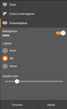
The visual exploration menu lets you change certain visualization properties, without making selections or editing the sheet. For example, you can change data, sort data, color by dimension or measure, and change how labels are displayed.
For a visual demo about how to use the visual exploration menu, see Visual explorations.
Example of visual exploration menu for a scatter plot visualization.

Using the visual exploration menu to change properties
Do the following:
- When analyzing, hover over the visualization you want to change.
- Click
at the top right of the visualization or right-click on the visualization and select Exploration menu.
- Update the properties you want to change.
-
To close the menu and save your changes, click
. The changes are saved during this session.
To save your changes for future sessions (and have them updated in the properties panel), click Apply. This button is only available for visualizations that are not master items or linked to master items, and for users with rights to edit the sheet.
Information noteIf you do not click Apply to save the changes or Discard to discard the changes and later click Edit to edit the sheet, you will be prompted to select whether to apply or discard the changes you made when analyzing the sheet.
Using the visual exploration menu to change data
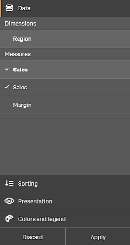
The visual exploration menu can change visualization data, if you have alternative dimensions or measures. Simply click on the dimension or measure you want the visualization to display. The selection is marked with a .
Example of visual exploration menu when changing data

Using the visual exploration menu to explore time series forecasting
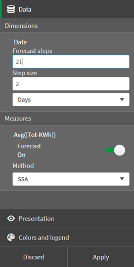
You can change the time series forecasting properties of line charts with the visual exploration menu.
Example of visual exploration when changing time series forecasting

For Dimensions, you can adjust the following properties:
-
Forecast steps: Enter the number of steps to forecast.
-
Step size: Enter a number to multiply each step by.
-
Step unit: Select a time or number interval.
For Measures, you can adjust the following properties:
-
Forecast: Turn forecasting on or off in the line chart..
-
Method: Select the forecasting method:
-
SSA: Singular Spectrum Analysis (SSA) identifies noise and seasonality as well as trend. SSA is the best option to forecast trends with cyclical or oscillatory behavior.
-
OLS: Ordinary Least Square (QLS) calculates a trend line by minimizing the sums of the squares of the differences between the observed dependent variable and the predicted dependent variable. OLS is the best option when you want to see a linear trend of the data.
For more information about forecasting methods, see OLS and SSA methods.
-
Limitations
The exploration menu has the following limitations:
-
You cannot use the exploration menu with analyses. For more information on analyses, see Creating and editing analyses.
-
The visualization exploration menu is not available for charts that are located inside a tab container, layout container, or legacy container object.
