Early Access: The content on this website is provided for informational purposes only in connection with pre-General Availability Qlik Products.
All content is subject to change and is provided without warranty.
Skip to main content Skip to complementary content

Variance waterfall chart

You can use the variance waterfall chart (Variance waterfall) to show the variance between two measures over the different values of a dimension. The variance waterfall chart is included in the Visualization bundle.
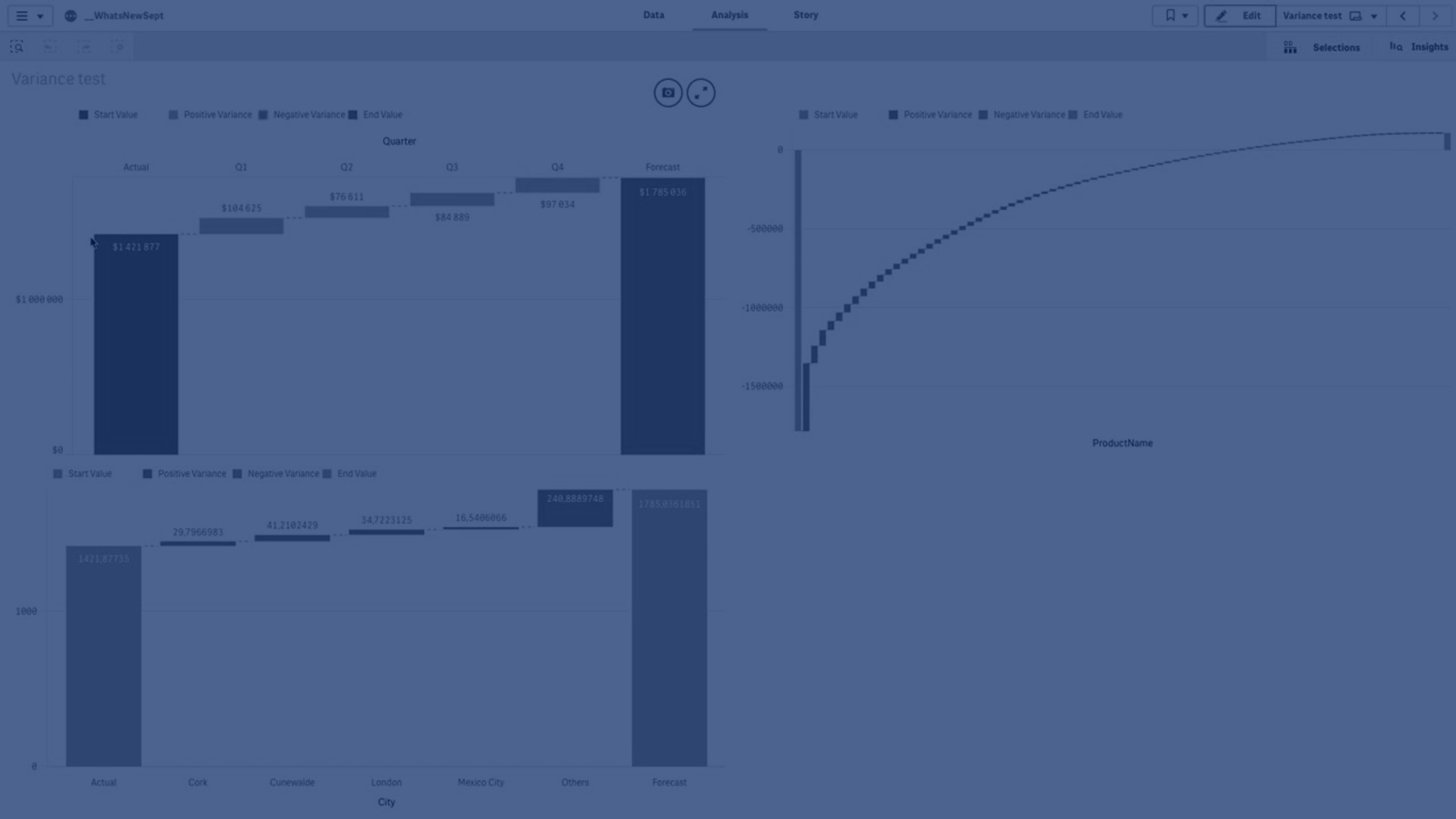
You need to use two measures, start value and end value, and one bridge dimension.

Variance waterfall chart showing spending over fiscal quarters
A variance water showing spending over several fiscal quarters.

Creating a variance waterfall chart

You can create a variance waterfall chart on the sheet you are editing.

  1. In the advanced edit mode assets panel, open Custom objects > Visualization bundle and drag a Variance waterfall object to the sheet.
  2. Click the Add dimension button to select the bridge dimension.

  3. Click the first Add measure button to select the measure to use as start value.
  4. Click the second Add measure button to select the measure to use as end value.

The variance waterfall chart is now displayed with one bar for the start value measure and one bar for the end value measure. Between the measure bars you will see the variance for each value of the bridge dimension.

Changing the appearance of the chart

You can customize the appearance of your chart.

Labels

You can turn off value labels by setting Appearance > Presentation > Value labels to Off.

Legend

You can customize the legend labels by setting Appearance > Presentation > Labels to Custom. You can set a custom text for the following legend labels:

  • Start value (Start value)
  • End value (End value)
  • Positive variance (Positive label)
  • Negative variance (Negative label)

You can also hide the legend by setting Appearance > Colors and legend > Show legend to Off or change the position of the legend with Appearance > Colors and legend > Legend position.

Using the styling panel to further customize the appearance

With Advanced options turned on, you have a number of styling options available under Appearance in the properties panel.

Click Styling under Appearance > Presentation to further customize the styling of the chart. You can reset your styles by clicking next to each section. Clicking Reset all resets styles for all available tabs in the styling panel.

For general information about styling an individual visualization, see Applying custom styling to a visualization.

Customizing the text

You can set the text for the title, subtitle, and footnote under Appearance > General. To hide these elements, turn off Show titles.

The visibility of the different labels on the chart depends on chart-specific settings and label display options. These can be configured in the properties panel.

You can style the text that appears in the chart.

  1. Click Advanced options.

  2. In the properties panel, expand the Appearance section.

  3. Under AppearancePresentation, click Styling.

  4. On the General tab, set the font, emphasis style, font size, and color for the following text elements:

    • Title

    • Subtitle

    • Footnote

Customizing the background

You can customize the background of the chart. The background can be set by color and image.

  1. Click Advanced options.

  2. In the properties panel, expand the Appearance section.

  3. Under AppearancePresentation, click Styling.

  4. On the General tab of the styling panel, you can select a background color (single color or expression). You can also set the background to an image from your media library or from a URL.

    Information note

    To add a background image from a URL, the URL's origin needs to be added to the allowlist in your tenant's Content Security Policy. The origin must be added with the following Directive: img-src. This is done by a tenant administrator.

    For more information, see Creating a CSP entry.

    When using a background color, use the slider to adjust the opacity of the background.

    When using a background image, you can adjust image sizing and position.

Customizing the border and shadow

You can customize the border and shadow of the chart.

  1. Click Advanced options.

  2. In the properties panel, expand the Appearance section.

  3. Under AppearancePresentation, click Styling.

  4. On the General tab of the styling panel, under Border, adjust the Outline size to increase or decrease the border lines around the chart.

  5. Select a color for the border.

  6. Adjust the Corner radius to control the roundness of the border.

  7. Under Shadow in the General tab, select a shadow size and color. Select None to remove the shadow.

Example of a variance waterfall chart

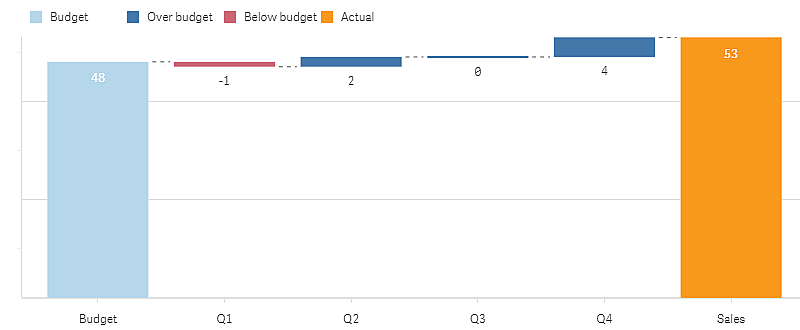
In this simple example we will show how quarterly sales numbers contribute to sales compared to budget.

Dataset

The dataset we use contains sales numbers and budgeted sales for each quarter. You can paste it into a text file and load it in Qlik Sense.

Quarter,Sales,Budget
Q1,9,10
Q2,14,12
Q3,12,12
Q4,18,14

Visualization

You can now create a variance waterfall chart.

  • Add Quarter as dimension.
  • Add Sum(Budget) as the first measure.
  • Add Sum(Sales) as the second measure.

The variance waterfall chart is created. We have adjusted the labels and colors in the example.
You can clearly see that Q1 had sales below budget, but the year ended with sales over budget, and that Q4 was the largest contribution.

Variance waterfall chart showing spending over fiscal quarters

A variance water showing spending over several fiscal quarters.

Limitations

For information about general limitations, see Limitations.

  • It is not possible to use a variance waterfall chart in a Trellis container.
  • You need to use the same number format for both measures to get correct number format for the dimension variance bars.

Learn more

Did this page help you?

If you find any issues with this page or its content – a typo, a missing step, or a technical error – let us know how we can improve!