
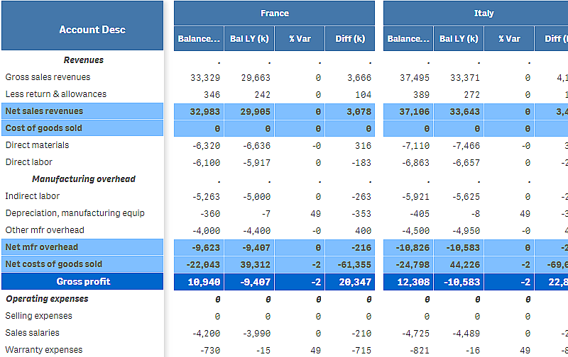
You can use the P&L pivot chart to create a pivot table with a layout for profit and loss reporting. You can color cells according to performance and style the chart with custom fonts and alternating row colors. You can also download the chart to Excel including formatting. The P&L pivot chart is included in the Visualization bundle.
| Dimensions | Measures | Result |
|---|---|---|
| 1 dimension | up to 9 measures | A table with one row for each dimension value and one column for each measure. |
| 2 dimensions | up to 8 measures | A pivot table with one row for each value of the first dimension and one column for each measure pivoted using the second dimension. |

Limitations
For information about general limitations, see Limitations.
-
There is a limitation for data transfer between Qlik Engine and P&L pivot. This limits each request for data to 10000 elements, for example, 1000 rows and 10 columns. P&L pivot can make automatic requests for more data using pagination.
You can set the limit of how much data to request with Pagination > Max pagination loops. The default value is 20000 elements (20k cells) and the maximum value is 40000 elements.
You can also modify the error message displayed to the user when the data limit is exceeded. The recommended workaround when the data limit is exceeded is to apply filters to the data to limit the data transfer.
- It is not possible to convert a P&L pivot chart to another visualization or convert another visualization to a P&L pivot chart.