Trellis container advanced mode examples
This help topic shows examples of how you can use a Trellis container in advanced mode to configure advanced expressions in your charts.
The following variables are shown in this help topic:
-
$(vDim)
-
$(vDimValue)
-
$(vDimSetFull)
For additional examples, see Using advanced mode.
Example 1: Conditional measure expression
This example shows you how the $(vDimValue) variable can be added to measure expressions to make the Trellis container compatible with advanced expressions. The expression used in this chart is a conditional if expression.
Add the data
Create a new app and add the load script below into the Data load editor. Then, load the data.
Create the master visualization
Do the following:
-
Open a sheet in edit mode.
-
Drag a bar chart onto the sheet.
-
Add Item Type as a dimension to the bar chart.
-
Add the following expression as a measure:
=if(Sum([Units Sold])>=40000, Sum({<Region={$(vDimValue)}>} [Total Profit]), Sum({<Region={$(vDimValue)}>} [Units Sold]))In the Trellis container, this expression will show:
-
If there are 40,000 or more units sold: The total profit for each distinct region.
-
If there are less than 40,000 units sold, or if the data is null: The total number of units sold for each distinct region.
For each chart in the container, the $(vDimValue) variable will be replaced by the dimension value name for Region.
-
-
For the measure you just added, add the following Label:
=if(Sum([Units Sold])>=40000, 'Total Profit', 'Items Sold') -
In the properties panel, expand Sorting. Adjust the sorting so that the chart sorts primarily by the measure value in descending order.
-
In the properties panel, under Appearance, expand Colors and legend.
-
Set Colors to Custom and choose the option to color the chart By dimension.
-
Turn on Persistent colors.
-
Right-click the chart, or use the
button, and click Add to master items.
-
Give the master item a Name (for example, BarChartExample), and click Add.
Create the Trellis container
Do the following:
-
In the assets panel, open Charts and under Dashboard objects, drag a Trellis container onto the sheet.
-
Click Add dimension, and select Region.
-
Click Add master visualization. In the drop down menu, select the BarChartExample master item.
-
In the properties panel for the Trellis container, under Appearance, expand Trellis options.
-
Set Advanced mode to On.
-
In the properties panel for the Trellis container, under Appearance, expand General.
-
Toggle on Show titles if needed. Add the following expression for the Title of the chart:
=if(Sum([Units Sold])>=40000, 'Total Profit, by Region and Item Type', 'Total Items Sold, by Region and Item Type')
Resize the Trellis container on the sheet so that it has enough space to show all data. Your chart should now look something like the following image.
Example result with no selections made in the app

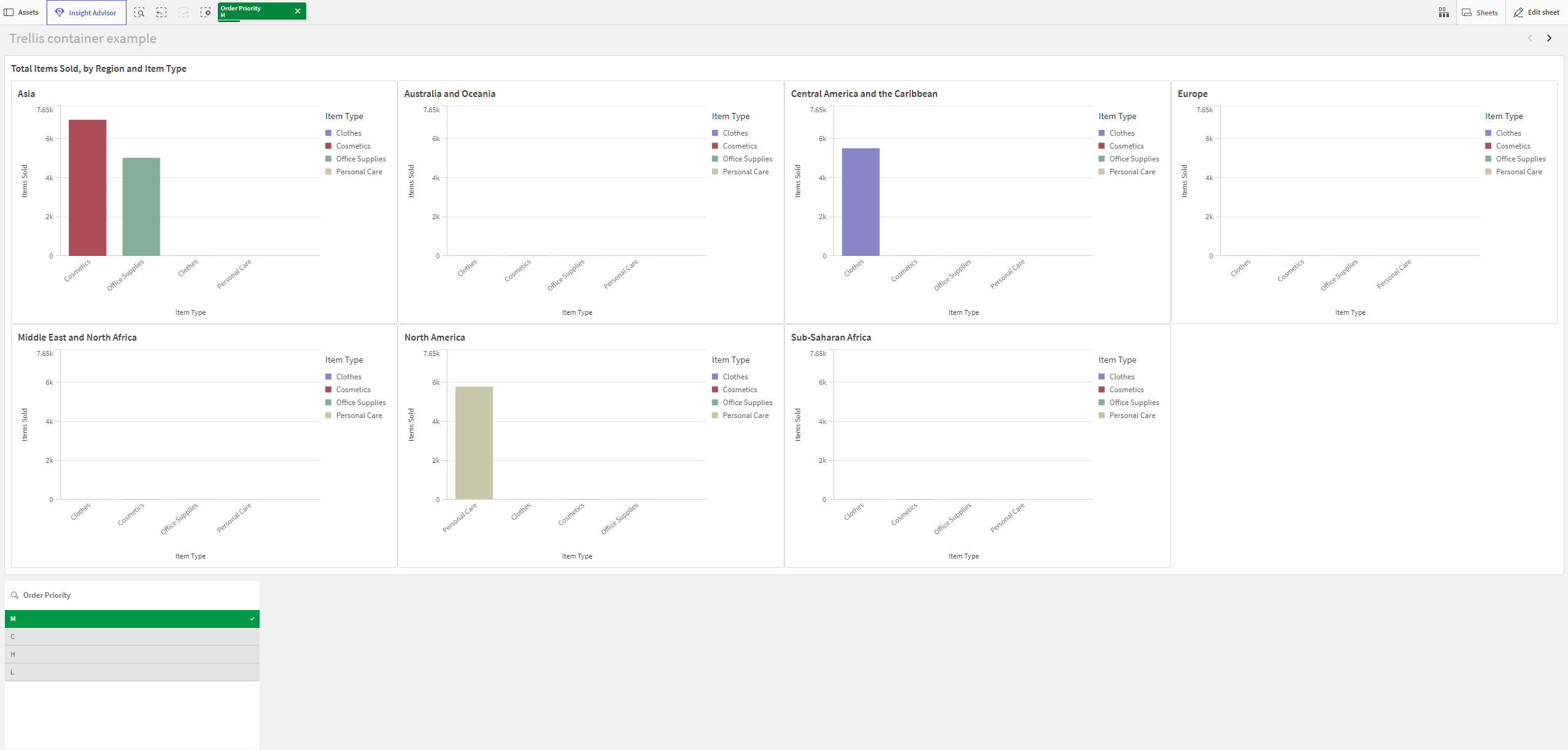
If you make selections in the app (for example, by selecting a specific Order Priority), the measure shown in the chart could change given the lower order volume.
Example result with a selection made in the app

Example 2: Coloring on a map chart
This example will show you how to configure a Trellis container in Advanced mode to color a map chart by measure expression. Specifically, it shows the following:
-
Using $(vDimSetFull) to color map charts by measure.
-
Using $(vDim) and $(vDimValue) in text within the charts (in this case, for the chart subtitles).
Add the data
Create a new app and the load script below into the Data load editor. Then, load the data.
Create the master visualization
Do the following:
-
Open a sheet in edit mode.
-
Drag a map chart onto the sheet.
-
In the properties panel, create a new area layer for the chart.
-
Add Country as the dimension for the area layer.
-
In the Country area layer, expand Colors.
-
Set Colors to Custom and select the By measure color setting.
-
Add the following expression for Select measure:
=Sum($(vDimSetFull) Sales) -
Add the following Label to the measure color: Total Sales
-
Expand the Appearance > General section in the properties panel.
-
Enter the following expression for the chart Subtitle:
='Total Sales, ' & $(vDim) & ': ' & $(vDimValue)This expression returns an error in the master visualization, but in the Trellis container, it functions intended. For each unique Year value, the title of the chart will be Total Sales, Year: <year>.
-
Right-click the chart, or use the
button, and click Add to master items.
-
Give the master item a Name (for example, MapChartExample), and click Add.
Create the Trellis container
Do the following:
-
In the assets panel, open Charts and under Dashboard objects, drag a Trellis container onto the sheet.
-
Click Add dimension, and select Year.
-
Click Add master visualization. In the drop down menu, select the MapChartExample master item.
-
In the properties panel for the Trellis container, under Appearance, expand Trellis options.
-
Set Advanced mode to On.
-
Set Number of columns to a value that works best for your sheet and screen size. To match the image below, set this to 5.
-
In the properties panel for the Trellis container, under Appearance, expand General.
-
Add the following Title for the chart: Total Sales by Country
-
Resize the chart if needed so that it occupies the entire length of the sheet.
-
Exit sheet edit mode.
To get the same color scheme as shown in the image below, set the app theme to Sense Classic.
Example result

